

Orange And White Colour Combination
Discover two colour combinations to add a dynamic touch to your space.
Orange And White Colour Combination
In this section, you'll find essential tips and inspiring examples on how to effectively pair these two Orange And White Colour Combinations. Discover the perfect shades, explore their interactions with different environments, and unleash the bold potential of Orange And White Colour Combo in your projects.
For more insights, visit our detailed resource on Two Colour Combination
Try with Visualizer
FIND IN STORE
Disclaimer: Actual wall paint colour applied may differ from the on-screen representation above. Please confirm your colour choices prior to purchase by viewing a physical colour shade card or a painted sample.
Still confused ? Explore all our shades from our colour catalogue
Create Your Dream Home With Our Painting Experts
Fill the form below to book a free site evaluation by Nerolac Nxtgen painting Services expert
Unique Two Colour Combinations to Try
Experiment with these beautiful two colour combo and transform your space
Orange and White Colour Combination for your Home
Orange comes between red and yellow on the colour wheel, a secondary colour made from two primaries. It carries the energy of red colour and the brightness of yellow colour in a single warm tone. On the other hand, white falls at the opposite end of the value spectrum, not technically as a colour on the wheel, but as the fullest expression of light and openness a wall can carry.
Orange signifies warmth, appetite, vitality, and social energy; white signifies clarity, space, and freshness. Together, the orange and white colour combination creates one of the most universally welcoming interior pairings, bold enough to have character and clean enough to never feel heavy.
Quick Summary
Orange and white is a warm-meets-clean combination. White's role in this combination is structural; it gives the room definition and prevents it from feeling saturated with warmth.
Why Orange and White Colour Combination Works So Well
The orange-white colour combination has a directness that most pairings lack. It doesn't need interpretation or careful styling to feel welcoming.
A) Colour Psychology
Orange stimulates appetite, social connection, and positive energy; it's a colour that makes people feel welcomed and at ease. White communicates openness, cleanliness, and possibility; it expands perceived space and clarifies the room's atmosphere.
B) Contrast Between Warm and Cool Tones
Orange is among the warmest tones on the colour spectrum. White, particularly cooler whites, comes at the cool, neutral end of the value range. The temperature contrast between the two creates visual clarity; the eye moves between orange's warmth and white's coolness naturally, which keeps rooms feeling energised without becoming restless.
C) Natural Inspiration
Orange and white together appear throughout the natural world, tigers in snow, autumn leaves against a pale sky, tropical fish in clear water, marigolds and jasmine. It's a two colour combination that carries biological familiarity. The eye recognises it as natural and responds positively before any aesthetic assessment happens.
D) Modern Interior Trend Relevance
Contemporary interior walls have moved this combination well beyond the overtly festive or obviously ethnic associations some people carry around orange. Deeper, more amber versions of orange alongside warm, slightly creamy whites appear in high-design living room walls and refined bedrooms with a sophistication that makes the combination feel genuinely current.
Best Orange and White Colour Combination Ideas for Walls
Each pairing in this selection has a distinct character, from the light and fresh to the warm and deeply settled. The right choice depends on the room's scale, lighting conditions, and the specific atmosphere being built.
1. Touch of Paprika + Converse White
A warm, slightly spiced combination with a grounded, organic quality. Touch of Paprika colour carries the warmth of the spice, earthy, deep, and satisfying, alongside the clean balance of Converse White colour, which is neither too cool nor too warm. This pairing feels natural and unhurried.
2. Juicy Bits + Raft White
A bright, fresh combination with a citrus-inspired energy. Juicy Bits colour brings vivid orange warmth; Raft White colour has a soft, slightly warm quality that responds to the orange rather than contrasting it coldly. Together, they create an interior that feels alive and sunny, good for kitchens, informal living spaces, and rooms that need lifting.
3. Campfire's Burning + White Sails
Campfire's Burning colour is a deep, glowing orange with fire-quality warmth; White Sails colour is a clean, airy white that creates the maximum contrast the combination offers. Best used in large rooms with generous natural light where both colours can operate at full strength.
4. Orange Valley + Snow Storm
A mid-depth orange alongside a crisp, slightly cool white. Orange Valley colour is a settled, earthy orange with a natural quality; Snow Storm colour brings a clean, contemporary crispness. Together, they create a combination that feels both warm and precise, suited to contemporary living rooms and open-plan spaces where the orange needs to function as a clear design choice.
5. Orange Embers + Chymes
A mellow, deeply warm combination at the amber end of the orange family. Orange Embers colour has the quality of dying firelight, warm, deep, and restful. Chymes colour, as the white brings a softness that complements the orange's warmth rather than sharpening it.
6. Amber's Arch + Winter's Chill
A rich, layered combination where both colours carry their own complexity. Amber's Arch colour is a deep, golden-orange with warmth and depth; Winter's Chill colour is a cool white with a faint blue colour undertone that creates a subtle but effective temperature contrast.
Orange and White Living Room Colour Combination
For orange and white wall colour ideas for living room spaces specifically, the distribution of each colour across the room's surfaces shapes the entire atmosphere.
A) Feature Wall Concepts
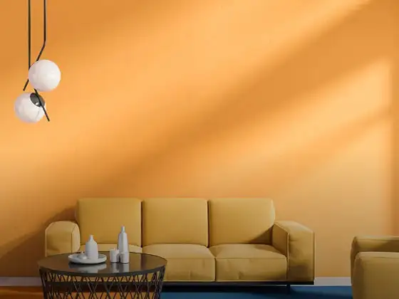
A single orange feature wall with white on the surrounding three walls creates a living room with depth and a clear visual anchor. The white surfaces reflect light and keep the space feeling open; the orange feature wall provides the warmth and character that makes the room feel designed rather than default. Orange Valley against Snow Storm on the surrounding walls is one of the more refined options in this family.
B) Furniture + Curtain Coordination
White or off-white upholstery creates a direct echo of the wall's white surfaces and allows the orange colour to appear as the clear lead colour. Natural timber furniture grounds the combination with organic warmth. Dark curtains in charcoal, deep brown, or navy blue colour add the contrast that prevents the orange-white combination from feeling too sweet.
|
Style |
Orange Shade |
White Shade |
Application |
|
Contemporary |
Orange Valley |
Snow Storm |
Feature wall orange, crisp white on three walls |
|
Warm Traditional |
Touch of Paprika |
Converse White |
Full warm room, white on the ceiling and trim |
|
Bold Statement |
Campfire's Burning |
White Sails |
Deep orange feature wall, bright white surrounds |
|
Amber-Toned |
Amber's Arch |
Winter's Chill |
Rich amber feature wall, cool white for contrast |
Orange and White Bedroom Colour Combination
The orange and white two colour combination for bedroom walls succeeds when white dominates the room's overall tone and orange functions as a warm, focused accent.
A) Soft Calming Palettes Explanation
Orange Embers alongside Chymes, or Amber's Arch with Winter's Chill, represents the most restful version of this combination for bedroom application. Both orange shades fall at the amber end of the family, warm and rich without being energising. A bedroom in these tones feels genuinely cosy and settled rather than stimulating.
B) Romantic + Refreshing Feel
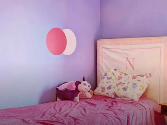
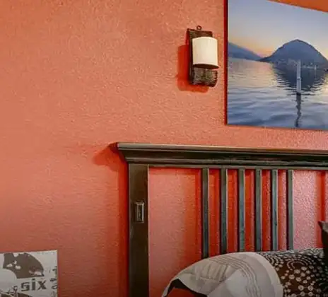
A headboard wall in Orange Embers or Touch of Paprika against three white walls creates a bedroom with a warm, intimate focal point. The white walls and ceiling keep the room feeling open and airy; the single orange wall brings the warmth and depth that make a bedroom feel genuinely inviting rather than merely tidy.
C) Wall Paint Suggestions
For the most versatile orange and white colour combination for bedroom walls, a single headboard wall in Orange Valley or Touch of Paprika against Converse White or Raft White on the surrounding walls creates the right balance between warmth and openness. Keep bed linen in white or warm cream and add timber furniture for grounding.
|
Style |
Orange Shade |
White Shade |
Application |
|
Warm Accent |
Touch of Paprika |
Converse White |
Headboard wall orange, white on three walls |
|
Amber Bedroom |
Orange Embers |
Chymes |
Single amber wall, soft white surrounds |
|
Fresh and Clean |
Juicy Bits |
Raft White |
Bright orange accent, warm white dominant |
|
Sophisticated |
Amber's Arch |
Winter's Chill |
Deep amber headboard wall, crisp white contrast |
Orange and White Kitchen Colour Combination
For the orange and white colour combination for kitchen walls, white on the upper walls and ceiling keeps the space feeling light, while orange on the lower cabinets or a single feature wall provides personality and warmth without reducing the room's sense of openness.
A) Fresh and Energetic Kitchen Aesthetics
Juicy Bits or Orange Valley on lower cabinet doors with White Sails or Snow Storm on the upper walls creates a kitchen with clear visual separation, the warmth comes low, the light comes high. The result feels contemporary, clean, and energised.
B) Cabinet + Backsplash Pairing Ideas
Carrot Stick on cabinet doors pairs naturally with a white tile backsplash; the white tile creates a clean, hygienic transition between the orange cabinets and white walls without introducing a competing element.
C) Small Kitchen Styling
In smaller kitchens, the orange and white colour combination for kitchen walls works best when white dominates entirely. Hayley White or Ivy White on all surfaces, with orange appearing only in a single painted cabinet row, a shelf interior, or small ceramic accessories, keeps the combination fresh without using up visual space in a compact room.
|
Kitchen Area |
Orange Shade |
White Shade |
Application |
|
Compact kitchen |
Orange Melon |
Hayley White |
White dominant, orange in single cabinet detail |
|
Standard kitchen |
Carrot Stick |
Ivy White |
Lower cabinets orange, upper walls white |
|
Open kitchen |
Orange Valley |
Snow Storm |
Kitchen island orange, all walls crisp white |
|
Bold kitchen |
Campfire's Burning |
White Sails |
Feature cooking wall orange, bright white throughout |
Best Shades of Orange and White for Different Home Styles
A) Modern Homes
Clean, precisely contrasting pairings. Orange Valley with Snow Storm or Carrot Stick with Ivy White colour creates the fresh, contemporary quality modern interiors need. Keep furniture minimal, lines sharp, and let the orange and white colour combination carry the room's personality without competing with decoration.
B) Luxury Homes
Amber's Arch alongside a warm, soft white like Chymes or White Peaches creates a depth and refinement that suits high-design spaces. Add dark timber, brushed copper fixtures, velvet upholstery, and statement lighting. Both colours at this depth respond well to luxurious materials.
C) Minimal Homes
Orange Melon with Hayley White colour or Ivy White in the most restrained possible proportions, a single orange element in an otherwise white space. In minimal homes, orange functions as a single, very considered gesture rather than a dominant statement.
D) Traditional Homes
Touch of Paprika with Converse White has a richness and warmth that suits traditional Indian interiors naturally. Alongside dark wood furniture, brass accessories, handwoven textiles, and terracotta tile, this combination creates the kind of warm, accumulated traditional interior that cooler colour families simply cannot replicate.
How to Balance Orange and White Colours in Your Home
The balance principle for this combination is simple: white should always hold more of the room's surface area than orange, and the deeper the orange, the more important this proportion becomes.
A) 60:30:10 Rule
Apply 60% of the room in white, walls, ceiling, and large surfaces. Use orange for 30% through a feature wall, lower cabinets, upholstery, and larger textiles. Reserve 10% for naturals and metallics.
B) Accent Wall Strategy
A single orange accent wall in a predominantly white room is the most reliable and accessible starting point for this combination. It tests the shade pairing in your real room conditions before any wider commitment and provides exactly the warmth and focal point the combination needs without requiring the room to be fully replanned.
C) Neutral Balancing Colours
Dark timber, warm cream, terracotta tile, and natural stone all work as neutral colours between orange and white. They add the organic grounding that prevents the combination from feeling stark or too obviously paired.
D) Furniture and Fixture Balance
Keep large upholstered furniture in white, warm cream colour, or natural linen. Timber furniture adds the organic warmth that connects orange's richness to the room's natural materials.
Common Mistakes to Avoid with Orange and White Colour Combination
- Combining colours that are excessively bold and overpowering
- Overlooking the importance of a balanced lighting plan
- Adding too many statement décor pieces to the same space
- Skipping neutral shades that help create visual balance
- Pairing colours with undertones that clash rather than complement each other
- Choosing a finish that does not suit the room’s purpose
- Ignoring the impact of room size and natural light on colour selection
Orange and White House Colour Combination for Exterior Walls
The orange and white house colour combination on exterior walls is one of the most distinctive and welcoming choices for Indian homes.
A) Exterior Paint Pairing Ideas
Touch of Paprika on the main exterior wall with Converse White or Hayley White on window frames, columns, and architectural trim creates a façade with genuine warmth and distinction. For a more contemporary exterior, Carrot Stick or Orange Melon on the main structure with Ivy White on all features creates a clean, modern, and welcoming result.
B) Balcony Wall Styling
A balcony wall in Juicy Bits or Orange Valley against a White Sails or Snow Storm main exterior creates a clear level differentiation between floors that feels deliberate. Add terracotta planters, trailing greenery, and dark iron railings for a colour palette that reinforces the warmth of the combination across the outdoor space.
|
Exterior Style |
Orange Shade |
White Shade |
Application |
|
Traditional Indian |
Touch of Paprika |
Converse White |
Main walls orange, white on trim and frames |
|
Contemporary |
Carrot Stick |
Ivy White |
Orange main structure, white on all architectural details |
|
Bold Festive |
Campfire's Burning |
White Sails |
Deep orange feature wall, bright white on all surroundings |
|
Warm Minimal |
Orange Melon |
Hayley White |
Soft orange walls, warm white on trim only |
Ready-Made Orange and White Wall Paint Options
For wall painting across full rooms, custom mixing is rarely as reliable as factory-formulated, pre-mixed shades, particularly for orange.
A) Benefits of Ready-Made Options
Factory-mixed paints maintain identical tone across every litre of the project, critical for orange, especially, where batch variation is immediately apparent across large wall surfaces. Pre-mixed paints are also formulated for proper adhesion, washability, and finish consistency, not just colour accuracy at the point of mixing.
B) Why Choose Nerolac
Nerolac's range is formulated specifically for Indian homes, accounting for the natural light behaviour in Indian interiors, regional climate conditions, and surface types common in Indian construction.
C) Nerolac Shade Family Recommendations
Orange Shade Options: Carrot Stick, Orange Melon, Tropicana
White Shade Options: Ivy White, Hayley White, White Peaches
D) Paint Finish Options Available
Nerolac's orange and white shades are available across matte, satin, and semi-gloss finishes. Matte for bedrooms and living rooms where warmth and softness are the priority; satin for kitchens and high-traffic areas where cleanability is required; semi-gloss for cabinet doors and woodwork where a harder, more durable surface is needed.
E) Colour Matching Service
Nerolac's in-store colour matching service allows precise tinting within the orange and white spectrum, particularly useful when extending an existing scheme into a new room or matching to existing flooring, timber tones, or textile colours already in the space.
How Nerolac Paint Can Help You Create the Perfect Orange and White Walls
Getting orange and white right on actual walls requires more than choosing two compatible shades. Surface preparation, primer selection, and application technique all affect whether orange performs evenly and consistently across large surfaces.
A) Wide Shade Range
Nerolac's catalogue spans the full orange and white spectrum, from the palest Orange Melon and Hayley White through to the deep vibrancy of Tropicana and crisp White Sails, giving a wide range within a consistent quality framework.
B) Interior Finishes for Every Need
Matte for bedrooms and living rooms; washable satin for kitchen surfaces and high-traffic walls; semi-gloss for cabinet doors - Nerolac's finish range covers every application within the orange and white combination without compromising colour quality across any of them.
C) Expert Colour Solutions
Nerolac's colour consultation service helps identify the right shade pairing for your specific room, accounting for natural light levels, room dimensions, and existing furniture tones before making a recommendation.
D) Durable Wall Finishes
Nerolac's interior formulations are developed for long-term colour retention, washability, and resistance to humidity and UV exposure. Orange shades in rooms with direct sunlight exposure benefit from UV-stable formulations that prevent the tone from shifting or fading over time.
E) Sustainability and Quality
Nerolac offers low-VOC paint options across several product lines, relevant for bedrooms, kitchens, and any space where indoor air quality is a priority for the people who live there.
Visualise Your Orange and White Wall Combination with Nerolac Tools
Seeing a colour on a wall before committing paint to it saves a lot of time, money, and regret. Nerolac's digital tools make that process simple.
Virtual Colour Visualiser
Upload a photograph of your room and apply any Nerolac shade digitally. You get a realistic preview of how your chosen colour combination ideas will look in your actual space, before a single wall is touched.
Interactive Colour Catalogue
Browse the complete Nerolac range online, filter by colour family, and build your own curated palette. The interactive colour catalogue makes it easy to experiment with different combinations quickly.
Paint Quantity Calculator
Enter your room dimensions and get a precise estimate of how much paint you need. It prevents over-ordering waste and ensures you have enough for complete, consistent coverage.
Colour Consultation Booking
Book a session with a home painting services, online or at your nearest store. They will help you move from uncertainty to a confident, specific colour decision based on your home and preferences.
Conclusion
The orange and white colour combination is one of those pairings that delivers on every promise it makes. It's warm, it's clean, it's visually alive, and it works across virtually every room in the home when the right shade depth is matched to the right space.
Whether you're working with the spice-market warmth of Touch of Paprika and Converse White in a living room, or the amber richness of Orange Embers alongside Chymes in a bedroom, this combination consistently creates rooms that feel genuinely worth returning to.
Trending Colour Shades
Find the Perfect Colour Shades for you walls


Find an Expert Painter Near You
Enjoy a holistic painting experience with Nerolac NxtGen Services
Frequently Asked Questions For Orange And White Colour Combination
What colours go well with orange and white colour combination?
Colours such as gray, black, or gold pair beautifully with orange and white , resulting in a balanced and elegant appearance. Neutral tones like beige or cream can also help to soften the intensity of this colour combination.
What colour do orange and white combine to create?
When orange and white are mixed together, they usually produce a shade of pink, with the specific hue depending on the ratio of each colour used.
Is orange and white a good colour combination for a bedroom?
Orange and white can indeed be a fantastic colour scheme for a bedroom.
Can orange be used effectively in a living room design?
Definitely! ORANGE can be effectively used as a lively accent colour in a living room, especially when combined with neutral furniture or decor.
What mood does a orange and white colour scheme create in a room?
A orange and white colour scheme creates a mood that is energetic and vibrant yet balanced and refreshing.
Can orange and white be used in modern interior designs?
Yes, orange and white work well in modern interiors by combining sleek furniture and clean lines.
How does natural light affect a orange and white room?
Natural light enhances the brightness of white, creating a sense of openness, while orange adds warmth.
What are some stylish orange and white wall paint ideas?
Create a feature wall in orange with white walls surrounding it for contrast.
Can I paint one wall orange and another white for a bold accent?
Yes, painting one wall orange and the rest white creates a bold, eye-catching accent.
Which shade of white works best with orange walls?
It depends on the warmth of your orange. Warm, amber-toned oranges like Touch of Paprika and Orange Embers pair best with warm whites like Hayley White and White Peaches; the warmth in both colours connects naturally.
Is orange and white a good wall colour combination?
Yes, it's one of the most reliably successful warm combinations for home interiors. Orange brings warmth, energy, and personality; white provides the clean contrast and visual breathing room that prevents orange from becoming overwhelming.
Which orange shade looks modern with white?
Carrot Stick with Ivy White or Orange Valley with Snow Storm are the most contemporary pairings. Both have enough saturation to feel present in a modern interior without the bluntness of a fully primary orange.
Can orange and white work in small rooms?
Yes, with the right shades and proportions. White dominant throughout, with orange appearing only on a single accent wall or in cabinet details, keeps the combination feeling open rather than enclosed.
Is orange and white suitable for bedrooms?
Yes, when handled correctly. Choose amber-toned, muted oranges, Orange Embers, Amber's Arch, Touch of Paprika, rather than bright, vivid versions.
What neutral colours balance orange and white walls?
Dark timber is the most effective neutral; it grounds orange's warmth and connects it to the natural world. Warm cream and off-white upholstery provide a softer contrast than stark white furniture.
Which finish is best for orange and white walls?
Matte for bedroom and living room walls. It softens both colours and creates a warm, enveloping quality. Avoid high-gloss on both orange and white surfaces in the same room. It creates too much reflection and makes the combination feel commercial rather than residential.
How do I make orange and white walls look elegant?
Move the orange toward its amber and muted versions, Orange Melon or Touch of Paprika, rather than a primary bright orange. Choose a warm white with slight creaminess.
Create magic with our inspiring Two Colour Combinations!
-
Lilac And Red Colour Combinations
-
Lilac And Orange Colour Combination
-
Lilac And Yellow Colour Combination
-
Lilac And Green Colour Combination
-
Lilac And Blue Colour Combination
-
Lilac And Violet Colour Combination
-
Lilac And Beige Colour Combination
-
Lilac And Neutral Colour Combination
-
Lilac And White Colour Combination
-
Lilac And Pink Colour Combination
-
Lilac And Purple Colour Combination
-
Lilac And Peach Colour Combination
-
Lilac And Cream Colour Combination
-
Lilac And Grey Colour Combination
-
Lilac And Gold Colour Combination
-
Lilac And Brown Colour Combination
-
Peach And Red Colour Combinations
-
Peach And Orange Colour Combination
-
Peach And Yellow Colour Combination
-
Peach And Green Colour Combination
Latest Happenings in the Paint World
Get some inspiration from these trending articles


Get in Touch
Looking for something else? Drop your query and we will contact you.
Popular Searches
What’s Trending in Bedrooms
Explore Trending Living Room Ideas
- Living Room Colour Combination
- Modern Two Colour Combination for Living Room
- Wall Texture for Living Room
- Vastu Colours for Living Room
- Wall Texture Design for Living Room
- Living Room Paint Ideas
- Living Room Design Ideas
- Paint Colour Ideas for Living Room
- Living Room TV Wall Designs
- Green Living Room Walls
Kitchen Ideas People Love
Explore Trending Ceiling Ideas
Study Room Ideas in Demand
Explore Wall Paint Categories
Handpicked Colour Inspirations
- Accent Wall Design
- Bedroom Design Ideas
- Exterior Wall Colour Design Ideas
- Interior Wall Colour Design Ideas
- Kitchen Design Ideas
- Living Room Interior Design
- Geometric Wall Design Ideas
- Home Colour Combination Ideas
- Home Décor Ideas
- Mural Wall Paint Design Ideas
- Office Space Design Ideas
- Puja Room Design Ideas
- Texture Design Ideas
- Festival Painting Ideas
- Paint Colour Chart
- Wall Painting Designs
- Wood Wall Décor Ideas
- Mural Wall Paint Design
- Hall Design Ideas
- Gate Colour Design
- Exterior Wall Colour Design
- Door Colour Design Ideas
-
 Get in Touch
 -
Store Locator
-
 Download App
×
Get in Touch
Looking for something else? Drop your query and we will contact you.

