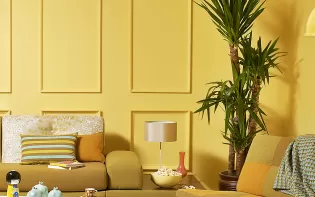
Red And Yellow Colour Combination
Discover two colour combinations to add a dynamic touch to your space.
Red And Yellow Colour Combination
Disclaimer: Actual wall paint colour applied may differ from the on-screen representation above. Please confirm your colour choices prior to purchase by viewing a physical colour shade card or a painted sample.
Still confused ? Explore all our shades from our colour catalogue

Create Your Dream Home With Our Painting Experts
Fill the form below to book a free site evaluation by Nerolac Nxtgen painting Services expert
Unique Two Colour Combinations to Try
Experiment with these beautiful two colour combo and transform your space
Red and Yellow Colour Combination for Walls & Design
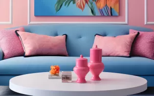
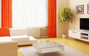
The red and yellow colour combination is a practical route to rooms that feel upbeat, focused, and easy to navigate. Yellow lifts light levels and broad surfaces; red defines focal points, guides movement, and adds a sense of intent. Together, they read as clear and functional, ideal for compact city homes and larger open plans alike.
As you scroll further, the guide progresses from practical wall colour inspiration and modern red and yellow combinations to simple mix techniques, smart decor pairing tips, and a helpful FAQ section to make your painting choices easier.
Best Red and Yellow Combination Ideas
Here are some of the best ideas of red yellow colour combinations:
Anchor with one surface, echo with accents
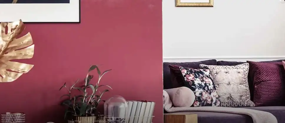
Choose a single deep red wall-brick, terracotta, or pomegranate to ground the room. Keep the remaining planes in warm neutrals, then echo yellow through an amazon blaze, old ginger, or hullabaloo. This red and yellow combination reads composed rather than loud.
Two-tone discipline for narrow rooms
Where corridors or studies feel tight, paint the lower half in pale yellow for lift and the upper half in a muted red. A slim chalk-white trim draws a clean line and tidies the look.
Quiet base, movable colour
In busy family rooms, maintain bright zinnia or urban pink and carry colour in textiles: a yellow delight and girl power. The red yellow colour combination is there, without covering every wall.
Architectural micro-focals
Paint a door, arch, or display niche in jujube or maroon and pair it with a straw-toned ceiling to visually raise the room. It is effective in rental homes where repainting whole rooms isn’t feasible.
Materials that tame saturation
Good Grains, pancake panache, lumineon, crocheted scarf, berry glory, and subtly pink soften reflections and keep the red yellow combination tactile.
Product Guidance
Premium feature walls benefit from Impressions Kashmir for a refined, even depth; high-touch zones are easier to maintain with Nerolac Beauty Gold Washable; overhead consistency comes from Nerolac Beauty Ceiling.
Modern Red and Yellow Colour Palettes
Saffron - Pomegranate – Sand Colour
Sunlit saffron offsets grounded red; sandy neutrals knit everything together. Works with walnut furniture and cane lighting.
Mustard - Fantasy Red - West Sun Colour
Crisp and contemporary. Mustard energises, fantasy red adds gravitas, west sun frames trims, bookcases, or a media wall.
Strawberry Bowl - Terracotta – Adventure Colour
Light yet warm for kitchens and breakfast nooks; looks clean under neutral-white LEDs.
Sunflower Field - Red Ranch - Warm Grey Colour
Ideal for open-plan layouts where continuity is key. Warm grey bridges zones so repeated yellow and red accents don’t compete.
Sample generously. View swatches by a window at noon and again at dusk. Decide which hue leads, which supports, and which neutral binds the scheme.
Red and Yellow Mix: Which Colour Do They Make?
In paint, a combination of red and yellow colours produces orange. Proportion controls the outcome: more red leans to a fire tone; more yellow tips toward citrus. Undertones matter, too-a cool red with lemon yellow yields a quieter orange than a warm scarlet with golden yellow.
Exploring the Result of Mixing Red and Yellow Paint Colour
When you mix red and yellow, a unique colour emerges that evokes a different feeling.
Undertone alignment
Cool-biased pigments produce restrained blends; warm-biased ones appear richer. This matters when matching skirting, shutters, or mural details to a red and yellow combination.
Finish and light
High-sheen surfaces reflect more light and appear brighter, while matte surfaces read deeper. In family spaces, washable mid-sheen emulsions keep walls practical without glare.
Layer, don’t always mix
A transparent yellow glaze over a red ground can create glow and texture without fully turning to orange. Use for niches, headboard walls, or framed panels.
Creative Uses of Red and Yellow in Interiors & Fashion
Using yellow and red enhances the interior walls of a home, creating a unique look.
For home interiors
- Dining: A single brick-red wall, straw upholstery, and amber glass pendants create a warm atmosphere that suits Indian meals and long conversations.
- Study Corners: Mustard task lighting, a red pinboard, and light-wood shelving support focus without harshness.
- Kids’ Room: Sunlit yellow storage, a patterned rug with small red motifs, and low-reflection paint for calmer surfaces.
- Entryway: A red door and pale yellow console signal welcome; woven baskets keep everyday clutter organised.
- Rotate patterned yellow throws with solid red cushions to refresh a neutral sofa.
- Consider introducing cinnabar ceramics or saffron drapery for a seasonal lift without the need for repainting.
- Curate prints that scatter both hues across the room, tying textiles and paintwork together.
- Establish a lead hue. Let one shade carry the room; yellow walls with red accents typically feel calmer than the reverse.
- Use texture to diffuse. Cane, jute, linen, and boucle scatter reflections, softening bold blocks of colour.
- Match sheen to function. Washable mid-sheen for high-contact areas; lower sheens for lounges and bedrooms.
- Calibrate lighting. Warm LEDs enrich reds; neutral-white keeps yellows crisp. Dimmers enable a gentle evening fall-off.
- Test at scale. Paint sizable samples across corners and mid-walls to catch undertone shifts and shadow behaviour.
- Repeat small accents. Echo red and yellow in trims, cushions, and art, so no single element shouts.
Fashion & soft furnishings
Red, Blue, and Yellow Colour Scheme Explained
Red, blue, and yellow form a primary triad. In interiors, triadic schemes work best with hierarchy: pick one base (often yellow for light), one focus (red), and a precise accent (blue)-perhaps a vase, ottoman, or frame series.
Keep a neutral through-line, warm white, greige, or stone-so the eye rests between saturated notes. This approach prevents a red yellow combination from feeling theatrical in everyday use.
Tips to Balance Red and Yellow in Home Décor
If you are using yellow and red colours in your home, then keep these things in mind while combining these two colours:
FAQs on Red and Yellow Colour Combination on Walls
- Kokam Red, May Blossom, Austen Gold
- Saffron, Burnt Sienna, Golden Kiwi
- Waxed Gold, Berry Sensation, Pomegranate
- April Sun, Bumble Bee, Extravaganza
Trending Colour Shades
Find the Perfect Colour Shades for you walls
Frequently Asked Questions
What colours go well with red and yellow ?
Colours such as gray, black, or gold pair beautifully with red and yellow , resulting in a balanced and elegant appearance. Neutral tones like beige or cream can also help to soften the intensity of this colour combination.
What colour do red and yellow combine to create?
When red and yellow are mixed together, they usually produce a shade of pink, with the specific hue depending on the ratio of each colour used.
Is red and yellow a good colour combination for a bedroom?
red and yellow can indeed be a fantastic colour scheme for a bedroom.
Can red be used effectively in a living room design?
Definitely! RED can be effectively used as a lively accent colour in a living room, especially when combined with neutral furniture or decor.
What mood does a red and yellow colour scheme create in a room?
A red and yellow colour scheme creates a mood that is energetic and vibrant yet balanced and refreshing.
Can red and yellow be used in modern interior designs?
Yes, red and yellow work well in modern interiors by combining sleek furniture and clean lines.
How does natural light affect a red and yellow room?
Natural light enhances the brightness of yellow, creating a sense of openness, while red adds warmth.
What are some stylish red and yellow wall paint ideas?
Create a feature wall in red with yellow walls surrounding it for contrast.
Can I paint one wall red and another yellow for a bold accent?
Yes, painting one wall red and the rest yellow creates a bold, eye-catching accent.
Create magic with our inspiring Two Colour Combinations!
-
Orange And Lilac Colour Combination
-
Red And Brown Colour Combination
-
Yellow And Blue Colour Combination
-
Yellow And Green Colour Combination
-
Yellow And Orange Colour Combination
-
Yellow And Red Colour Combinations
-
Orange And Brown Colour Combination
-
Orange And Gold Colour Combination
-
Orange And Grey Colour Combination
-
Orange And Cream Colour Combination
-
Orange And Peach Colour Combination
-
Orange and Red Colour Combination
-
Orange And Purple Colour Combination
-
Orange And Pink Colour Combination
-
Orange And White Colour Combination
-
Orange And Neutral Colour Combination
-
Orange And Beige Colour Combination
-
Orange And Violet Colour Combination
-
Orange And Blue Colour Combination
-
Orange And Green Colour Combination
Get in Touch
Looking for something else? Drop your query and we will contact you.
Popular Searches
What’s Trending in Bedrooms
Explore Trending Living Room Ideas
- Living Room Colour Combination
- Modern Two Colour Combination for Living Room
- Wall Texture for Living Room
- Vastu Colours for Living Room
- Wall Texture Design for Living Room
- Living Room Paint Ideas
- Living Room Design Ideas
- Paint Colour Ideas for Living Room
- Living Room TV Wall Designs
- Green Living Room Walls
Kitchen Ideas People Love
Explore Trending Ceiling Ideas
Study Room Ideas in Demand
Explore Wall Paint Categories
Handpicked Colour Inspirations
- Accent Wall Design
- Bedroom Design Ideas
- Exterior Wall Colour Design Ideas
- Interior Wall Colour Design Ideas
- Kitchen Design Ideas
- Living Room Interior Design
- Geometric Wall Design Ideas
- Home Colour Combination Ideas
- Home Décor Ideas
- Mural Wall Paint Design Ideas
- Office Space Design Ideas
- Puja Room Design Ideas
- Texture Design Ideas
- Festival Painting Ideas
- Paint Colour Chart
- Wall Painting Designs
- Wood Wall Décor Ideas
- Mural Wall Paint Design
- Hall Design Ideas
- Gate Colour Design
- Exterior Wall Colour Design
- Door Colour Design Ideas
-

Get in Touch Get in Touch -

Store Locator Store Locator -

Download App Download App
Get in Touch
Looking for something else? Drop your query and we will contact you.


