
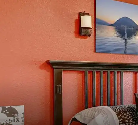
Terracotta Colour
Terracotta
Colour code - 02174
Terracotta is a warm earthly colour, radiating the smell of petrichor and connecting deeply with the roots of life. There is something very enticing about this colour, which allured the hearts of every poet to seek abstractness.
Painting the walls with Terracotta brings the essence of unadulterated, soulful and rustic life amidst the concrete jungle.
With the undertones of deep burnt orange and a hint of brown, this shade echows the symphony of baul ektara when complemented with red, yellow, and beige.
Disclaimer: Actual wall paint colour applied may differ from the on-screen representation above. Please confirm your colour choices prior to purchase by viewing a physical colour shade card or a painted sample.
Still confused ? Explore all our shades from our colour catalogue
Paint your life's canvas with our painting experts
Fill the form below to book a free site evaluation by Nerolac Express Painting Service expert
Trending Colour Shades
Find the Perfect Colour Shades for you walls


Find an Expert Painter Near You
Enjoy a holistic painting experience with Nerolac NxtGen Services
About Terracotta Colour
Terracotta Colour Designs, Shades & Combinations for Your Home
Terracotta is inspired by the earthy tones of sun-dried clay. It's a mix of orange colour, brown and red, which makes it feel both rich and grounded. Terracotta colour has its own kind of appeal, as it adds a touch of cosiness and natural beauty to homes. Its earthy personality makes it attractive in both modern and traditional homes. Whether used as a bold feature wall or paired with softer neutral colours, it adds depth and warmth to any room. With the right shade and combination, terracotta can turn plain walls into an inviting and appealing backdrop.Key Characteristics of Terracotta Colour
- Warm and earthy appearance: Terracotta has a naturally warm tone that makes rooms feel cosy and inviting. It works especially well in spaces where people relax or gather.
- Inspired by natural elements: The colour draws inspiration from clay and earth, giving it a grounded and organic look. It pairs beautifully with materials like wood, stone and indoor plants.
- Rich but not overpowering: Terracotta colour shades add depth and character to walls without looking too harsh. When used thoughtfully, it brings colour while still keeping the room calm.
- Easy to pair with other shades: Terracotta pairs well with colours such as white colour, cream, green, and even deep blue colour. This makes it easy to create attractive colour combinations at home.
- Timeless and versatile: Terracotta has remained popular in interior wall design for many years. Its earthy appeal suits both traditional and modern interiors.
Practical Uses of Terracotta Colour
- Accent wall in the living room: Terracotta works well as a feature wall, adding warmth and depth while allowing furniture and décor to stand out.
- Dining room walls: Using terracotta colour’s different shades in dining room colours creates a warm and welcoming atmosphere that feels comfortable during meals.
- Bedroom feature wall: Terracotta behind the bed can create a cosy focal point. It can give out relaxing vibes in a room.
- Balcony or patio walls: Its earthy tone blends naturally with plants and outdoor décor, making the space feel more connected to nature.
- Hallways and entryways: Terracotta adds warmth and personality to entrance areas, helping create a welcoming first impression.
Terracotta Paint Choices for Your Walls
You will come across different terracotta colour shades, which makes it easier to use across different rooms in the home. The right tone can change the overall mood of a space, depending on how bold or soft you want the room to feel.1.Soft and Light Terracotta Colour
Soft terracotta shades of colour offer a light, slightly muted feel for everyday spaces. They introduce warmth to walls without overwhelming a room. Arizona Stone: It works well for living rooms, bedrooms and reading nooks where a more relaxed feel is desired. Arizona Stone colour is also appropriate for smaller rooms or hallways that require a warm colour without closing up the space.2.Balanced and Medium Terracotta Colour
Medium shades in terracotta colour make a balanced look with a lot of warmth and depth. They grab more attention than lighter colours, but they are still comfortable and easy to use in most rooms. Copper Stone: It looks great in dining rooms, living room walls, or as a feature wall behind a TV or sofa. Copper Stone colour also goes well with wooden furniture and simple decorations.3.Deep and Bold Terracotta Colour
Deep terracotta colours are richer and more dramatic, which makes them great for making a strong focal point. These types of terracotta colour shades give the room more depth and personality. Clown Fish: It looks best on accent walls in living rooms, dining rooms, or big bedrooms. Clown Fish colour can also use it in entryways to make a strong first impression.Terracotta Wall Colour Combinations for Your Home
Terracotta is a warm colour that looks even better when paired with the right shade. But many wonder how to create terracotta colour combinations that work. Always try to pair it with shades that soften or highlight its richness. Choosing one supporting colour helps the room feel balanced while allowing terracotta to add warmth and character.| Room / Space | Recommended Colour Combination |
|---|---|
|
Living room (feature wall) |
Terracotta + Amazing Grace – 4141 |
|
Bedroom (headboard wall) |
Terracotta + Baby Ballerina – 4102 |
| Dining area (accent wall) |
Terracotta + Red Dragonfruit – 4788 |
| Study or home office |
Terracotta + Herring Red – 4802 |
1.Terracotta + Amazing Grace Colour Combination
Amazing Grace is a gentle neutral that softens terracotta’s warmth and stops the room from feeling too heavy. This terracotta colour combination works nicely in living rooms where terracotta is applied on the feature wall, and Amazing Grace colour surrounds it. It also contributes to a bright and airy feel.2.Terracotta + Red Dragonfruit Colour Combination
Red Dragonfruit colour creates a lively terracotta colour contrast and brings a welcoming look. This combo is effective in dining or social areas where you want to give out energetic vibes. It adds warmth but also makes the space more visually interesting.3.Terracotta + Baby Ballerina Colour Combination
Baby Ballerina tempers the heat of terracotta and gives a soft, balanced look. The mix works for bedrooms, with terracotta behind the bed and Baby Ballerina colour on the other walls. It helps to create a peaceful and comfortable environment.4.Terracotta + Herring Red Colour Combination
This is a deeper and more dramatic pairing. Herring red colour works well in studies or home offices where a bold and expressive approach to aesthetics is needed. It brings more depth and character into the room.Best Terracotta Shades for Accent Walls
One of the easiest ways to add a terracotta colour palette in a room is with accent walls. They contribute to a sense of focal point. The rest of the walls remain lighter and balanced. This technique is particularly effective in rooms where you desire warmth and personality but still want the area to feel open. When selecting a terracotta colour for an accent wall, it is helpful to choose a wall that naturally attracts the eye. You can choose the TV wall in the living room or the back side of a bed. The colour feels crisp and shows its true depth on a clear surface with fewer windows or doors.| Colour Shades | Accent-wall location |
|---|---|
|
Arizona Stone |
Living room feature wall |
| Copper Stone |
Dining area accent wall |
| Clown Fish |
Bedroom headboard wall |
Simple Tips for Using Terracotta Colour at Home
Terracotta is a warm and expressive colour that can make a room feel inviting when used thoughtfully. The right placement and two colour combinations help keep the space balanced and comfortable.- Use it as a feature wall: Wondering how to make terracotta colour pop without it covering the entire room? Use behind a sofa, TV unit or even the bed. This creates an impressive feature in the room.
- Pair it with light neutrals: Cream, beige colour or pale white helps to temper terracotta while bringing brightness into the space. These tones prevent the room from being too dark.
- Combine with natural textures: Wood furniture, woven décor, and plants help showcase terracotta’s earthy side. They help provide a cosy, informal feel inside.
- Consider the lighting: Good natural light enhances terracotta, while using it on one wall works better in darker rooms. This keeps the space from appearing too dim.
- Keep décor simple: Minimal patterns and simple furniture help maintain a balanced look. This allows the wall colour to remain the highlight of the room.
How Nerolac Can Help You Paint Your Walls in Terracotta Colour
If the texture of the surface base is patchy or colours run much deeper than expected, terracotta tones may reveal themselves in a wall a little differently. With Nerolac home painting service, homeowners get help at every step of the painting journey. You can have at-home consultations and advice on everything from colour choice to the final application. There are also trained painters, a clean painting process, and colour visualisation tools to make the decision easier. If in doubt about a shade, then it is ideal to shortlist a few options and verify them with an actual shade card or a painted sample, as colours can look different on-screen compared to the walls.Plan, Design and Paint Your Walls With Nerolac Tools
Ready to plan your Terracotta makeover? Use the tools below to explore shades, visualise rooms and estimate paint and budget.Colour Visualiser
Use the Nerolac Colour Visualiser to try out different shades and textures from our colour and texture palette on the walls of our ‘room presets.’ You can also see how each colour will look under various lighting conditions, such as natural sunlight, cool white light and warm yellow colour light, before finalising a shade.Colour Catalogue
Use the Nerolac Colour Catalogue to browse over 1,500 Nerolac wall paint shades. Search by colour name or code, or filter by colour family to quickly discover options that match your décor. Shortlist your favourite shades and pair them with the other Nerolac tools to finalise the perfect colour scheme for your home.Paint Calculator
Use the Nerolac Paint Calculator to estimate the area to be painted and the required paint volume for your décor project. Enter wall dimensions, room count, and preferred product to get an approximate paint quantity and cost, helping you plan your project with greater confidence.Frequently Asked Questions For Terracotta
What colour goes with terracotta walls?
Terracotta walls look harmonious with shades of pink, white, green, mustard and violet.
Is terracotta colour warm or cool?
Terracotta colour is a warm and earthy tone with rich undertones of burnt orange and brown.
Is terracotta a good colour for a bedroom?
Yes, terracotta is a rustic colour for a bedroom with its earthy, warm tones and splendid orange-red vibrancy.
Is terracotta a neutral colour?
No, terracotta is a warm colour and not a neutral tone.
What colour curtains go with terracotta painted walls?
Neutrals like white, Gray and cream add balance to terracotta colour walls. Shades like navy, pink, pista green will also look good with terracotta.
How do you style furniture in a room with terracotta walls?
Jewel-toned furniture or neutral furniture add to the earthy tone of terracotta walls. Accents in deep blue or light pink can add drama to a terracotta-coloured room.
Can I use terracotta colour in a living room?
With its warm and earthy tones, terracotta is a perfect choice for an inviting and cosy living room.
Is terracotta brown or red?
Terracotta has brown and orange-red undertones but is primarily a brown tone.
What kind of colour is terracotta?
Terracotta is a warm, earthy colour that takes inspiration from baked clay. It consists of colours such as orange, red, and brown that have a natural appearance.
How do you make terracotta colour look good in living rooms?
In a living room, terracotta will not let you down as part of a feature wall. A minimalist décor allows the colour to shine while ensuring that the space does not feel overwhelming.
Which colours go well with terracotta walls?
Terracotta works well with softer neutrals like cream, beige, and white. It also works beautifully with colours including sage green, dusty pink and deep blue.
Does terracotta paint make a room look smaller?
In small rooms, the use of darker shades of terracotta on all walls can seem overpowering. Using it on one wall or balancing it with lighter colours helps maintain an open feel in the space.
What finish works best for terracotta wall paint?
For terracotta walls, matte and eggshell finishes are used because they reveal the richness of the colour. Such finishes also assist in achieving a sleek and polished appearance.
Is terracotta paint suitable for bedrooms?
Terracotta works beautifully in a bedroom as long as you have balanced it out with some calm and light colours. It creates a warm and cosy environment that conveys relaxation.
Create magic with our inspiring Two Colour Combinations!
-
Red And Brown Colour Combination
-
Orange And Lilac Colour Combination
-
Orange And Yellow Colour Combination
-
Orange And Green Colour Combination
-
Orange And Blue Colour Combination
-
Orange And Violet Colour Combination
-
Orange And Beige Colour Combination
-
Orange And Neutral Colour Combination
-
Orange And White Colour Combination
-
Orange And Pink Colour Combination
-
Orange And Purple Colour Combination
-
Orange and Red Colour Combination
-
Orange And Peach Colour Combination
-
Orange And Cream Colour Combination
-
Orange And Grey Colour Combination
-
Orange And Gold Colour Combination
-
Orange And Brown Colour Combination
-
Yellow And Red Colour Combinations
-
Yellow And Orange Colour Combination
-
Yellow And Green Colour Combination
Latest Happenings in the Paint World
Get some inspiration from these trending articles

How To Make Turquoise Colour: Tips for Perfect Wall Paint Shades & Home Décor Ideas

How to Make Sky Blue Colour: Tips for Perfect Wall Paint Shades & Home Décor Ideas

How to Make Silver Colour: A Complete Paint Mixing Guide for Homes and Interiors

How to Make Red Colour: Tips for Perfect Wall Paint Shades & Home Décor Ideas

How To Make Purple Colour: Tips for Perfect Wall Paint Shades & Home Décor Ideas

How to Make Pink Colour: Tips for Perfect Wall Paint Shades & Home Décor Ideas
Get in Touch
Looking for something else? Drop your query and we will contact you.
Popular Searches
What’s Trending in Bedrooms
Explore Trending Living Room Ideas
- Living Room Colour Combination
- Modern Two Colour Combination for Living Room
- Wall Texture for Living Room
- Vastu Colours for Living Room
- Wall Texture Design for Living Room
- Living Room Paint Ideas
- Living Room Design Ideas
- Paint Colour Ideas for Living Room
- Living Room TV Wall Designs
- Green Living Room Walls
Kitchen Ideas People Love
Explore Trending Ceiling Ideas
Study Room Ideas in Demand
Explore Wall Paint Categories
Handpicked Colour Inspirations
- Accent Wall Design
- Bedroom Design Ideas
- Exterior Wall Colour Design Ideas
- Interior Wall Colour Design Ideas
- Kitchen Design Ideas
- Living Room Interior Design
- Geometric Wall Design Ideas
- Home Colour Combination Ideas
- Home Décor Ideas
- Mural Wall Paint Design Ideas
- Office Space Design Ideas
- Puja Room Design Ideas
- Texture Design Ideas
- Festival Painting Ideas
- Paint Colour Chart
- Wall Painting Designs
- Wood Wall Décor Ideas
- Mural Wall Paint Design
- Hall Design Ideas
- Gate Colour Design
- Exterior Wall Colour Design
- Door Colour Design Ideas
-
 Get in Touch
 -
Store Locator
-
 Download App
×
Get in Touch
Looking for something else? Drop your query and we will contact you.
