

Purple Colour
Discover purple colour shades to add a dynamic touch to your space.
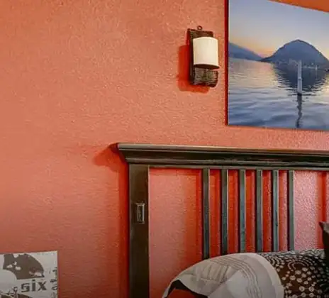
Explore 16 Trending Purple Colour Combination for Walls
Products in this shade & Palette of Purple Colour
Browse through our wide range of paints to find the one that accentuates your home's beauty
Trending Colour Shades
Find the Perfect Colour Shades for you walls


Find an Expert Painter Near You
Enjoy a holistic painting experience with Nerolac NxtGen Services
About Purple Colour
Purple Colour Designs, Shades & Combinations for Your Home
Purple is a colour that brings creativity, elegance, and personality into a space. It is a shade that combines the calmness of blue colour with the warmth of red colour. That is why it can feel both relaxing and expressive. Soft lavender shades can brighten a bedroom, while deeper plum tones add depth to a living room. Purple colour works well in both modern and traditional interiors. When paired with the right colours and décor, it can make simple walls look stylish and full of character.Key Characteristics of Purple Colour
- Creative and expressive: Purple shades of colour are commonly associated with creativity and artistic expression. They add a bold touch and make the interior visually striking.
- Brings both warmth and coolness: It has the calmness of blue and the liveliness of red. Lighter colours are calming. Darker ones add depth and richness.
- Vast range of colours: Purple colour different shades, can vary from light lilac and lavender to deep plum and aubergine. You can easily pick a tint suitable for your space.
- Elegant look: The colour has always been associated with luxury and royalty. It can add an elegant polish to minimally decorated interiors.
- Flexible with colour combinations: Purple goes well with neutral shades like white, beige and grey colour. It can also play well with darker tones or metallic accents.
Practical Uses of Purple Colour
- Accent walls in living rooms: Painting one wall with purple colour shades can brighten up the entire living room walls. It brings depth and style without overpowering the rest of the room.
- Bedrooms for a relaxing atmosphere: For a relaxing bedroom, lighter purple colours like lavender or lilac colour can help. These colours are easy on the eyes and can make the room feel calm.
- Study rooms or creative workspaces: Purple is often associated with creativity and imagination. Lighter shades are good for study room wall paints or home offices where you need to stay focused and get ideas.
- Dining area feature walls: Deep purple colours like plum or grape colour can make dining room colour feel warmer and more spacious. These colours make a warm and slightly dramatic background for meals and get-togethers.
- Children’s and teen bedrooms: Purple can make a room for kids or teens feel fun and lively. You can easily match brighter or softer colours with fun decorations to make the room feel playful and personal.
Purple Paint Choices for Your Walls
The different types of purple colour shades make it easy to find one that suits different rooms and moods. Let’s look at a few shades and where they can work best.1.Soft and Light Purple Colour
Light purple feels soft, calm, and refreshing. They add colour to the room without making it look heavy or dark. These shades are great for spaces where you want a relaxed and comfortable atmosphere. Purple Aster is a soft and delicate purple shade that adds a gentle touch of colour to the walls. It works well in bedrooms, children’s rooms or quiet reading corners. It can create a nice purple colour contrast with white furniture, light wood, and neutral décor.2.Balanced and Medium Purple Colour
Medium shades in purple colour offer a good balance between light and bold tones. They add colour and character to the walls. Purple Tourmaline is a grounded shade that adds warmth and style to spaces. It’s effective in living rooms, dining areas or as an accent wall behind a sofa or bed. It provides a beautiful ambience to the room when combined with neutral colours like beige, grey or cream colour.3.Deep and Bold Purple Colour
If you’re wondering how to make purple colour pop on your walls, go for deep shades. These shades go well with the brighter colours and add depth, making a strong visual impact in the room. Mystic Purple is a rich and bold shade to add depth and sophistication to interior wall. It serves well as an accent wall in living rooms, dining room walls or contemporary bedrooms. Styling it with lighter furniture or warm lighting will soften the atmosphere of this strong colour and keep the room feeling subtly chic.Purple Wall Colour Combinations for Your Home
The different purple colour shades can work with many colours, depending on the mood you want to create in a room. Some pairings make the space feel soft and relaxing, while others bring contrast and energy. Here are some popular pairings:1.Purple + Pink Colour Combination
Purple and pink give a bright and lovely appearance. These two colours complement each other effortlessly and bring about warmth in the space. This combination works best in bedrooms, dressing rooms or creative spaces, with purple on one accent wall and softer pink colour tones surrounding it.2.Purple + Lilac Colour Combination
Purple and lilac colour are also very soft and soothing colours to combine. Because lilac is a paler version of purple, the two pair well without creating a jarring contrast. This pairing works for bedrooms, reading nooks or low-key hangout spots.3.Purple + White Colour Combination
These two colours form a clean and balanced look. White colour maintains the space’s brightness, while purple bestows depth and style. This purple colour two colour combinations works well in living rooms, bedrooms or hallways.4.Purple + Green Colour Combination
Purple and green colour are a combination that is bold but refreshing. Purple makes a room feel rich, and green gives a fresh feeling. This combination is effective in living rooms, dining areas or creative spaces.Best Purple Shades for Accent Walls
If you want to know how to create a purple colour balance in your room, try to use the shade on accent walls. They allow the colour to stand out while the rest of the space stays light and balanced. Choosing the right wall is important. A wall with fewer doors or windows usually works best because the colour can be seen clearly without too many interruptions. Purple accent walls can add depth, style and a strong focal point to different areas of the home.|
Colour Shades |
Accent-wall location |
|
Purple Aster |
Bedroom wall or quiet reading corner |
| Purple Tourmaline |
Living room feature wall or behind the sofa |
| Mystic Purple |
Dining room wall or modern bedroom accent wall |
Simple Tips for Using Purple Colour at Home
Purple can bring character to your home, but the most important thing is how you use it. With these tips, you can incorporate purple sensibly and comfortably in your setup.- Start with one wall first: If you're not sure about purple, pick just one wall to be a feature wall as opposed to painting the entire room. This allows the colour to take centre stage without overcrowding a space.
- Pair it with neutral colours: White, beige or light grey tones help balance purple and keep things light and fresh in the space.
- Consider natural lighting: Lighter shades of purple can complement smaller or darker spaces, while bolder colors may be better suited to bright rooms.
- Repeat the colour in décor: Cushions, curtains or artwork in similar hues create a cohesive purple colour palette.
- Choose the right finish: Matte finishes are beautiful for a soft look in bedrooms. For living areas that require durability, satin or semi-gloss is preferable.
How Nerolac Can Help You Paint Your Walls Purple Colour
Purple shades can sometimes look different once they are applied to the wall, especially if the surface is not prepared properly. Nerolac home painting service simplifies the process with at-home consultation, expert colour advice, and guidance from start to finish. With trained painters, a clean painting process, and colour visualisation tools, it becomes easier to choose the right shade. If you are deciding between two purple tones, checking a physical shade card or a painted sample can help avoid surprises, as colours on screens may look different on the wall.Plan, Design and Paint Your Walls With Nerolac Tools
Ready to plan your Purple Shade makeover? Use the tools below to explore shades, visualise rooms and estimate paint and budget.Colour Visualiser
Use the Nerolac Colour Visualiser to try out different shades and textures from our colour and texture palette on the walls of our ‘room presets.’ You can also see how each colour will look under various lighting conditions, such as natural sunlight, cool white light and warm yellow colour light, before finalising a shade.Colour Catalogue
Use the Nerolac Colour Catalogue to browse over 1,500 Nerolac wall paint shades. Search by colour name or code, or filter by colour family to quickly discover options that match your décor. Shortlist your favourite shades and pair them with the other Nerolac tools to finalise the perfect colour scheme for your home.Paint Calculator
Use the Nerolac Paint Calculator to estimate the area to be painted and the required paint volume for your décor project. Enter wall dimensions, room count, and preferred product to get an approximate paint quantity and cost, helping you plan your project with greater confidence.Frequently Asked Questions For Purple Colour Shades & Palette
How to Make Purple colour?
To make purple colour, mix equal parts of red and blue.
Can I check how the purple colour shades will look on the walls?
Before going ahead with a fresh coat of paint, it is necessary to see how the Purple colour shades look on the walls. To make things easier, first, go to our purple Colour Catalogue and browse through the colours you like the most. Pick your choice of shade, click on the home icon to visualize how it will look on the walls.
From where can I buy the paint after selecting the purple colour shade?
After you have selected the shade, you can pick a store near you with the help of Store Locator and purchase interior, exterior purple Colour shades, enamel paint and many more products of your choice.
What’s next after selecting purple paint colours for my home?
NXTGEN painting service – our brand-new service gives you an exemplary purple colour painting by our highly experienced and reliable painters. All you need to do - drop your details, and an expert will get in touch with you. Et Voila! Your space is redefined within 5 days.
I am not sure of my selection of purple colour shade, can i watch a preview of it from my home?
Different light settings accentuate and enhance the colour on the walls. To visualize the purple colour shade before finalizing, download our Colour My Space app on Apple or Google Play Store. Here you can watch presets for different rooms, select the right texture and then simply call a painter near your location. Also, our very own NVISION tool renders you with a visual, answering every speck of your concerns.
How much purple colour paint will I require to repaint my home?
Check out the Paint Calculator tool to get the exact amount of paint required along with its cost in minutes.
How to decide which purple colour combination works well on walls?
Our Colour Catalogue has vivid purple colour shades. Each shade has 4 combinations picked from the colour palette that complements it best.
I am looking for some ideas for painting my home.
Head over to our inspiration section for trendy purple wall painting ideas for your home. From sought-after ideas to newly bloomed ones, you have it all in one place.
What is Nerolac NXTGEN?
Painting your home is the last step before you see the dream colour on the interior wall paint or exterior wall paint of your home. NXTGEN is a home painting service, which primarily provides the fastest route to paint your home. Pick a suitable purple colour, drop your details, and a certified expert will drop by your home to evaluate the home before painting.
What colours are in Purple?
The Purple palette in Nerolac has more than 200 shades of purple: light shades like lavender and lilac all the way to plum, amethyst, and royal violet. These colours are used to enrich interiors with grace, wealth, and spiritual beauty.
What does Purple colour symbolize?
Purple symbolizes royalty, luxury, spirituality, creativity, ambition, mystery, passion, and wisdom. It often connects to elegance and depth, inspiring inspiring spaces with a sense of prestige and inspiration.
What is the code for Purple?
Every purple variation has its codes- some of them are Purple Shade (2300), Purple Aster (2283), Purple Pashmina (4202), and Mystic Purple (4196). There is a complete catalogue of more than 200 such codes to be used accurately.
What is the contrast colour of the Purple Colour palette?
Purple pairs wonderfully with neutral tones like white, gray, beige—or soft off‑white. These cooler contrasts balance its richness, creating refreshing, balanced spaces with a stylish look.
What are the 10 shades of Purple?
Ten examples include Purple Aster (2283), Mystic Purple (4196), Purple Gaga (4212), Purple Pashmina (4202), Purple Saga (4204), Purple Shade (2300), Purple Tourmaline (4188), Purple Tulips (4209), Shush Purple (4218), Smokey Purple (4176).
What is Purple colour called in Hindi?
In Hindi, purple is more likely to be referred to as "baingni" or "jamuni," both of which literally translate to violet shades or aubergine. They convey the richness and vigour of the colour and its ubiquity in most of the country. Whether talking about fashion, art, or nature, knowing these Hindi words can help you enjoy this beautiful colour more.
What is Purple colour called in Marathi?
The purple colour is called in Marathi as jambhala. This word stretches over a variety of tones, comprising not only violet but also purple, as most people use the term in their vernacular. Talking about fashion, art or nature, you may use the same term, jambhala, to describe these lovely colours.
What is Purple colour called in Kannada?
Purple, in Kannada terminology, is referred to as "jambhali" or "perpal." "Jambhali" is used specifically to refer to a colour equal to violet or purple, and it is used extensively in everyday usage. Whether it is art, fashion, or nature, this lavish colour pervades one's life in numerous ways.
Is purple a good colour for home interiors?
Purple can bring personality and elegance to a house if applied judiciously. Pastel hues can feel calm, and dark colours can be chic.
How do you make purple colour work in living rooms?
Try purple on a feature wall. Choose a paler shade to prevent the room from seeming too dark. Simple decor allows the colour to pop but still keeps a balanced look.
What kind of lighting is best for purple walls?
Purple walls are most effective when used with warm lighting. This helps to soften the colour and also make it feel more friendly. Strong natural light can also make the shade appear brighter and more balanced.
What is the meaning of the colour purple?
Purple is often associated with creativity, wealth and imagination. It may also evoke tranquillity and autonomy. So it’s often used in areas for relaxing.
How can I incorporate purple into a boy’s room?
Purple can look good in boys’ rooms, especially in darker or muted tones. It adds some character to the space while being stylish and comfortable.
What paint finish is best for purple walls?
Use satin and matte finishes for a softer, smoother look in bedrooms. Satin or semi-gloss finishes are more durable and perform well in living rooms or busy areas.
Create magic with our inspiring Two Colour Combinations!
-
Cream And White Colour Combination
-
Cream And Pink Colour Combination
-
Cream And Purple Colour Combination
-
Cream And Lilac Colour Combination
-
Cream And Peach Colour Combination
-
Cream And Grey Colour Combination
-
Cream And Gold Colour Combination
-
Cream And Brown Colour Combination
-
Grey And Red Colour Combinations
-
Grey And Orange Colour Combination
-
Grey And Yellow Colour Combination
-
Grey And Green Colour Combination
-
Grey And Blue Colour Combination
-
Grey And Violet Colour Combination
-
Grey And Beige Colour Combination
-
Grey And Neutral Colour Combination
-
Grey And White Colour Combination
-
Grey And Pink Colour Combination
-
Grey And Purple Colour Combination
-
Grey And Lilac Colour Combination
Latest Happenings in the Paint World
Get some inspiration from these trending articles

How to Make Brown Colour: Tips for Perfect Wall Paint Shades & Home Décor Ideas

How to Make Beige Colour: Tips for Perfect Wall Paint Shades & Home Décor Ideas

Friday Colour to Wear – Lucky Colours, Astrology Meaning, Outfit & Wall Colour Guide

Thursday Colour to Wear – Lucky Colours, Astrology Meaning, Outfit & Wall Colour Guide

Tuesday colour to wear – Lucky Colours, Astrology Meaning & Outfit & Wall Colour Guide

Monday Colour to Wear – Lucky Colours, Astrology Meaning, Outfit & Wall Colour Guide
Get in Touch
Looking for something else? Drop your query and we will contact you.
-
 Get in Touch
 -
Store Locator
-
 Download App
×
Get in Touch
Looking for something else? Drop your query and we will contact you.
