अस्वीकरण: लागू किया गया वास्तविक दीवार पेंट रंग ऊपर दिए गए ऑन-स्क्रीन प्रतिनिधित्व से भिन्न हो सकता है। भौतिक रंग छाया कार्ड या पेंट किए गए नमूने को देखकर खरीद से पहले कृपया अपने रंग विकल्पों की पुष्टि करें।
Still confused ? Explore all our shades from our colour catalogue
हमारे पेंटिंग विशेषज्ञों के साथ अपने जीवन के कैनवास को पेंट करें
नेरोलैक एक्सप्रेस पेंटिंग सर्विस विशेषज्ञ द्वारा निःशुल्क साइट मूल्यांकन बुक करने के लिए नीचे दिया गया फॉर्म भरें
Trending Colour Shades
Find the Perfect Colour Shades for you walls


इस छाया में उत्पाद
अपने घर की सुंदरता को निखारने वाले पेंट को खोजने के लिए हमारे पेंट्स की व्यापक रेंज को ब्राउज़ करें

Neroalc Excel Mica Marble Strech Sheen & Mica Marble Stretch Sheen NXT
Nerolac Excel Mica marble stretch sheen Nxt & Mica Marble Strech Sheen is an extremely durable water...

Beauty Gold washable and Beauty Gold Washable NXT
Nerolac Beauty Gold Washable paint has a soft sheen finish, with excellent stain-cleanability at an a...

Impressions Kashmir
Nerolac Impressions Kashmir Luxury Emulsion is a superior quality 100% acrylic emulsion based interi...

Beauty Gold Washable Plus
Nerolac Beauty Gold Washable Plus is an interior emulsion paint has a rich sheen finish, with highes...

Neroalc Excel Mica Marble Strech & Sheen Super
Nerolac Excel Mica Marble Stretch and Sheen Super is an extremely durable water based high performan...


अपने आस-पास एक विशेषज्ञ पेंटर खोजें
Enjoy a holistic painting experience with Nerolac NxtGen Services
About Pinkish White Colour
Pinkish White Colour Designs, Shades & Combinations for Your Home
Pinkish white colour is a soft off-white colour with a delicate pink colour undertone, so it feels gentler than plain white and quieter than pastel pink. Pink is commonly viewed alongside red and mauve on modern colour wheels, which helps explain why a pink-tinted white can feel warm, calm, and slightly refined at the same time. In home interior walls, shades with a pink undertone are often chosen because they create a soft, serene, and open look while remaining easy to pair with both warm and cool tones. That is what makes this shade so useful. It keeps a room bright, but it removes the starkness that sometimes comes with ordinary white. In the right setting, it can make a home feel lighter, softer, and more comfortable without asking for too much decoration.Key Characteristics of Pinkish White Colour
Feels soft without losing brightness
One of the main strengths of this shade is that it keeps the room looking open. Even when used on large wall surfaces, it still feels light. At the same time, the pink undertone stops it from looking sharp or clinical.Has a settled appearance
Pink-based off-whites are often chosen for their soft and serene quality, which is one reason they work so well in rooms meant for rest or everyday comfort. Pink is also often associated with calm, warmth, and kindness, which supports the gentle mood this shade can bring to a space.Changes gently with lighting
This is not a colour that looks exactly the same all day. In bright daylight, it may seem cleaner and closer to white. Under warm indoor lighting, the pink undertone usually becomes easier to notice.Offers quite a variety
Pinkish white colour shades can move from barely-there blush whites to cooler rose-tinted whites. That makes it easier to choose a version that matches the room instead of forcing the same tone into every space.Practical Uses of Pinkish White Colour
1.Pinkish White Colour for Living rooms
Pinkish white colour different shades can work well in living rooms where ordinary white feels too plain. They create a softer backdrop for sofas, rugs, and wooden furniture while keeping the room visually open.2.Pinkish White Colour for Guest rooms
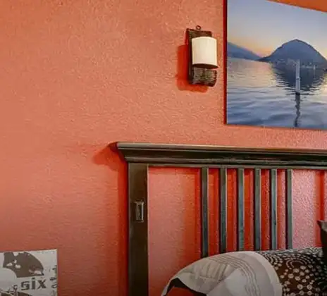
Guest spaces often benefit from colours that feel welcoming but not too personal. A pink-tinted off-white does that well. It looks thoughtful without being difficult to decorate around.3.Pinkish White Colour for Bedrooms
This shade is very easy to use in bedrooms because it keeps the room looking restful and light. It gives the walls a softer edge, which can make the space feel more comfortable without making it look overly feminine.4.Pinkish White Colour for Dressing Areas
This is a very suitable shade for smaller personal spaces. It keeps them bright, but it also adds a little more warmth and polish than a standard white wall would.5.Hallways and compact spaces
Pinkish white shades of colour can help smaller areas feel light and clean while still showing a little personality. In narrow passages or smaller rooms, that subtle colour presence can make the space feel more finished.Pinkish White Paint Choices for Your Walls
Before you choose the final wall shade, it helps to study the room properly. Pale wall colours react strongly to their surroundings, so a small sample on a paint card is rarely enough.Soft and floral tones
- Sakura Pink: Sakura Pink colour suits rooms that need a delicate and airy wall colour. It works especially well in bedrooms, guest rooms, and reading corners where a lighter mood is more important than strong colour.
Balanced and everyday tones
- Pink Sash: Pink Sash colour is a steadier version for people who want a soft tinted wall without too much visible pink. It is a practical choice for living rooms, study room walls, and shared spaces that need calm but still need some character.
Warmer tones
- Pink Magic: It is better suited to rooms that can carry a little more visible undertone. Pink Magic colour still feels light, but it has more presence on the wall. This can work well in vanity areas, feature corners, and brighter rooms with good natural light.
Pinkish White Wall Colour Combinations for Your Home
A pale shade still needs structure. The wall colour may be gentle, but the overall room looks better when there is a clear relationship between the main shade and its supporting tones. A thoughtful pinkish white colour combination gives the room more definition without disturbing its softness.| Type of room/space | Recommended colour combination |
|---|---|
|
Living room |
Pinkish White + White Essence - W-131 |
|
Master bedroom |
Pinkish White + Cotton Lace - W-116 |
|
Guest room |
Pinkish White + Smooth As Satin - W-199 |
| Study corner |
Pinkish White + Pearl White - W-113 |
| Entryway |
Pinkish White + White Essence - W-131 |
| Dressing area |
Pinkish White + Cotton Lace - W-116 |
1.Pinkish White + White Essence Colour Combination
This pairing keeps the room very light, but it does not feel flat. White Essence colour works especially well in living room walls and entryways where the walls should look fresh and polished from the moment you enter.2.Pinkish White + Cotton Lace Colour Combination
Cotton Lace colour supports a softer and more restful scheme. This makes it a good choice for bedrooms and quieter corners of the home where the atmosphere should remain calm.3.Pinkish White + Smooth As Satin Colour Combination
This two colour combination gives the room a slightly more dressed finish. Smooth As Satin colour suits guest rooms and reading corners where you want the walls to feel refined but still understated.4.Pinkish White + Pearl White Colour Combination
Pearl White colour is useful when the room needs subtle layering rather than visible contrast. It can work well in study spaces, dressing corners, or smaller rooms where gentle variation is enough.Best Pinkish White Shades for Accent Walls
A light accent wall can work just as well as a dark one. If you do not want to paint the full room in a pink-tinted white, one selected wall can introduce the colour without changing the brightness of the whole space. When choosing from shades in pinkish white colour, the best wall is usually the one that already has a visual role in the room. That may be the wall behind the bed, the wall behind a sofa, or the wall framing a dresser or mirror. Placement matters as much as the paint itself.| Pinkish White Colour Shades | Location |
|---|---|
|
Cotton Lace |
Behind the bed |
| White Essence |
Behind the sofa |
| Cotton Lace |
Dressing backdrop |
| Pearl White |
Reading nook |
Simple Tips for Using Pinkish White at Home
This colour is easy to like, but it still needs a little thought. Because it is light and nuanced, small changes in furniture, fabric, and lighting can influence the final result more than many people expect. If you are planning the room from the beginning, focus on the large surfaces first. Floors, wardrobes, beds, sofas, and curtains will shape the wall colour more than small accessories. Once those elements are clear, the right shade becomes much easier to choose. A few practical ideas can make the process easier:- Keep the ceiling paint white or soft off-white so the room feels open.
- Use pale wood, cream, beige, or light grey colour furniture if you want the walls to look cleaner.
- Choose matte or low-sheen paint for a smoother and softer finish.
- Use one deeper accent piece, such as a chair, side table, or lamp base, instead of several strong additions.
- If the room is small, keep the floor and upholstery lighter so the walls remain airy.
- Try warm indoor lighting if you want the undertone to feel more comfortable in the evening.
How Nerolac Can Help You Paint Your Walls Pinkish White?
Pinkish white may look simple on a shade card, but the final wall still depends on proper preparation. If the surface underneath is uneven, if the primer is unsuitable, or if the coats are rushed, the finished wall can look patchy or slightly inconsistent. Nerolac’s professional home painting service helps reduce that risk by treating the room as a complete project rather than just a colour choice. The wall condition, room size, light levels, and room use are reviewed before the final shade is selected, so the paint feels right for the space.Plan, Design and Paint Your Walls With Nerolac Tools
Ready to plan your bottle green colour combination makeover? Use the tools below to explore shades, visualise rooms and estimate paint and budget.Colour Visualiser
Use the Nerolac Colour Visualiser to try out different shades and textures from our colour and texture palette on the walls of our ‘room presets.’ You can also see how each colour will look under various lighting conditions, such as natural sunlight, cool white light and warm yellow colour light, before finalising a shade.Colour Catalogue
Use the Nerolac Colour Catalogue to browse over 1,500 Nerolac wall paint shades. Search by colour name or code, or filter by colour family to quickly discover options that match your décor. Shortlist your favourite shades and pair them with the other Nerolac tools to finalise the perfect colour scheme for your home.Paint Calculator
Use the Nerolac Paint Calculator to estimate the area to be painted and the required paint volume for your décor project. Enter wall dimensions, room count, and preferred product to get an approximate paint quantity and cost, helping you plan your project with greater confidence.Frequently Asked Questions For Pinkish White
How to make Pinkish White colour?
To understand How To Make Pinkish White Colour, start with a white base and add a very small amount of pink. If the result feels too sweet, a tiny touch of cool violet or soft grey can help settle it into a more usable Pinkish White Colour.
Will Pinkish White make my room feel small?
Usually, no. Pinkish White Colour, especially from lighter Pinkish White Colour Shades, keeps the room feeling open. In most cases, it feels softer than plain white rather than smaller.
What colour furniture goes well with Pinkish White walls?
White, cream, pale wood, beige, soft grey, light taupe, and muted gold details work very well with Pinkish White Colour Combination options. These finishes help maintain a balanced Pinkish White Colour Palette.
Can I use Pinkish White colour in a bedroom?
Yes, very easily. Different Pinkish White Colour Shades are good choices for a bedroom because they feel bright, restful, and softer than standard white, making them ideal Types Of Pinkish White Colour Shades for interiors.
Can Pinkish White be used with limited natural light?
Yes, but choose carefully from Pinkish White Colour Different Shades. In dimmer rooms, a slightly warmer option from Pinkish White Shades Of Colour usually works better than a cooler rose-white.
How does Pinkish White interact with light colours?
It works very well with them. Shades In Pinkish White Colour are versatile and easy to coordinate, fitting well within various Pinkish White Colour Contrast setups alongside warm and cool tones.
Can I check how the shades will look on the walls?
Before going ahead with a fresh coat of paint, it is necessary to see how Pinkish White Colour Shades will look on the walls. Browse the Colour Catalogue to explore Different Pinkish White Colour Shades, select your preferred shade, and visualize it using the home preview tool.
From where can I buy the paint after selecting the shade?
After selecting from Pinkish White Colour Different Shades, you can use the Store Locator to find a nearby store and purchase interior, exterior, enamel paints, and more.
What’s next after selecting paint colours for my home?
Once you finalize your Pinkish White Colour Palette, you can opt for NXTGEN painting service. Our expert painters help bring your chosen Pinkish White Colour Combination to life within 5 days.
I am not sure of my selection of shade, can I watch a preview of it from my home?
Different lighting conditions affect how Pinkish White Shades Of Colour appear. Use the Colour My Space app to preview textures, Pinkish White Colour Contrast, and combinations before finalizing.
What is the hex code of Pinkish White colour? Which colour family does Pinkish White belongs to?
Pinkish White Colour belongs to the white colour family, and its hex code is #F4EAED. It is part of a wider range of Shades In Pinkish White Colour known for their soft and versatile appeal.
Create magic with our inspiring Two Colour Combinations!
-
Orange And Yellow Colour Combination
-
Yellow And Gold Colour Combination
-
Green And White Colour Combination
-
Green And Neutral Colour Combination
-
Green And Beige Colour Combination
-
Green And Violet Colour Combination
-
Green And Blue Colour Combination
-
Green And Yellow Colour Combination
-
Green And Orange Colour Combination
-
Green And Red Colour Combinations
-
Yellow And Brown Colour Combination
-
Orange and Red Colour Combination
-
Yellow And Grey Colour Combination
-
Yellow And Cream Colour Combination
-
Yellow And Peach Colour Combination
-
Yellow And Lilac Colour Combination
-
Yellow And Purple Colour Combination
-
Yellow And Pink Colour Combination
-
Yellow And White Colour Combination
-
Yellow And Neutral Colour Combination
Latest Happenings in the Paint World
Get some inspiration from these trending articles


संपर्क में रहो
किसी और चीज को ढूंढ रहे हैं? अपनी क्वेरी छोड़ें और हम आपसे संपर्क करेंगे।
Popular Searches
What’s Trending in Bedrooms
Explore Trending Living Room Ideas
- Living Room Colour Combination
- Modern Two Colour Combination for Living Room
- Wall Texture for Living Room
- Vastu Colours for Living Room
- Wall Texture Design for Living Room
- Living Room Paint Ideas
- Living Room Design Ideas
- Paint Colour Ideas for Living Room
- Living Room TV Wall Designs
- Green Living Room Walls
Kitchen Ideas People Love
Explore Trending Ceiling Ideas
Study Room Ideas in Demand
Explore Wall Paint Categories
Handpicked Colour Inspirations
- Accent Wall Design
- Bedroom Design Ideas
- Exterior Wall Colour Design Ideas
- Interior Wall Colour Design Ideas
- Kitchen Design Ideas
- Living Room Interior Design
- Geometric Wall Design Ideas
- Home Colour Combination Ideas
- Home Décor Ideas
- Mural Wall Paint Design Ideas
- Office Space Design Ideas
- Puja Room Design Ideas
- Texture Design Ideas
- Festival Painting Ideas
- Paint Colour Chart
- Wall Painting Designs
- Wood Wall Décor Ideas
- Mural Wall Paint Design
- Hall Design Ideas
- Gate Colour Design
- Exterior Wall Colour Design
- Door Colour Design Ideas
-
 संपर्क में रहो
 -
Store Locator
-
 ऐप डाउनलोड करें
×
संपर्क में रहो
किसी और चीज को ढूंढ रहे हैं? अपनी क्वेरी छोड़ें और हम आपसे संपर्क करेंगे।
