

Green And Orange Colour Combination
Discover two colour combinations to add a dynamic touch to your space.
Green And Orange Colour Combination
Here is our guide on green & orange combinations! This new blend of green and orange creates a zesty, bright design that will liven up any room.
In this section, you'll find essential tips and inspiring examples on how to effectively pair these two Green And Orange Colour Combinations. Discover the perfect shades, explore their interactions with different environments, and unleash the bold potential of Green And Orange Colour Combo in your projects.
For more insights, visit our detailed resource on Two Colour Combination
Try with Visualizer
FIND IN STORE
Disclaimer: Actual wall paint colour applied may differ from the on-screen representation above. Please confirm your colour choices prior to purchase by viewing a physical colour shade card or a painted sample.
Still confused ? Explore all our shades from our colour catalogue
Create Your Dream Home With Our Painting Experts
Fill the form below to book a free site evaluation by Nerolac Nxtgen painting Services expert
Unique Two Colour Combinations to Try
Experiment with these beautiful two colour combo and transform your space
Green and Orange Colour Combination for your Home
Green and orange bring together the freshness of nature and the warmth of sunlight, creating a combination that feels lively yet comfortable. The green and orange wall colour combination has a welcoming charm that can brighten a space while still maintaining a sense of balance. Whether used in soft, earthy tones or richer shades, these colours create interiors that feel full of personality.
On the colour wheel, green and orange exist next to complementary opposites, sharing yellow colour as a common influence. That connection gives them enough contrast to feel interesting while still allowing them to coexist naturally in the same space. Green colour brings in a sense of calm and freshness. Orange wraps the space in warmth that feels comforting rather than loud.
The combination can shift beautifully depending on how it is used. In one room, it can feel earthy and relaxed as if nature has gently wandered indoors. In another, it can feel rich, artistic and full of energy. That is what makes it so special to style around a home. Whether it finds its place in a bedroom, living area, balcony, dining space, or a quiet reading corner, the green and orange two colour combination brings a lived-in beauty that feels easy to connect with.
Quick Summary
This guide explores how the green and orange wall colour combination can bring warmth, character, and balance into different parts of a home. From colour psychology and room-wise styling ideas to décor pairings, lighting tips, common mistakes, and Nerolac shade recommendations, you will find practical and creative ways to make this combination feel beautiful, natural, and easy to live with every day.
Why Green and Orange Colour Combination Works So Well
Some colour combinations look good in photos but feel difficult to live with after a while. The green and orange wall colour combination is different because it feels relaxed, warm, and full of character without trying too hard.
Colour Psychology
Green has a quiet sort of calmness to it. It slows a room down and makes the space feel lighter to be in. Orange changes the mood completely by adding warmth, conversation, and the kind of energy that makes a room feel lived in rather than untouched.
The Balance Between Earthiness and Warmth
Too much green on its own can sometimes make a room feel cold or shaded. Orange softens that feeling and brings back warmth in a way that feels natural instead of dramatic. The contrast between the two colours keeps the room from feeling flat and gives the interior walls more depth.
Inspired by Nature
This pairing works because your eyes already recognise it from the outside world. You see it in marigolds against leaves, oranges hanging from trees, and sunsets falling across green landscapes. There is something familiar about the combination, which is probably why it feels comforting inside a home, too.
A Perfect Match for Modern Interiors
People are decorating homes differently now. Spaces are starting to feel less formal and more personal, with colours that actually make rooms feel welcoming instead of perfectly staged. The green and orange wall colour combination fits naturally into that shift because it feels expressive without becoming difficult to style every day.
Best Green and Orange Colour Combination Ideas for Walls
The shades matter more than people think. The best green and orange colour combination for walls can make a room feel warm, fresh, cosy, or full of character without looking loud.
1. Pond Moss + Campfire's Burning
This blend feels peaceful and warm at the same time. Pond Moss colour gives the room some depth, and Campfire’s Burning colour adds a warm, cosy feel to the evening. It’s a perfect fit for living rooms and relaxing spaces.
2. Sea Green + Coral Dust
Sea Green colour keeps it fresh and light. Coral Dust colour is easy on the eyes and softens a room. This pair is perfect for bedrooms and balconies.
3. Forest Green + Orange Valley
Forest Green colour makes the walls look richer and fuller. Orange Valley colour adds warmth and softness to prevent the room from feeling too dark. The whole space feels comfortable and full of life.
4. Emerald Green + Copper Stone
Emerald Green colour appears to be bold and dramatic. Copper Stone colour offers that same richness, but with a warm, relaxed and earthy feeling. This combination can create a room that has an air of stylishness.
5. Pistachio Nut + Apricot Bush
Pistachio Nut colour feels soft, light, and easy to live with. Apricot Bush colour adds warmth that makes the room feel cheerful and welcoming. It is a lovely choice for smaller rooms that need colour without feeling crowded.
6. Peppermint + Orange Grove
Peppermint colour instantly freshens up the mood of a room. Orange Grove colour adds brightness and brings more energy into the space. This combination feels playful, happy, and easy to enjoy every day.
Green and Orange Living Room Colour Combination
The living room walls carries the mood of the whole house. If the colours feel cold or flat, the room never quite feels inviting, no matter how expensive the furniture is. A good green and orange living room colour combination changes that instantly. The space starts feeling warmer, more relaxed, and far more lived in.
Feature Wall Concepts
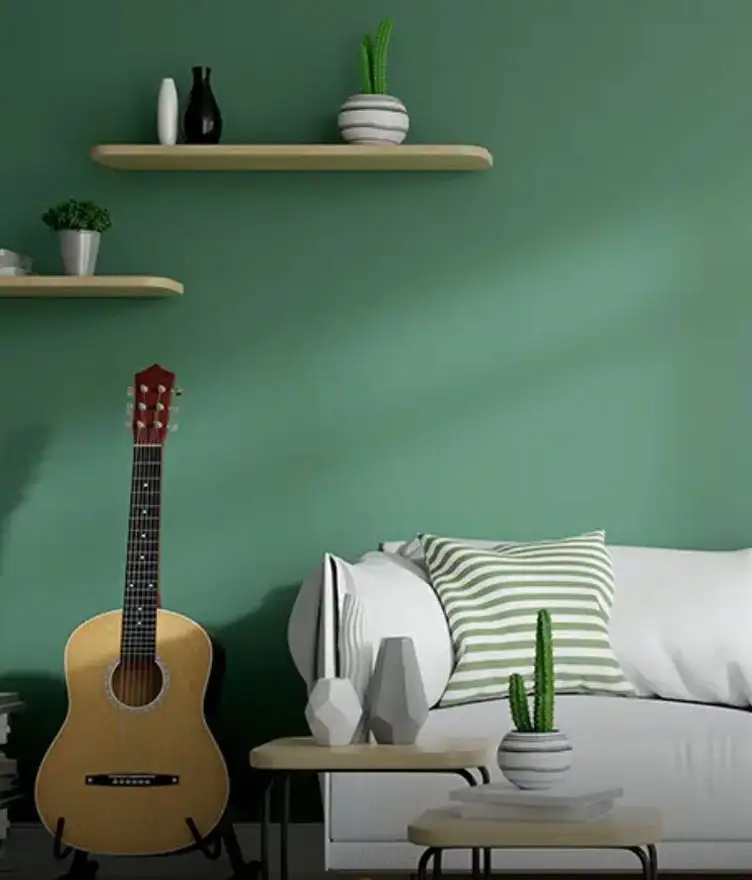
A deep green wall behind the sofa instantly gives the room more depth. Forest Green or Pond Moss looks beautiful with softer orange touches through cushions, artwork, or décor pieces. Those looking for green and orange wall colour ideas for living room should go with dark greens and warmer oranges.
Furniture + Curtain Coordination
Green walls work beautifully with rust cushions, wooden furniture, and warm lighting. If the walls are more orange, softer greens through curtains, plants, or chairs help balance the space naturally.
|
Style |
Green Shade |
Orange Shade |
Application |
|
Contemporary |
Sea Green |
Coral Dust |
Soft green walls with orange accents through décor and textiles |
|
Bold Statement |
Emerald Green |
Copper Stone |
Deep feature wall with warmer orange tones layered around the room |
|
Traditional Indian |
Forest Green |
Orange Valley |
Full room styling with wood, brass, and warm lighting |
|
Minimal Warm |
Pistachio Nut |
Apricot Bush |
Single accent wall with neutral furniture and lighter fabrics |
Green and Orange Bedroom Colour Combination
Bedrooms should feel calm and comforting at the end of the day. The right green and orange bedroom colour combination can make the space feel cosy, warm, and relaxed without looking too dark or heavy.
Soft and Relaxed Colour Palettes
Softer shades work best for a restful bedroom. Pistachio Nut with Apricot Bush feels light, warm, and easy to live with every day.
Warm Yet Refreshing Feel
Sea Green with Coral Dust keeps the room feeling fresh while still adding warmth. This green and orange colour combination for bedroom walls feels airy, soft, and welcoming.
Wall Paint Suggestions
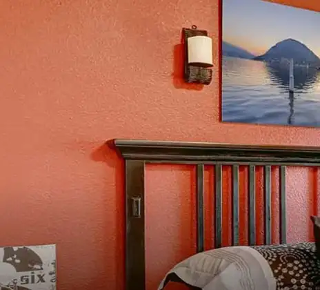
A softer green on most walls with a warmer orange behind the bed usually creates the best balance. The room feels layered without looking too colourful.
|
Style |
Green Shade |
Orange Shade |
Application |
|
Soft Calm |
Pistachio Nut |
Apricot Bush |
Headboard wall in green with softer orange across the remaining walls |
|
Warm Minimal |
Sea Green |
Coral Dust |
Single accent wall with light neutral surroundings |
|
Bold Bedroom |
Emerald Green |
Copper Stone |
Feature wall with layered warm textiles and wooden furniture |
|
Traditional |
Forest Green |
Orange Valley |
Full room styling with dark wood and warm lighting |
Green and Orange Kitchen Colour Combination
Green and orange can make a kitchen feel warmer and far more welcoming than plain neutral colour shades. The right green and orange kitchen colour combination adds freshness and energy to the space.
Fresh and Lively Colour Pairings
Peppermint with Orange Grove feels bright and cheerful straight away. For a softer look, Sea Green with Coral Dust keeps the kitchen feeling calm and fresh.
Cabinet + Backsplash Pairing
Green cabinets look beautiful with warm orange-toned backsplashes. You can also keep the cabinets neutral and bring colour in through tiles or walls instead.
Matte vs Glossy Finish
Matte walls keep colours looking softer and more relaxed. Glossy cabinets make deeper greens and oranges feel richer and cleaner.
Small Kitchen Styling
In smaller kitchens, let one colour lead and use the second shade in smaller details. Always go with a balanced green and orange colour combination for kitchen walls to prevent the space from feeling cluttered.
|
Kitchen Area |
Green Shade |
Orange Shade |
Application |
|
Compact Kitchen |
Pistachio Nut |
Apricot Bush |
Soft green walls with orange used only in backsplash or décor details |
|
Standard Kitchen |
Sea Green |
Coral Dust |
Lower cabinets in green with softer orange walls |
|
Open Kitchen |
Forest Green |
Orange Valley |
Feature cooking wall in green with warm orange accents across open areas |
|
Traditional Kitchen |
Pond Moss |
Campfire's Burning |
Rich green walls with earthy orange through shelves, trim, or tiles |
Best Shades for Different Home Styles
The same green and orange colour combination ideas will not work the same way in every home. Some two colour combinations feel clean and modern, while others suit richer and more traditional spaces.
Modern Homes
Sea Green with Coral Dust keeps modern spaces feeling fresh and uncluttered. The colours add warmth without taking away the clean look of the room.
Luxury Homes
Emerald Green with Copper Stone feels rich and dramatic in the best way. It works beautifully with marble, brass, and darker wooden finishes.
Minimal Homes
Minimal spaces look better when colour is used carefully. A soft Pistachio Nut wall against white colour surroundings can make the room feel warmer without losing simplicity.
Traditional Homes
Forest Green and Orange Valley fit naturally into homes with woodwork, layered fabrics, and classic décor. The combination feels warm, earthy, and full of depth.
How to Balance Green and Orange Colours in Your Home
The shades matter, but the balance in the green orange colour combination matters even more. Too much colour in every corner can quickly make a room feel overwhelming.
60:30:10 Rule
Use one colour the most, the second colour a little less, and keep the rest neutral. This keeps the room feeling balanced and comfortable.
Accent Wall Strategy
If full-room colour feels too risky, start with one wall. A deep green or warm orange accent wall can completely change the mood of the room.
Neutral Balancing Colours
Cream, beige colour, warm white, and soft grey help break up stronger shades. They make the space feel calmer and easier on the eyes.
Furniture and Fixture Balance
Bold walls look better with simpler furniture and natural textures. Bring extra colour in slowly through cushions, curtains, or décor pieces.
Common Mistakes to Avoid
- Using overly bright shades together
- Ignoring lighting changes
- Adding too many bold décor pieces
- Forgetting neutral tones
- Mixing clashing undertones
- Using dark shades in tiny rooms
Green and Orange House Colour Combination for Exterior Walls
Green and orange outside the house can look beautiful when the shades feel earthy instead of overly bright. The green and orange house colour combination has warmth to it, especially in natural daylight.
Exterior Paint Pairing Ideas
A softer green across the main walls with orange around doors or window frames usually looks balanced straight away. Forest Green with Orange Valley works especially well for this.
Balcony Wall Styling
Balconies can handle brighter shades because sunlight softens everything outdoors. Peppermint with Orange Grove feels cheerful and fresh without looking too loud from a distance.
|
Exterior Style |
Green Shade |
Orange Shade |
Application |
|
Heritage Indian |
Forest Green |
Orange Valley |
Main walls in green with orange on trims and entrance details |
|
Contemporary |
Sea Green |
Coral Dust |
Upper exterior in green with softer orange around frames and balcony areas |
|
Festive |
Emerald Green |
Orange Grove |
Feature entrance wall with orange accents across gates and boundaries |
|
Minimal Modern |
Pond Moss |
Copper Stone |
Main exterior walls in muted green with orange used only on trims and frames |
Ready-Made Green and Orange Wall Paint Options
Choosing ready-made shades makes things much easier, especially when working with stronger colours like green and orange. It saves time and removes the stress of trying to get the same shade mixed again later.
Benefits of Ready-Made Options
Ready-made paints keep the colour consistent from one wall to another. The shade you choose stays the same across the room without unexpected changes.
Why Choose Nerolac
Nerolac shades work well across different lighting conditions and wall textures. That makes the colours much easier to trust once they are actually painted at home.
Nerolac Shade Recommendations
Orange shades: Campfire's Burning, Coral Dust, Orange Valley
Green shades: Pond Moss, Sea Green, Forest Green
Paint Finish Options
Matte finishes work beautifully in bedrooms and living rooms. Satin and silk finishes are usually easier to clean in kitchens and high-use spaces.
Colour Matching Service
If you already have a fabric, tile, or décor piece you want to match, Nerolac's colour matching service can help find a shade that fits naturally with the rest of the room.
How Nerolac Paint Can Help You Create the Perfect Green and Orange Walls
The right shades become much easier to choose when you have enough options to work with. Nerolac offers combinations that range from soft and earthy to rich and dramatic, depending on the mood you want for the space.
Wide Shade Range
From softer greens to deeper earthy oranges, there are shades for every kind of room and style. You can keep things subtle or go much bolder without struggling to find matching tones.
Interior Finishes for Every Need
Different rooms need different paint finishes. Nerolac offers finishes that work well for bedrooms, kitchens, living rooms, and spaces that need easier cleaning.
Expert Colour Solutions
Sometimes a shade card alone is not enough. Nerolac colour experts help based on room size, lighting, and the overall mood you want the space to have.
Durable Wall Finishes
Walls deal with sunlight, humidity, dust, and daily wear all the time. Nerolac paints are designed to hold colour well and stay fresh-looking for longer.
Sustainability and Quality
Low VOC paint options help create a healthier indoor environment without affecting colour quality or finish. The walls still feel rich and beautiful while being safer for everyday living.
Visualise Your Green and Orange Wall Combination with Nerolac Tools
Choosing paint from a tiny shade card can feel impossible sometimes. A colour that looks perfect in the store can suddenly feel completely different once it reaches the wall, which is why visual tools help so much.
Virtual Colour Visualiser
You can upload a photo of your own room and try different Nerolac shades digitally before painting anything. It gives a much clearer idea of how green and orange will actually look in your space.
Interactive Colour Catalogue
The online Nerolac colour catalogue makes it easy to explore different greens, oranges, and matching combinations without rushing through decisions. You can compare shades slowly and see what feels right together.
Paint Quantity Calculator
This tool helps estimate how much paint the room actually needs. It saves you from buying too much or running short halfway through the work.
Colour Consultation Booking
If you still feel confused between shades, Nerolac painting services can guide you properly. Sometimes, even a small suggestion about undertones or lighting can make the final choice much easier.
Conclusion
The green orange colour combination has a warmth that feels easy to connect with. Some shades feel calm and earthy, some feel rich and dramatic, and some simply make a room feel happier to spend time in. With the right Nerolac shades, finishes, and visual tools, it becomes much easier to create a space that feels personal, welcoming, and comfortable every single day.
Trending Colour Shades
Find the Perfect Colour Shades for you walls
Products in this shade
Browse through our wide range of paints to find the one that accentuates your home's beauty
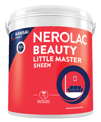
Beauty Little Master Sheen
Nerolac Beauty Little Master Sheen is an Economy Interior Wall Emulsion with very good sheen, smooth...
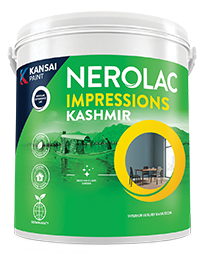
Impressions Kashmir
Nerolac Impressions Kashmir Luxury Emulsion is a superior quality 100% acrylic emulsion based interi...
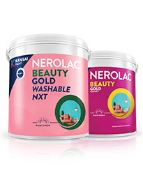
Beauty Gold washable and Beauty Gold Washable NXT
Nerolac Beauty Gold Washable paint has a soft sheen finish, with excellent stain-cleanability at an a...
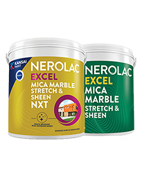
Neroalc Excel Mica Marble Strech Sheen & Mica Marble Stretch Sheen NXT
Nerolac Excel Mica marble stretch sheen Nxt & Mica Marble Strech Sheen is an extremely durable water...
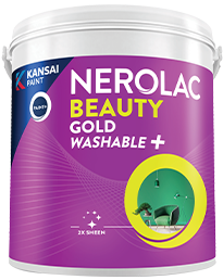
Beauty Gold Washable Plus
Nerolac Beauty Gold Washable Plus is an interior emulsion paint has a rich sheen finish, with highes...


Find an Expert Painter Near You
Enjoy a holistic painting experience with Nerolac NxtGen Services
Frequently Asked Questions For Green And Orange Colour Combination
What colours go well with green and orange colour combination?
Colours such as gray, black, or gold pair beautifully with green and orange , resulting in a balanced and elegant appearance. Neutral tones like beige or cream can also help to soften the intensity of this colour combination.
What colour do green and orange combine to create?
When green and orange are mixed together, they usually produce a shade of pink, with the specific hue depending on the ratio of each colour used.
Is green and orange a good colour combination for a bedroom?
Green and orange colour combo can indeed be a fantastic colour scheme for a bedroom.
Can green be used effectively in a living room design?
Definitely! GREEN can be effectively used as a lively accent colour in a living room, especially when combined with neutral furniture or decor.
What mood does a green and orange colour scheme create in a room?
A green and orange colour scheme creates a mood that is energetic and vibrant yet balanced and refreshing.
Can green and orange be used in modern interior designs?
Yes, green and orange work well in modern interiors by combining sleek furniture and clean lines.
How does natural light affect a green and orange room?
Natural light enhances the brightness of orange, creating a sense of openness, while green adds warmth.
What are some stylish green and orange wall paint ideas?
Create a feature wall in green with orange walls surrounding it for contrast.
Can I paint one wall green and another orange for a bold accent?
Yes, painting one wall green and the rest orange creates a bold, eye-catching accent.
Does the green and orange wall colour combination work in small rooms?
Yes, it absolutely can. You just need to stay with softer shades like Pistachio Nut and Apricot Bush so the room still feels open and airy.
Which green shade works best with burnt orange walls?
Deeper greens like Forest Green or Pond Moss pair beautifully with burnt orange tones. They create a warm and earthy look that feels balanced instead of too bright.
Is green and orange a good choice for bedrooms?
It works surprisingly well in bedrooms when the shades are softer and warmer. The combination can make the room feel cosy, calm, and comfortable at the same time.
Can I use green and orange in a modern home?
Yes. But muted tones are generally better in modern interiors. For instance, Sea Green and Coral Dust look clean and fresh without making the space look too busy.
What colours go well with green and orange walls?
Neutral shades such as cream, beige, white and warm grey work beautifully with this palette. Wooden textures and brass accents are natural fits.
Should both colours be used equally in a room?
Usually, no. It looks much better when one colour dominates the space and the second colour is used through accents, décor or one feature wall.
Do green and orange walls make a room look dark?
Only if the shades are too deep for the amount of light in the room. Softer greens and muted oranges keep the space feeling much lighter and easier to live with.
Which finish works best for green and orange walls?
Matte finishes usually make these colours feel softer and more natural. Satin or silk finishes work well in kitchens and spaces that need easier cleaning.
Create magic with our inspiring Two Colour Combinations!
-
Orange And Lilac Colour Combination
-
Red And Brown Colour Combination
-
Yellow And Blue Colour Combination
-
Yellow And Green Colour Combination
-
Yellow And Orange Colour Combination
-
Yellow And Red Colour Combinations
-
Orange And Brown Colour Combination
-
Orange And Gold Colour Combination
-
Orange And Grey Colour Combination
-
Orange And Cream Colour Combination
-
Orange And Peach Colour Combination
-
Orange and Red Colour Combination
-
Orange And Purple Colour Combination
-
Orange And Pink Colour Combination
-
Orange And White Colour Combination
-
Orange And Neutral Colour Combination
-
Orange And Beige Colour Combination
-
Orange And Violet Colour Combination
-
Orange And Blue Colour Combination
-
Orange And Green Colour Combination
Latest Happenings in the Paint World
Get some inspiration from these trending articles


Get in Touch
Looking for something else? Drop your query and we will contact you.
Popular Searches
What’s Trending in Bedrooms
Explore Trending Living Room Ideas
- Living Room Colour Combination
- Modern Two Colour Combination for Living Room
- Wall Texture for Living Room
- Vastu Colours for Living Room
- Wall Texture Design for Living Room
- Living Room Paint Ideas
- Living Room Design Ideas
- Paint Colour Ideas for Living Room
- Living Room TV Wall Designs
- Green Living Room Walls
Kitchen Ideas People Love
Explore Trending Ceiling Ideas
Study Room Ideas in Demand
Explore Wall Paint Categories
Handpicked Colour Inspirations
- Accent Wall Design
- Bedroom Design Ideas
- Exterior Wall Colour Design Ideas
- Interior Wall Colour Design Ideas
- Kitchen Design Ideas
- Living Room Interior Design
- Geometric Wall Design Ideas
- Home Colour Combination Ideas
- Home Décor Ideas
- Mural Wall Paint Design Ideas
- Office Space Design Ideas
- Puja Room Design Ideas
- Texture Design Ideas
- Festival Painting Ideas
- Paint Colour Chart
- Wall Painting Designs
- Wood Wall Décor Ideas
- Mural Wall Paint Design
- Hall Design Ideas
- Gate Colour Design
- Exterior Wall Colour Design
- Door Colour Design Ideas
-
 Get in Touch
 -
Store Locator
-
 Download App
×
Get in Touch
Looking for something else? Drop your query and we will contact you.

