Onion Pink Colour
Onion Pink
Every house has a journey of becoming a home, where the hearts bond and smiles bloom, and happiness blossoms. Onion Pink colour is that hue that transcends every feeling to love.
It's a soft hue with a red and white undertone, curated to infuse love in your living space. This colour is an expression of togetherness when you love to decorate your home with elements of Mother Gaia.
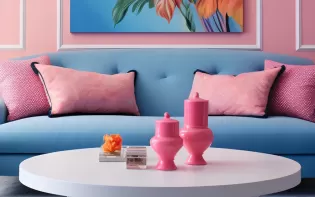
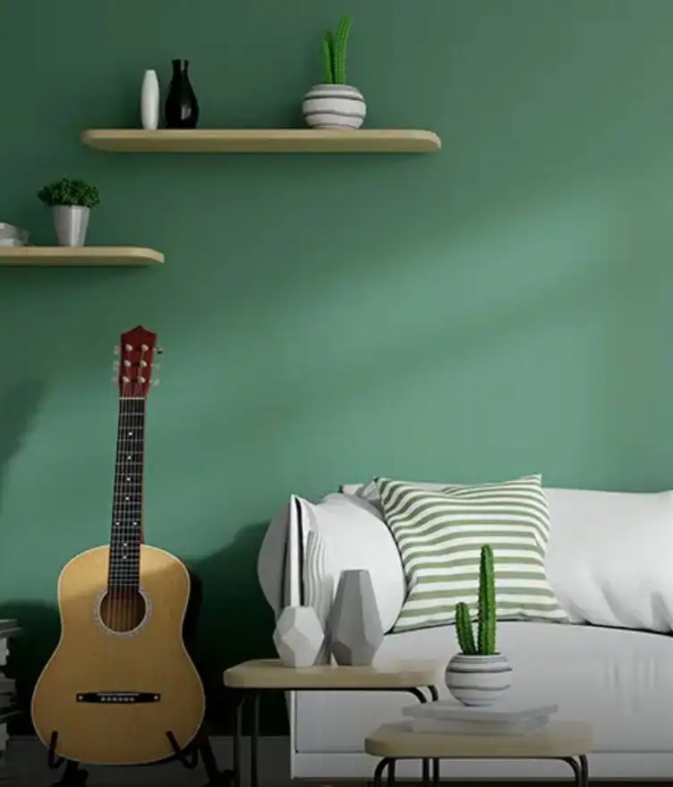
Onion Pink colour creates the grandeur of prodigality when complemented with hues of green, blue, orange, and yellow.
Disclaimer: Actual wall paint colour applied may differ from the on-screen representation above. Please confirm your colour choices prior to purchase by viewing a physical colour shade card or a painted sample.
Still confused ? Explore all our shades from our colour catalogue
Paint your life's canvas with our painting experts
Fill the form below to book a free site evaluation by Nerolac Express Painting Service expert
Trending Colour Shades
Find the Perfect Colour Shades for you walls



About Onion Pink Colour
Onion Pink Colour Designs, Shades & Combinations for Your Home
Onion pink is a soft, muted pink with a red-and-white undertone that appears warm without looking loud. This onion pink colour is positioned close to red on the colour wheel because pink is essentially red lightened with white, which is why it can look comfortable in both traditional and modern interiors when handled carefully.
It is a shade connected with love and togetherness, making it a natural choice for lived-in spaces such as bedrooms and living rooms. The key to using this colour is following a balanced approach: correct lighting, clean ceilings, and a plan for how much colour the room should carry.
Key Characteristics of Onion Pink Colour
-
Soft, composed undertone
Onion pink is a soft hue with a red and white undertone. This is why it generally feels calm on large wall surfaces. It is usually easier to live with than brighter pinks because it does not demand constant visual attention.
-
Light-temperature responsive tone
Under warm yellow lighting, onion pink can appear richer. Under cooler white lighting, it can look more muted and slightly dusty. This is normal for pink tints and can be checked with a sample patch in your real lighting.
-
Modern “neutral-like” warmth
Many onion pink colour shades behave like a neutral with warmth. This is especially true if you pair them with white ceilings, light greys, and warm wood. This makes onion pink suitable for apartments where furniture and flooring are already neutral.
-
Minimal-friendly refinement
Onion pink is most convincing when the room is not visually crowded. Too many prints or mixed decor colours can make the wall look less refined than it should.
Practical Uses of Onion Pink Colour
-
Restful bedrooms
A well-chosen onion pink is a practical bedroom colour. It stays gentle during the day and comfortable under warm bedside lighting. Keep bedding light and reduce patterns if you want the wall to look clean.
-
Welcoming living rooms
Onion pink can soften strong contrasts from dark TV units, black frames, or heavy furniture. It is a useful option when the space already has strong lines and needs a calmer background.
-
Defined dining spaces
In open layouts, colour often does the job of zoning. Onion pink can define a dining wall without even adding partitions or decorative elements.
-
Passages and entryways
Many homes paint these spaces white and rely on lighting alone. A lighter onion pink can make passages look more finished, as long as the ceiling remains bright and the lighting is consistent.
-
Elegant children’s rooms
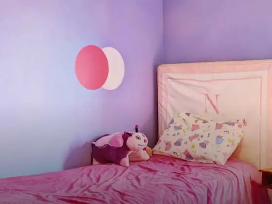
When families want a colour that does not feel temporary, onion pink is often a safer choice than livid pink. It can be styled in a simple way and still feel relevant and appropriate over time.
Onion pink colour is primarily preferred for interior walls, but in controlled architectural use it can also work for exterior feature elements such as entry walls or shaded façades.
Onion Pink Paint Choices for Your Walls
Choosing onion pink is easier when you start with the room conditions rather than the shade name. Check daylight direction and the finish of your flooring. Take note of the lighting you actually use after sunset. You must not forget to inspect the wall. Deep patches and rough sanding can show up clearly once a tinted wall dries. Confirm the shade choice with a physical shade card or a painted sample because screens do not match wall paint entirely.
Once you do those checks, it becomes simpler to shortlist different onion pink colour shades that fit the room’s size and function, instead of selecting only by appearance on a phone screen.
Light and airy tones
A lighter onion pink works best when you want the room to stay open and bright.
-
Pink Magic suits compact bedrooms, guest rooms, and spaces with limited daylight, because it adds warmth without reducing the sense of space.
Dusty, modern tones
A slightly muted, dusty onion pink is often the most practical choice for living rooms.
-
Roseberry Bits tends to look modern next to grey sofas, neutral curtains, and minimal artwork, and it remains stable across different lighting conditions.
Deeper tones
If you prefer a stronger statement, choose a deeper onion pink for one feature wall only.
-
Pink Sash works well when you want colour presence but still need a modern, uncluttered look.
It is also the best option to create a planned onion pink colour palette without making the full room feel tinted.
Onion Pink Wall Colour Combinations for Your Home
The most reliable approach is to decide what stays constant (ceiling white, trim tone) and then use one supporting shade to define a specific room. This makes your onion pink two colour combination easier to apply consistently across living, dining, and passage areas.
Here are four pairing shades mapped to common rooms.
|
Room/space |
Recommended colour combination |
|
Living room (TV wall / main seating wall) |
Onion pink + Velvet – 2262 |
|
Master bedroom (headboard wall/dressing wall) |
Onion pink + Deep Rosette – 4160 |
|
Study/home office (back wall) |
Onion pink + Rose Aura – 2218 |
|
Dining area (feature wall) |
Onion pink + Watermelon Popsicle – 4758 |
-
Onion pink + Velvet Colour Combination
Use Velvet colour where you want the overall look to stay soft and stable, typically a living-room TV wall or a foyer highlight, while onion pink remains on larger surrounding surfaces.
-
Onion pink + Watermelon Popsicle Colour Combination
Watermelon popsicle colour is suitable when you want the dining corner to feel more energetic, but still controlled; keep furniture finishes simple and avoid heavy patterns on curtains.
-
Onion pink + Deep Rosette Colour Combination
Deep rosette colour works well in bedrooms because it can add depth in a focused area (such as the headboard wall) while onion pink keeps the rest of the room calm and comfortable.
-
Onion pink + Rose Aura Colour Combination
Rose aura colour combination is a good fit for studies and guest rooms because it keeps the space soft while still looking structured, particularly with tidy storage and minimal wall decor.
If the question is more technical, like how do you make onion pink colour look even on the wall, the answer is uniform surface preparation, correct priming, and consistent application so the wall dries with the same colour density across the full surface.
If your goal is a cohesive home scheme, how to create pink colour continuity is mainly about repeating the same undertone direction. Also, limit the number of partner shades and keep the finish consistent across connected rooms.
Best Onion Pink Shades for Accent Walls
Accent walls are often the best option when you want colour presence without full-room coverage. They also allow you to test a deeper direction safely, especially in compact apartments where too much colour can reduce the feeling of openness.
If you are selecting shades in onion pink colour for an accent wall, choose the wall with the cleanest surface and the most predictable lighting (for example, a TV wall that receives even overhead light).
|
Shade |
Accent-wall location |
|
Pink Sash |
Living room TV wall |
|
Pink Magic |
Bedroom headboard wall |
|
Roseberry Bits |
Study wall behind the desk |
Simple Tips for Using Onion Pink at Home
Onion pink gives the best results when it is planned like a finish material. It should not be treated as a last-minute colour decision. The most common issues usually come from lighting choices and surface preparation. If you want an onion pink colour contrast in a modern apartment, keep it controlled.
Go for light ceilings, clean edges, and one deeper supporting shade instead of multiple bright colours. Practical steps that help:
-
Test two sample patches: You can use one near a window and one away from it. Check both in daylight and under your usual night lighting.
-
Decide sheen by room use: Bedrooms often suit matte for softness. Living rooms and passages can benefit from a soft sheen.
-
Keep ceilings and trims bright: This protects the sense of height. It keeps pink tones from feeling overly tinted.
-
Reduce visual noise: Limit heavy patterns in curtains, rugs, and cushions. The wall colour remains steady this way.
-
Repeat the colour carefully: One or two small repeat points in decor are enough. Too many repeats can make the room feel forced.
-
Allow proper drying time: Rushed coats can lead to an uneven finish. This is especially true for tinted walls.
When you compare types of onion pink colour shades across connected spaces, keep the undertone direction consistent. A dusty onion pink in the living room should not shift sharply to a peach-leaning tone in the dining zone if you want to achieve that continuity in home paint.
Plan, Design and Paint Your Walls With Nerolac Tools
Ready to plan your onion pink makeover? Use the tools below to explore shades, visualise rooms and estimate paint and budget.
Colour Visualiser
Use the Nerolac Colour Visualiser to try out different shades and textures from our colour and texture palette on the walls of our ‘room presets.’ You can also see how each colour will look under various lighting conditions, such as natural sunlight, cool white light and warm yellow light, before finalising a shade.
Colour Catalogue
Use the Nerolac Colour Catalogue to browse over 1,500 Nerolac wall paint shades. Search by colour name or code, or filter by colour family to quickly discover options that match your décor. Shortlist your favourite shades and pair them with the other Nerolac tools to finalise the perfect colour scheme for your home.
Paint Calculator
Use the Nerolac Paint Calculator to estimate the area to be painted and the required paint volume for your décor project. Enter wall dimensions, room count, and preferred product to get an approximate paint quantity and cost, helping you plan your project with greater confidence.
Frequently Asked Questions For Onion Pink
What colour goes with Onion Pink walls?
Onion Pink colour gives your home a sophisticated look when paired with subtle shades like grey, brown or light blue. Nerolac’s Softly Purple, Morning Haze and Pebble shades will go well with Onion Pink colour walls.
Is Onion Pink Colour warm or cool?
Onion Pink, like all other pinks, is a light shade of red. This makes it a warm colour.
Is Onion Pink Colour a good colour for a bedroom?
Onion pink may be used for the bedroom walls by pairing them with cool shades like light blues and greys to balance the energy.
Is Onion Pink Colour a neutral colour?
No. Onion Pink is a warm colour because it is a shade of pink.
What colour curtains go with Onion Pink Colour painted walls?
Choose golden, silver, brown or white curtains to go with onion pink painted walls.
How do you style furniture in a room with Onion Pink Colour walls?
Silver, Bronze and ceramic artefacts will great in rooms with Onion Pink coloured walls. Cane furniture and minimalistic décor would give the room a luxurious vibe.
Can I use Onion Pink Colour in a living room?
Yes. Pair it with Nerolac’s Fresh Peach, Beaumonde or Coffee shades to make the living room visually appealing.
What is the difference between Onion Pink and Burgundy Colours?
Burgundy is dark red purplish colour with predominance of red. Onion Pink Colour is a Purplish Pink colour with predominance of pink. Burgundy is a bright colour while onion pink is a pale pink shade.
Does Onion Pink suit modern interiors?
Yes. Onion pink can suit modern interiors when it is muted, paired with clean whites or light greys, and supported by simple furniture lines.
Is Onion Pink better as a feature colour or a full-room colour?
Yes. Onion pink can suit modern interiors when it is muted, paired with clean whites or light greys, and supported by simple furniture lines.
What finishes work best with Onion Pink paint?
Matte can look calm in bedrooms and reduce glare. Soft sheen can be practical in living rooms and passages where occasional cleaning is needed. Confirm with a sample, because the finish affects how the tone reads.
Does Onion Pink affect the mood of a space?
Onion pink is a shade connected with love and togetherness. This is why many homeowners choose it for bedrooms and shared family spaces.
Can Onion Pink be used in rooms with limited natural light?
Yes, but choose a lighter version and strengthen the lighting plan. You need to keep the ceiling and at least one major surface bright. This way, the room does not look dull or closed in.
How does Onion Pink interact with decor colours?
The colour can be complemented with hues of green, blue, orange, and yellow. In modern interiors, you can use these as small accents rather than large competing blocks of colour.
Create magic with our inspiring Two Colour Combinations!
-
Orange And Lilac Colour Combination
-
Red And Brown Colour Combination
-
Yellow And Blue Colour Combination
-
Yellow And Green Colour Combination
-
Yellow And Orange Colour Combination
-
Yellow And Red Colour Combinations
-
Orange And Brown Colour Combination
-
Orange And Gold Colour Combination
-
Orange And Grey Colour Combination
-
Orange And Cream Colour Combination
-
Orange And Peach Colour Combination
-
Orange and Red Colour Combination
-
Orange And Purple Colour Combination
-
Orange And Pink Colour Combination
-
Orange And White Colour Combination
-
Orange And Neutral Colour Combination
-
Orange And Beige Colour Combination
-
Orange And Violet Colour Combination
-
Orange And Blue Colour Combination
-
Orange And Green Colour Combination
Get in Touch
Looking for something else? Drop your query and we will contact you.
-

Get in Touch Get in Touch -

Store Locator Store Locator -

Download App Download App
Get in Touch
Looking for something else? Drop your query and we will contact you.

