
Purple And White Colour Combination
Discover two colour combinations to add a dynamic touch to your space.
Purple And White Colour Combination
In this section, you'll find essential tips and inspiring examples on how to effectively pair these two Purple And White Colour Combinations. Discover the perfect shades, explore their interactions with different environments, and unleash the bold potential of Purple And White Colour Combo in your projects.
For more insights, visit our detailed resource on Two Colour Combination
Try with Visualizer
FIND IN STORE
अस्वीकरण: लागू किया गया वास्तविक दीवार पेंट रंग ऊपर दिए गए ऑन-स्क्रीन प्रतिनिधित्व से भिन्न हो सकता है। भौतिक रंग छाया कार्ड या पेंट किए गए नमूने को देखकर खरीद से पहले कृपया अपने रंग विकल्पों की पुष्टि करें।
Still confused ? Explore all our shades from our colour catalogue
Create Your Dream Home With Our Painting Experts
नेरोलैक नेक्स्टजेन पेंटिंग सर्विसेज विशेषज्ञ द्वारा निःशुल्क साइट मूल्यांकन बुक करने के लिए नीचे दिया गया फॉर्म भरें
Unique Two Colour Combinations to Try
Experiment with these beautiful two colour combo and transform your space
Purple and White Colour Combination for Your Home
A purple and white wall colour combination has a way of making a room feel softer before you have even noticed the details. They create a striking balance between richness and simplicity. Purple brings warmth and a little bit of mystery. White steps in with lightness and calm.
On the colour wheel, purple colour lies between blue colour and red. White, as a neutral colour, doesn't compete with purple. Instead, it gives the colour room to breathe, allowing its character to shine without overwhelming the space.
This is the kind of pairing that suits homes wanting beauty without excess, personality without heaviness. Whether used in bedrooms, living spaces, or study room walls, the purple and white colour combination can create interiors that feel graceful, bright, and full of charm.
Quick Summary
The purple and white wall colour combination feels calming, elegant, and expressive at the same time. Together, they work beautifully in bedrooms, living rooms, and modern interiors when used in the right balance.
Why Purple and White Colour Combination Works So Well
None of the colours tries to compete with the other. Purple brings mood, personality, and a sense of richness into the room, while white quietly keeps everything feeling lighter and more open.
Colour Psychology
Purple has always carried a slightly emotional quality to it. Sometimes it feels luxurious and dramatic. Sometimes it feels soft, comforting, and almost nostalgic, depending on the shade you choose. White changes how purple behaves inside a room. With white beside purple, the entire space suddenly feels calmer, fresher, and easier to live with every day.
The Balance Feels Natural
The purple and white two colour combination feels smooth rather than sharp. White tones down the heaviness of purple without taking away its personality, which is why the combination feels elegant without looking overdesigned. Even when purple is used boldly, white keeps the room from feeling visually crowded.
It Already Exists Beautifully in Nature
A purple white colour combination has a sense of familiarity. Lavender fields, orchids, lilacs, wisteria and even soft evening skies carry the same mix of richness and lightness. There is something calming about the way these colours naturally fit beside each other, which is exactly why they translate so well into home interior walls.
Modern Interior Trend Relevance
Modern interiors have moved towards softer, more liveable versions of purple and white colour combination ideas. Dusty lavender, muted plum, mauve, and soft violet paired with warm whites are becoming far more popular in contemporary homes because they add personality without making the space feel visually heavy.
Best Purple and White Colour Combination Ideas for Walls
Purple and white can feel completely different from one home to another. Sometimes the combination feels soft and restful. Sometimes it feels rich and dramatic. That depends entirely on the shades you choose and how they look inside the room.
1. Brinjal Purple + Ivy White
Brinjal Purple colour gives a room that deep, cocoon-like warmth people usually try to create with dim lighting and heavy décor. The colour already does the work on its own. Ivy White colour cuts through that richness just enough to stop the space from feeling closed in. Together, the room feels cosy instead of dark.
2. Mystic Purple + Converse White
This pairing feels lighter from the very beginning. Mystic Purple colour carries colour gently across the walls instead of demanding attention from every corner of the room. Converse White colour keeps everything looking fresh and breathable. The combination works beautifully in homes that want colour but still want the room to feel bright during the day.
3. Purple Aster + Raft White
Purple Aster colour has a softness that makes a room feel immediately relaxed. It does not feel loud or overly polished. Raft White colour adds warmth beside it instead of creating a sharp contrast. The result feels easy, comfortable, and natural in the way lived-in homes often do.
4. Purple Gaga + White Sails
Some shades want to stay in the background. Purple Gaga colour is not one of them. It brings instant personality into the room and changes the entire mood of the space. White Sails colour keeps that boldness under control so the walls still feel balanced instead of overwhelming. This combination works especially well when one wall needs to stand out a little more than the others.
5. Purple Pashmina + Snow Storm
There is something very calm about this pairing. Purple Pashmina colour feels soft without becoming plain, while Snow Storm colour keeps the room looking crisp and open. Together, they create the kind of bedroom people actually want to spend slow mornings in.
6. Purple Saga + Shell White
Purple Saga colour brings depth into a room very quickly. It has that slightly dramatic quality that instantly makes the space feel more intimate. Shell White colour softens the mood before it becomes too heavy. The balance between the two colours feels warm, relaxed, and quietly elegant.
Purple and White Living Room Colour Combination
A purple and white living room colour combination works well only when used in balance. The trick is to let one colour take the spotlight while the other quietly supports the atmosphere around it.
A) Feature Wall Concepts
The best purple and white wall colour ideas for living room walls often involve feature walls. Shades like Brinjal Purple or Purple Saga immediately add depth and make the space feel more layered. The surrounding white walls stop the room from feeling closed in.
B) Furniture + Curtain Coordination
White walls already brighten the room naturally, so the furniture should bring warmth rather than more starkness. Purple already carries enough personality on the walls, so the rest of the room feels better when it stays relaxed and understated.
|
Style |
Purple Shade |
White Shade |
Application |
|
Modern Elegant |
Purple Saga |
Shell White |
Purple feature wall with warm neutral furniture |
|
Soft Contemporary |
Mystic Purple |
Converse White |
Light purple walls with layered white décor |
|
Luxury Inspired |
Brinjal Purple |
Ivy White |
Deep purple accent wall with gold and beige accents |
|
Calm Minimal |
Purple Pashmina |
Snow Storm |
White-led room with soft purple touches throughout |
Purple and White Bedroom Colour Combination
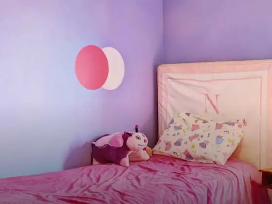
A purple and white colour combination for bedroom walls carries a softer and calmer mood. The balance between the two colours can completely change the atmosphere of the bedroom, depending on how bold or subtle you want the space to feel.
A) Soft Calming Palettes
Purple Pashmina and Snow Storm can create a cosy feeling. The purple feels gentle instead of dramatic. The white keeps the room looking light and breathable throughout the day. This kind of purple and white bedroom colour combination works especially well in smaller spaces.
B) Cosy Yet Elegant Feel
A deeper shade like Purple Saga on the headboard wall makes the bedroom feel warmer and more intimate. Pair with softer whites for a layered look. The room ends up feeling elegant in an effortless way rather than overly styled.
C) Wall Paint Suggestions
Purple works best in bedrooms when it does not cover every wall equally. Keeping the richer shade behind the bed usually creates a far calmer and more balanced look. The surrounding white walls allow natural light to move around the room more freely and prevent the bedroom from feeling visually crowded.
|
Style |
Purple Shade |
White Shade |
Application |
|
Soft Romantic |
Purple Pashmina |
Snow Storm |
Soft purple headboard wall with airy white surroundings |
|
Elegant Modern |
Purple Saga |
Shell White |
Deep purple behind the bed with warm white walls |
|
Calm Minimal |
Mystic Purple |
Converse White |
Pale purple accents with bright white throughout |
|
Rich Contemporary |
Brinjal Purple |
Ivy White |
Dark purple feature wall with layered neutral décor |
Purple and White Kitchen Colour Combination
A purple and white colour combination for kitchen walls can look surprisingly beautiful when the balance feels right. Let purple add character in smaller areas, while white keeps the kitchen feeling easy to move around in.
A) Fresh Yet Elegant Kitchen Aesthetics
A kitchen with Purple Saga or Brinjal Purple on the lower cabinets instantly feels richer and more stylish. The deeper purple grounds the space beautifully. Softer whites on the upper walls and shelves stop the kitchen from feeling visually crowded.
B) Cabinet + Backsplash Pairing Ideas
Pairing purple lower cabinets with white marble backsplashes or soft white wall tiles creates a clean balance between richness and brightness. Larger kitchens can have a single purple wall behind the dining area.
C) Small Kitchen Styling
In smaller kitchens, white should always remain the dominant shade. Shades like Converse White or Snow Storm help reflect more light around the room and make the kitchen feel more spacious. Purple works better in smaller touches here, cabinet trims, bar stools, open shelves, or a single lower cabinet section.
|
Kitchen Area |
Purple Shade |
White Shade |
Application |
|
Compact kitchen |
Mystic Purple |
Converse White |
White walls with soft purple cabinet accents |
|
Standard kitchen |
Purple Pashmina |
Snow Storm |
Purple lower cabinets with bright white walls |
|
Open kitchen |
Brinjal Purple |
Ivy White |
Deep purple island counter with warm white surroundings |
|
Modern kitchen |
Purple Saga |
Shell White |
Rich purple cabinets balanced with soft white backsplashes |
Best Shades of Purple and White for Different Home Styles
The mood of a purple and white home changes completely depending on the shades you choose. Some combinations feel soft and calming, while others bring richness and drama into the space very naturally.
A) Modern Homes
Mystic Purple with Converse White feels clean, airy, and very easy to style in modern interiors. The softer purple adds personality without disturbing the simplicity modern homes usually need.
B) Luxury Homes
Brinjal Purple paired with Ivy White creates a richer and more layered atmosphere. Add warm lighting, gold accents, and textured fabrics, and the space instantly feels more refined.
C) Minimal Homes
Purple Pashmina with Snow Storm works beautifully in minimal interiors because the colours never feel too loud. A single purple wall or soft purple décor pieces are often enough.
D) Traditional Homes
Purple Saga with Shell White carries a more classic warmth that suits traditional interiors beautifully. The combination feels elegant without losing that comfortable lived-in feeling.
How to Balance Purple and White Colours in Your Home
Purple naturally attracts attention, which is why balance matters so much with this combination. White keeps the space breathable and prevents the room from feeling visually heavy.
A) 60:30:10 Rule
Keep white as the dominant colour across most walls and larger surfaces. Purple works best as the secondary colour through feature walls, upholstery, cushions, or curtains.
B) Accent Wall Strategy
If full purple walls feel too heavy, start with one feature wall behind the sofa or bed. It gives the room personality without overwhelming the entire space.
C) Neutral Balancing Colours
Beige colour, cream, soft grey and natural wood work beside purple and white. They soften the contrast and make the room feel warmer overall.
D) Furniture and Fixture Balance
Light furniture usually works best with this combination. Wooden textures, soft fabrics and warm lighting help the room feel comfortable.
Common Mistakes to Avoid with Purple and White Colour Combination
- Using very dark purple across all four walls.
- Pairing cool purple shades with harsh bright whites.
- Adding too many bold accent colours into the room.
- Ignoring natural lighting while choosing purple shades.
- Using glossy finishes that make purple feel too harsh.
- Overcrowding the room with heavy furniture and décor.
Purple and White House Colour Combination for Exterior Walls
A purple and white house colour combination can look striking when the shades feel balanced properly. White keeps the house looking bright. Purple adds personality and depth.
Exterior Paint Pairing Ideas
Brinjal Purple on boundary walls or balcony sections paired with Ivy White on the main exterior creates a home that feels elegant and distinctive without looking overly loud.
Balcony Wall Styling
A soft purple balcony wall against white exteriors creates a beautiful visual break between floors. It adds colour gently without disturbing the openness of the façade.
|
Exterior Style |
Purple Shade |
White Shade |
Application |
|
Modern Elegant |
Purple Saga |
Shell White |
Purple balcony sections with white exterior walls |
|
Soft Contemporary |
Mystic Purple |
Converse White |
White exterior with soft purple accent areas |
|
Luxury Exterior |
Brinjal Purple |
Ivy White |
Deep purple gates and trims with warm white walls |
|
Minimal Modern |
Purple Pashmina |
Snow Storm |
White-led exterior with subtle purple highlights |
Ready-Made Purple and White Wall Paint Options
Ready-made purple and white shades make the entire painting process feel much simpler and less stressful. The colours look more balanced on the walls because the tones are already carefully matched.
Benefits of Ready-Made Options
Factory-mixed paints help maintain the same colour consistency across every wall. This becomes especially important with purple because uneven tones are easy to notice once the paint dries.
Why Choose Nerolac
Nerolac shades are created keeping Indian homes, lighting, and weather conditions in mind. Their purple and white combinations feel softer and far easier to live with in everyday spaces.
Nerolac Shade Family Recommendations
- Purple Shade Options: Brinjal Purple, Purple Saga, Mystic Purple
- White Shade Options: Shell White, Snow Storm, Converse White
Paint Finish Options
Matte finishes give bedrooms and living rooms a softer and calmer appearance. Satin finishes work better in kitchens and high-use spaces because they are easier to clean.
Colour Matching Service
Nerolac's colour consultation service helps homeowners choose shades that actually suit their room. This makes it easier to avoid combinations that may feel too dark or too flat later.
How Nerolac Paint Can Help You Create the Perfect Purple and White Walls
Purple changes noticeably depending on natural light, room size and surrounding décor. Nerolac helps simplify the process with balanced shades and practical finish options designed for real homes.
Wide Shade Range
From softer lilacs to richer plum tones, Nerolac offers purple shades for every kind of interior mood. Their white range also includes warmer shades that pair beautifully beside deeper colours.
Interior Finishes for Every Need
Whether you want a matte bedroom wall or a washable kitchen finish, there is a suitable option for every room. The colours remain smooth and consistent across different finishes as well.
Expert Colour Solutions
Their colour experts help homeowners find combinations that work naturally inside their homes. This makes the final result feel far more balanced and comfortable.
Durable Wall Finishes
The paints are designed for everyday durability and long-term colour retention. This helps deeper purple shades continue looking fresh for much longer.
Sustainability and Quality
Nerolac also offers low-VOC paint options for healthier indoor spaces. This makes the walls safer and more comfortable for everyday living.
Visualise Your Purple and White Wall Combination with Nerolac Tools
Seeing a colour on a wall before committing paint to it saves a lot of time, money, and regret. Nerolac's digital tools make that process simple.
Virtual Colour Visualiser
Upload a photograph of your room and apply any Nerolac shade digitally with colour visualiser. You get a realistic preview of how your chosen colour combination ideas will look in your actual space, before a single wall is touched.
Interactive Colour Catalogue
Browse the complete Nerolac range online, filter by colour family, and build your own curated colour palette. The interactive colour catalogue makes it easy to experiment with different combinations quickly.
Paint Quantity Calculator
Enter your room dimensions and get a precise estimate of how much paint you need. It prevents over-ordering waste and ensures you have enough for complete, consistent coverage.
Colour Consultation Booking
Book a session with a Nerolac painting expert, online or at your nearest store. They will help you move from uncertainty to a confident, specific colour decision based on your home and preferences.
Conclusion
The best purple and white colour combination for walls can create a cosy and stylish home. Whether you prefer soft lavender tones or deeper, dramatic purples, this combination always brings a sense of balance, warmth, and personality that feels easy to live with every single day.
Trending Colour Shades
Find the Perfect Colour Shades for you walls

इस छाया में उत्पाद
अपने घर की सुंदरता को निखारने वाले पेंट को खोजने के लिए हमारे पेंट्स की व्यापक रेंज को ब्राउज़ करें
Beauty Gold Washable Plus
Nerolac Beauty Gold Washable Plus is an interior emulsion paint has a rich sheen finish, with highes...
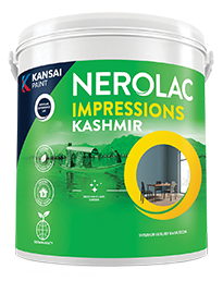
Impressions Kashmir
Nerolac Impressions Kashmir Luxury Emulsion is a superior quality 100% acrylic emulsion based interi...

Beauty Gold washable and Beauty Gold Washable NXT
Nerolac Beauty Gold Washable paint has a soft sheen finish, with excellent stain-cleanability at an a...
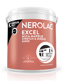
Neroalc Excel Mica Marble Strech & Sheen Super
Nerolac Excel Mica Marble Stretch and Sheen Super is an extremely durable water based high performan...
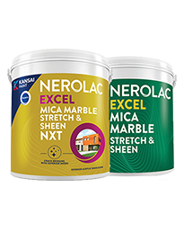
Neroalc Excel Mica Marble Strech Sheen & Mica Marble Stretch Sheen NXT
Nerolac Excel Mica marble stretch sheen Nxt & Mica Marble Strech Sheen is an extremely durable water...


अपने आस-पास एक विशेषज्ञ पेंटर खोजें
Enjoy a holistic painting experience with Nerolac NxtGen Services
Frequently Asked Questions For Purple And White Colour Combination
What colours go well with purple and white colour?
Colours such as gray, black, or gold pair beautifully with purple and white , resulting in a balanced and elegant appearance. Neutral tones like beige or cream can also help to soften the intensity of this colour combination.
What colour do purple and white combine to create?
When purple and white are mixed together, they usually produce a shade of pink, with the specific hue depending on the ratio of each colour used.
Is purple and white a good colour combination for a bedroom?
Purple and white can indeed be a fantastic colour scheme for a bedroom.
Can purple be used effectively in a living room design?
Definitely! PURPLE can be effectively used as a lively accent colour in a living room, especially when combined with neutral furniture or decor.
What mood does a purple and white colour scheme create in a room?
A purple and white colour scheme creates a mood that is energetic and vibrant yet balanced and refreshing.
Can purple and white be used in modern interior designs?
Yes, purple and white work well in modern interiors by combining sleek furniture and clean lines.
How does natural light affect a purple and white room?
Natural light enhances the brightness of white, creating a sense of openness, while purple adds warmth.
What are some stylish purple and white wall paint ideas?
Create a feature wall in purple with white walls surrounding it for contrast.
Can I paint one wall purple and another white for a bold accent?
Yes, painting one wall purple and the rest white creates a bold, eye-catching accent.
Does purple and white make a room look smaller?
Not really. White keeps the room feeling airy. Purple adds depth without making the walls feel closed in. The key is to use the shades in proper balance.
Which rooms suit purple and white the most?
It works well in bedrooms and living rooms. You get a soft and cosy mood from this pairing.
Can purple and white look modern instead of traditional?
Very easily. A muted purple with soft white walls and simple furniture can make the entire space feel clean and modern without looking cold.
Which colour should dominate the room?
Most people find it easier to live with more white and smaller touches of purple. It keeps the room balanced and stops the colour from feeling too intense after a while.
Do purple and white work in small homes?
Yes, especially softer lilac or lavender shades. They bring colour into the room gently instead of making the space feel crowded.
What colours work beside purple and white?
Wood, cream, beige, soft gold and even muted grey work beautifully here. They make the room feel warmer and more natural instead of overly decorative.
Are purple and white walls difficult to maintain?
Not as much as people think. Good paint finishes make cleaning easier, and softer purple shades usually hide marks better than very bright colours.
What is the biggest mistake with this combination?
Using too much dark purple too quickly usually makes the room feel heavy. The combination looks far better when white gets enough space to lighten everything around it.
Create magic with our inspiring Two Colour Combinations!
-
Orange And Lilac Colour Combination
-
Red And Brown Colour Combination
-
Yellow And Blue Colour Combination
-
Yellow And Green Colour Combination
-
Yellow And Orange Colour Combination
-
Yellow And Red Colour Combinations
-
Orange And Brown Colour Combination
-
Orange And Gold Colour Combination
-
Orange And Grey Colour Combination
-
Orange And Cream Colour Combination
-
Orange And Peach Colour Combination
-
Orange and Red Colour Combination
-
Orange And Purple Colour Combination
-
Orange And Pink Colour Combination
-
Orange And White Colour Combination
-
Orange And Neutral Colour Combination
-
Orange And Beige Colour Combination
-
Orange And Violet Colour Combination
-
Orange And Blue Colour Combination
-
Orange And Green Colour Combination
Latest Happenings in the Paint World
Get some inspiration from these trending articles


संपर्क में रहो
किसी और चीज को ढूंढ रहे हैं? अपनी क्वेरी छोड़ें और हम आपसे संपर्क करेंगे।
Popular Searches
What’s Trending in Bedrooms
Explore Trending Living Room Ideas
- Living Room Colour Combination
- Modern Two Colour Combination for Living Room
- Wall Texture for Living Room
- Vastu Colours for Living Room
- Wall Texture Design for Living Room
- Living Room Paint Ideas
- Living Room Design Ideas
- Paint Colour Ideas for Living Room
- Living Room TV Wall Designs
- Green Living Room Walls
Kitchen Ideas People Love
Explore Trending Ceiling Ideas
Study Room Ideas in Demand
Explore Wall Paint Categories
Handpicked Colour Inspirations
- Accent Wall Design
- Bedroom Design Ideas
- Exterior Wall Colour Design Ideas
- Interior Wall Colour Design Ideas
- Kitchen Design Ideas
- Living Room Interior Design
- Geometric Wall Design Ideas
- Home Colour Combination Ideas
- Home Décor Ideas
- Mural Wall Paint Design Ideas
- Office Space Design Ideas
- Puja Room Design Ideas
- Texture Design Ideas
- Festival Painting Ideas
- Paint Colour Chart
- Wall Painting Designs
- Wood Wall Décor Ideas
- Mural Wall Paint Design
- Hall Design Ideas
- Gate Colour Design
- Exterior Wall Colour Design
- Door Colour Design Ideas
-
 संपर्क में रहो
 -
Store Locator
-
 ऐप डाउनलोड करें
×
संपर्क में रहो
किसी और चीज को ढूंढ रहे हैं? अपनी क्वेरी छोड़ें और हम आपसे संपर्क करेंगे।

