

Wall Colour Combination
Wall Colour Combination Ideas for Every Room in Your Home
Wall colours influence how a room feels, how spacious it appears and how easily the décor comes together. That is why choosing a thoughtful combination matters before painting begins. A balanced palette can make everyday spaces feel calmer, brighter or more defined without relying on heavy decoration. A well-planned wall colour combo also gives each room a clear focal point, whether through an accent wall, a contrasting trim or two shades from the same colour family.
The right wall colour combination also helps connect furniture, flooring and lighting, giving the room a more considered look while still allowing your personal style to come through naturally. Whether you are planning a room colour combination for a single bedroom or a complete home colour combination, this guide covers wall paint colour combinations by room, the latest trends and common mistakes to avoid.
Create Your Dream Home With Our Painting Experts
Fill the form below to book a free site evaluation by Nerolac Nxtgen painting Services expert
How to Choose a Wall Colour Combination for Any Room
Begin with the room’s purpose, size and available daylight. A practical room colour combination should support existing furniture.
- Use one main shade for larger walls.
- Add a second colour on an accent wall.
- Check undertones against flooring and furniture.
- View samples in daylight and evening light.
Wall Colour Combo Basics: Base, Accent & Trim
A simple palette works when colours have clear roles. The base covers most walls, the accent adds contrast, and the trim frames doors or windows.
For a balanced wall colour combo, keep the base dominant and use the richer shade in smaller areas. A lighter trim can finish the scheme neatly.
Best Wall Colour Combinations for Indian Homes
Indian homes often combine wood, stone and patterned fabrics. A thoughtful home colour combination should suit them.
- Warm Beige and Cream: Soft and easy for shared spaces.
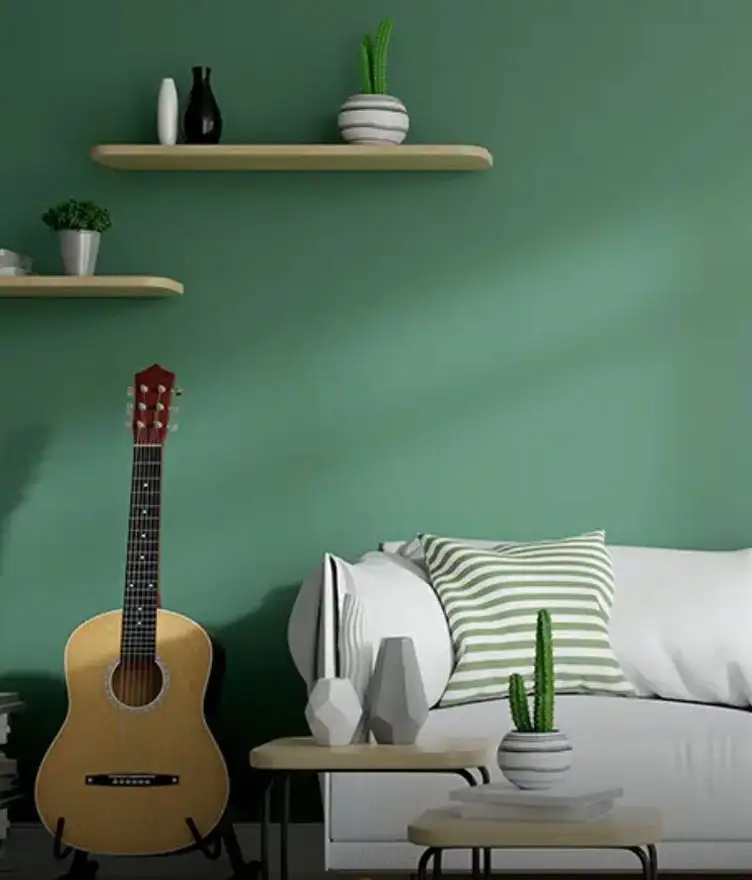
- Sage Green and Off White: Fresh without feeling too bright.
- Dusty Blue and Light Grey: Calm for bedrooms.
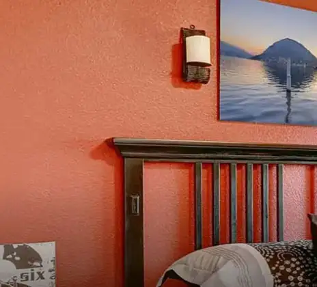
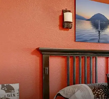
- Terracotta and Soft Beige: Warm with earthy finishes.
- Muted Peach and Ivory: Gentle for compact rooms.
Wall Colour Combination Ideas by Room: Bedroom, Hall, Living Room & More
Room function should guide colour placement. A calm colour combination inside room areas used for rest can differ from active shared spaces.
- Bedroom: Powder blue with warm white.
- Hall: Beige with muted green.
- Living Room: Off-white with terracotta.
- Dining Area: Cream with olive.
- Study: Light grey with muted blue.
Keep stronger shades limited in darker rooms.
Two & Three Colour Combination Basics
Two colours are often enough for a clean interior. Use one dominant shade and one accent for a simple colour combination in a wall plan. Three colours work when each has a clear role.
Avoid giving all three equal weight. Let one lead, another support it, and use the third sparingly so the palette stays connected.
Modern & Latest Wall Paint Colour Combination Trends 2026
2026 trends highlight greens, berry shades, neutrals, blues, greys, whites and yellow or gold accents. These suit homes seeking warmth and personality.
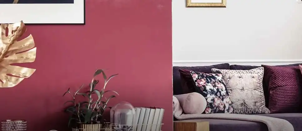
For a modern paint colour combination for wall surfaces, consider warm beige with sage, soft grey with deep blue, or off-white with a berry accent. Keep darker colours focused.
Common Wall Colour Combination Mistakes to Avoid
Even attractive colours can feel mismatched when light, placement or proportion is ignored.
- Choosing shades only from a digital screen.
- Using too many strong colours.
- Ignoring flooring and fixed furniture.
- Selecting dark accents without checking light.
- Repeating the same bold shade everywhere.
A successful design colour wall plan should look balanced in the actual room, not only on an inspiration image.
Nerolac Shade Card & Product Range Overview
The Nerolac colour catalogue currently features more than 1,500 colours across families such as red, orange, yellow, green, blue, beige, neutral, white, pink, cream and grey. Its interior wall paint range includes Luxury, Premium and Popular categories.
Use the shade card to shortlist combination wall colours, then compare physical samples before finalising. An on-screen shade may differ from the colour seen on a painted wall.
Book a Free Nerolac Colour Consultation
Choosing colours for several rooms can be easier with professional guidance. The Nerolac NxtGen Painting Service lists a free colour consultation after registration for a free site visit.
Use the consultation to discuss lighting, adjoining spaces, preferred mood and existing finishes before finalising a wall paint colour combination. Keep room photographs, flooring references and a few shortlisted shades ready so the discussion stays focused.
Unique Two Colour Combinations to Try
Experiment with these beautiful two colour combo and transform your space
Trending Colour Shades
Find the Perfect Colour Shades for you walls
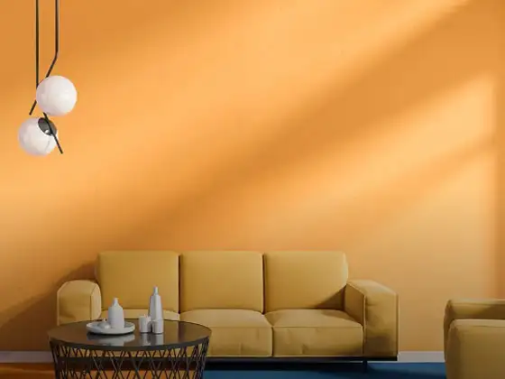
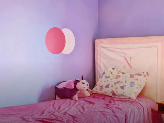
Products in this shade
Browse through our wide range of paints to find the one that accentuates your home's beauty
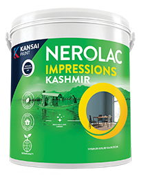
Impressions Kashmir
Nerolac Impressions Kashmir Luxury Emulsion is a superior quality 100% acrylic emulsion based interi...
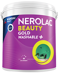
Beauty Gold Washable Plus
Nerolac Beauty Gold Washable Plus is an interior emulsion paint has a rich sheen finish, with highes...
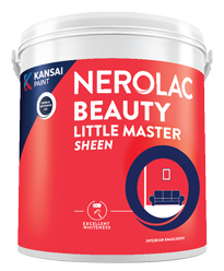
Beauty Little Master Sheen
Nerolac Beauty Little Master Sheen is an Economy Interior Wall Emulsion with very good sheen, smooth...
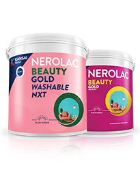
Beauty Gold washable and Beauty Gold Washable NXT
Nerolac Beauty Gold Washable paint has a soft sheen finish, with excellent stain-cleanability at an a...
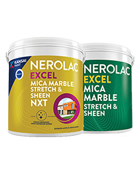
Neroalc Excel Mica Marble Strech Sheen & Mica Marble Stretch Sheen NXT
Nerolac Excel Mica marble stretch sheen Nxt & Mica Marble Strech Sheen is an extremely durable water...
FAQs
What is a good colour combination for a room?
A light neutral paired with a muted accent often works well because it creates contrast while remaining easy to coordinate with furniture.
What is the best wall colour combination for a home?
There is no single best pairing. Choose colours according to room size, daylight, flooring and furniture, while keeping adjoining spaces visually connected.
How do I design a wall colour combo that doesn’t clash?
Choose shades with compatible undertones, let one colour dominate, and test samples beside flooring, curtains and furniture before making your final decision.
What is trending in wall paint colour combinations for 2026?
Greens, berry shades, neutrals, blues, greys, whites and warm yellow or gold accents feature among the wall colour directions highlighted for 2026.
How Many colours should go into one wall colour combination?
Two colours are usually enough for a simple scheme. Three can work well when used clearly as a base, accent and supporting trim.
What is the difference between a wall colour combination and a wall colour scheme?
A combination usually refers to selected colours used together, while a colour scheme describes the broader planned palette across walls and surrounding elements.
Which rooms should I prioritise first when planning colours for a whole home?
Start with shared areas such as the living room and hall, then carry compatible undertones into bedrooms, dining spaces and other adjoining rooms.
How Many shades does Nerolac’s colour range offer?
The current online colour catalogue states that more than 1,500 colours are available, giving homeowners a broad selection across several colour families.
Is a bold wall colour combo a good idea for every room?
No. Bold colours work best where the room size, lighting and décor can support them. Smaller spaces may benefit from controlled accent placement.
How can I book a free Nerolac colour consultation for my home?
Sign up for a free site visit through the NxtGen Painting Service. The current service process lists a free colour consultation as the next step.
Need Professional Home Painting Services?
Nerolac also offers professional home painting services in Wall Colour Combination , from interior and exterior wall painting to protective exterior coatings that keep your walls looking new for years to come.


Find an Expert Painter Near You
Enjoy a holistic painting experience with Nerolac NxtGen Services
Create magic with our inspiring Two Colour Combinations!
-
Orange And Lilac Colour Combination
-
Red And Brown Colour Combination
-
Yellow And Blue Colour Combination
-
Yellow And Green Colour Combination
-
Yellow And Orange Colour Combination
-
Yellow And Red Colour Combinations
-
Orange And Brown Colour Combination
-
Orange And Gold Colour Combination
-
Orange And Grey Colour Combination
-
Orange And Cream Colour Combination
-
Orange And Peach Colour Combination
-
Orange and Red Colour Combination
-
Orange And Purple Colour Combination
-
Orange And Pink Colour Combination
-
Orange And White Colour Combination
-
Orange And Neutral Colour Combination
-
Orange And Beige Colour Combination
-
Orange And Violet Colour Combination
-
Orange And Blue Colour Combination
-
Orange And Green Colour Combination
Paint shop near you
Looking for paint shop near me? A Nerolac paint shop may be just down the street!
Nerolac paint shops are spread across India and offer the widest range of wall paint colours for all your painting needs big or small. Along with huge variety of wall paint and painting supplies you will find great service, expert advice and inspiration to bring your ideas and passion to life. We are committed to deliver high-quality paints and supplies to all customers including homeowners and professional painters or contractors. Visit a paint store nearby today!
-
Find a Paint Store Near Your Location
- or
Get in Touch
Looking for something else? Drop your query and we will contact you.
Latest Happenings in the Paint World
Get some inspiration from these trending articles
Popular Searches
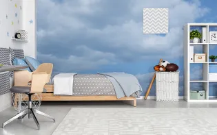
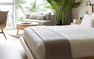
What’s Trending in Bedrooms
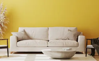
Explore Trending Living Room Ideas
- Living Room Colour Combination
- Modern Two Colour Combination for Living Room
- Wall Texture for Living Room
- Vastu Colours for Living Room
- Wall Texture Design for Living Room
- Living Room Paint Ideas
- Living Room Design Ideas
- Paint Colour Ideas for Living Room
- Living Room TV Wall Designs
- Green Living Room Walls
Kitchen Ideas People Love
Explore Trending Ceiling Ideas
Study Room Ideas in Demand
Explore Wall Paint Categories
Handpicked Colour Inspirations
- Accent Wall Design
- Bedroom Design Ideas
- Exterior Wall Colour Design Ideas
- Interior Wall Colour Design Ideas
- Kitchen Design Ideas
- Living Room Interior Design
- Geometric Wall Design Ideas
- Home Colour Combination Ideas
- Home Décor Ideas
- Mural Wall Paint Design Ideas
- Office Space Design Ideas
- Puja Room Design Ideas
- Texture Design Ideas
- Festival Painting Ideas
- Paint Colour Chart
- Wall Painting Designs
- Wood Wall Décor Ideas
- Mural Wall Paint Design
- Hall Design Ideas
- Gate Colour Design
- Exterior Wall Colour Design
- Door Colour Design Ideas
-
 Get in Touch
 -
Store Locator
-
 Download App
×
Get in Touch
Looking for something else? Drop your query and we will contact you.

