5 Shades of Blue colours to Enhance Your Home Décor
5 Shades of Blue colours to Enhance Your Home Décor
Published: 30 Jul 2018 |
Modified: 22 Jun 2026
HomeWall Paint
5 Shades of Blue colours to Enhance Your Home Décor
Quick Summary
Blue colour shades are among the most popular choices for home interiors due to their calming, refreshing, and versatile nature. From luxurious Bottle Blue and vibrant Deep Turquoise to soothing Denim Blue, elegant Blue Sapphire, and balanced Rainstorm Blue, each shade can enhance different areas of your home while creating a stylish and welcoming atmosphere.
Create Your Dream Home With Our Painting Experts
Fill the form below to book a free site evaluation by Nerolac Nxtgen painting Services expert
TABLE OF CONTENTS
Colours are an essential part of our life. Imagine a world devoid of Colour It’s practically unimaginable right? Well, colours have the power to affect our moods, eating habits, and even who we date. This is why, some people choose their house paint colour very carefully. As per a survey conducted by YouGov, blue is the most popular colour in 10 countries across four continents including China. You are probably not surprised by the results because you too have a couple of colour shades of blue in your wardrobe or on walls in your home. The blue colour is associated with feelings of tranquillity, and serenity. When used in homes it is known to give the viewer a reassuring effect.
Let’s Take a Look at Some Tones of Blue Colour to Bring About Tranquility in your Home :
Let’s Take a Look at Some Tones of Blue Colour to Bring About Tranquility in your Home
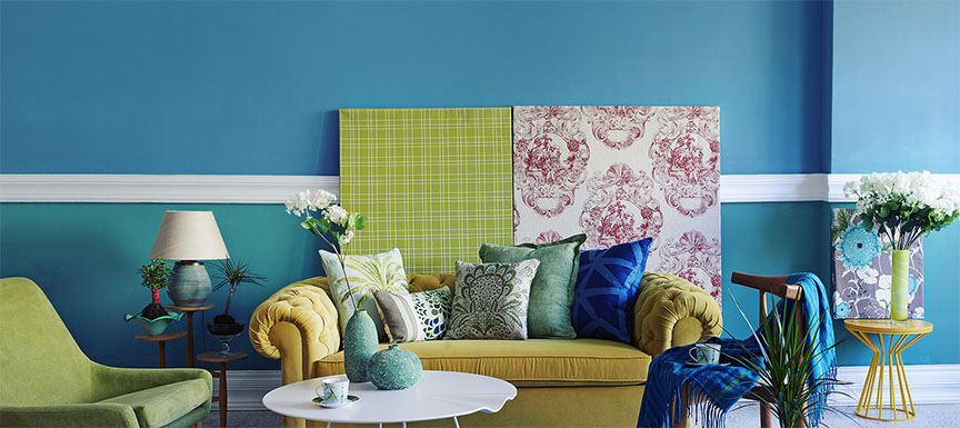
Bottle Blue Colour
When bottle blue or any other tone of blue is paired with black, it can give depth to your home decor. The neutrality of black gives a new definition to the blue colour. Blue as a house paint colour can add a sense of calm in your home. Combine it with black to make the combo look classy and luxurious.
Bottle Blue Colour
Deep Turquoise Colour
Turquoise is a combination of blue and green colour. Both are common colours found in nature. The sky and seas are blue, whereas the vegetation is majorly green. Turquoise can therefore give you an environment that conveys peace and tranquility along with added freshness when associated with a large incidence of natural light.
The combination of off-white and denim blue will work very well in a bedroom. If it is a kid’s bedroom, you can opt for bright yellow along with denim blue to bring vibrancy in the room. The mixture of these two colours works as an extra animation in the environment, making it more relaxed and fun.
Denim Blue Colour
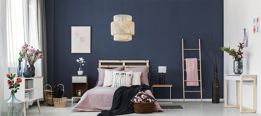
Blue Sapphire Colour
Lighten up your home environment with colour shades of blue sapphire with white or off-white colour. This can work well in those parts of the house where you want more light. This colour combination guarantees a light environment that brings in a sense of tranquility and calm to those at home. Opr for this colour combination where there is a lot of natural light, maybe in a room that has a large window.
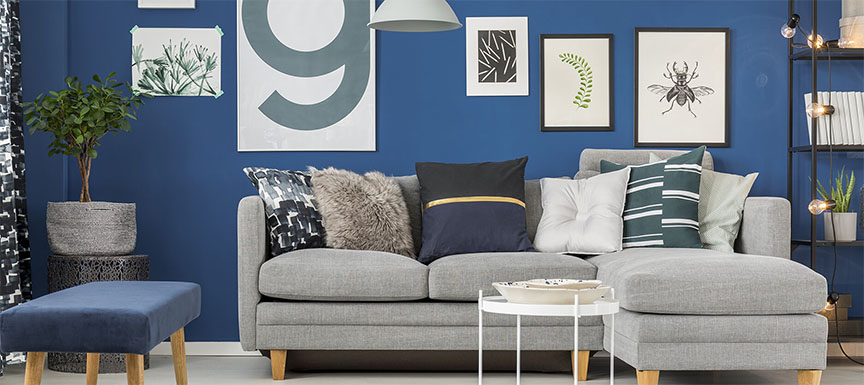
Combine rainstorm blue with red to bring a renewed sense of balance in your home. Blue is known to be a cold colour, whereas red is on the other end of the spectrum and is known as a hot Colour The presence of blue and red can evoke feelings of harmony and strength. Be mindful to not overdo the red, maintaining balance between the two shades is key.
Rainstorm Blue Colour
While these were just a few shades of blue, we provide a wide variety of blue tones to our customers. And, our consultants can help you pick the right colour shades for your home. Reach out to us today to colour your home intelligently.
Key Takeaways
Blue colours are associated with calmness, serenity, and relaxation.
Different shades of blue create unique moods and interior styles.
Bottle Blue works well for luxurious and sophisticated spaces.
Turquoise adds freshness and a nature-inspired aesthetic.
Denim Blue creates a cozy and welcoming bedroom environment.
Blue shades pair beautifully with white, black, yellow, red, and neutral colours.
Nerolac Paints, a leading paint company in India offers a wide range of wall paint colours & painting services & solutions for homes & offices.
Best Colour Combination For Walls To Elevate Your Home Interiors
Looking for something else? Drop your query and we will contact you.
FAQs
Which blue colour shade is best for small rooms?
+
Lighter blue shades such as Blue Sapphire, Sky Blue, and Soft Turquoise are ideal for small rooms because they reflect more light and create an illusion of spaciousness. These colours help make compact spaces feel brighter, more open, and airy.
What colours pair best with blue walls in home interiors?
+
Blue walls pair well with white, beige, grey, natural wood tones, gold accents, and soft yellows. Darker blues also work beautifully with metallic finishes and warm neutrals to create a balanced and sophisticated interior design.
Is blue a good colour choice according to colour psychology?
+
Yes. Blue is widely associated with calmness, trust, focus, and relaxation. It is often used in bedrooms, living rooms, study areas, and home offices because it promotes mental clarity and creates a peaceful environment.
Can dark blue wall colours work in modern homes?
+
Absolutely. Dark blue shades such as navy, sapphire, and bottle blue have become popular in contemporary interiors. When balanced with lighter furniture, natural lighting, and metallic accents, dark blue walls can create a luxurious and modern look.
Which rooms are best suited for blue wall colours?
+
Blue wall colours work exceptionally well in bedrooms, living rooms, study rooms, guest rooms, reading corners, and home offices. Lighter blues are ideal for bathrooms and small spaces, while deeper blues suit larger rooms and feature walls.
How can I decorate a room with blue walls?
+
To decorate a room with blue walls, incorporate contrasting textures and colours through furniture, rugs, curtains, artwork, and decorative accessories. White furniture, wooden accents, indoor plants, and metallic décor elements pair particularly well with blue interiors.
You will be redirected to a webpage/domain hosted by a third-party service provider (“Service Provider”) for limited purposes related to your interaction with Kansai Nerolac Paints.
Please note that while the Company’s logo may appear on the Service Provider’s page, it is not a Company-controlled page and is operated independently by the Service Provider.
On the Service Provider’s page, you will be provided with options for submitting your data, including uploading documents or providing information through various means.
While these options are enabled through a service provider, the Company does not endorse any specific option, and you are requested to choose independently and at your sole discretion.
Any actions taken on the Service Provider’s page, including the submission of data, shall be a matter between you and the Service Provider, and the Company will not be a party to this relationship.
You are responsible for the consent you provide on the Service Provider’s page, and any acceptance of terms beyond the purpose of use by the Company shall be deemed a contract between you and the Service Provider.
By providing your data through any of the available modes, you agree to share and disclose your information with the Company and the Service Provider for the purposes outlined above.
The Company may process, retain, and use the information as per its discretion.
For any modification, correction or erasure of the provided information, please raise you request by sending an email to dataprivacy@nerolac.com
Consent
In this Consent the following capitalized terms shall have the meanings assigned to them hereunder: By 'personal information' we mean names, addresses, email addresses, job experience and history and any other personal information you voluntarily provide about you and your skills and interests .“Data” shall mean all personal data, transactional data, Derivative Data, any other information, etc., in relation to me/us, including the following in relation to past Products:
By providing the consent you agree to providing your personal data which can be used by KNPL for the purposes mentioned hereafter and confirm that this consent is being given freely by you without any pressure, influence, or coercion from any other person, and that the consent is informed and unconditional.
Information submitted while making any application or request to the KNPL for any Product. Collection of information from personal correspondence (emails, letters) or third-party communications related to user activities on the website. Information may be used to offer products/services from the company and joint sponsors. Communicate with customers about orders, products, services, and promotional offers. Enhance and personalize the shopping and viewing experience on the website.
Additional information collected during transactions includes billing address, payment instrument details, and tracking information, handling orders, delivering products/services, and processing payments.
Information from messages or feedback provided by users is collected and retained for dispute resolution and customer support.
any information obtained/received by KNPL from any other source.
Collection of demographic and other data for advertising and promotional purposes. It can be used to show relevant content and customer reviews, suggest merchandise and services of interest, Improve the website and prevent/detect fraud or abuse, enable third parties to perform technical or logistical functions on behalf of the company.
We may share your personal information with vendors or service providers such as companies who help us with database administration. We may also share your personal information with other Kansai Nerolac companies in other countries where data privacy laws may not be equivalent to those in force in India.
any Derivative Data.
DEFINITIONS
“Derivative Data” shall mean any insights, analytics, performance metrics, behavioural projections, customer profiling, and reports (prepared by the Company internally or by third parties) that are generated through the analysis of data collected from customers, sales transactions, market research, and other relevant sources. This includes, but is not limited to, colour preference trends, purchase frequency, customer demographics, product usage patterns, and feedback analysis. Derivative Data may also include predictive analytics regarding future buying behaviour, inventory optimization, and market demand forecasts, whether derived from the information collected from customers or in combination with any other information sourced from external databases, market research firms, or other entities, whether by the Company or other persons. The process of arriving at and generating such Derivative Data through any of the above sub-processes/methods shall be referred to as “Derivation”.
“Specified Purposes” shall collectively mean the collection of personal data for various essential functions, including customer identification and verification to ensure eligibility for services or promotions, processing and fulfilling orders accurately, and enhancing customer engagement through tailored marketing campaigns and personalized offers. The data will also be utilized for monitoring sales trends and inventory management to optimize stock availability, providing customer support and service to address inquiries and resolve issues, and gathering feedback for product improvement and innovation. Additionally, the company will conduct market research and analysis to understand trends and customer preferences, implement risk assessment measures to detect and prevent fraud, and ensure compliance with legal obligations, including data protection and consumer rights. Personal data will support the management of loyalty programs and promotions, enhance the digital experience on the website through personalization, and facilitate data sharing with third-party partners for operational efficiency. Furthermore, the company will collect data for sustainability and environmental reporting, engage in necessary legal and regulatory compliance activities, and utilize analytics to monitor website performance and overall business effectiveness. aggregators, payment gateways, payments systems, performance of any legal and/or regulatory obligations, filings, reporting, etc., whether any of these are undertaken internally or through any Processing Entity.
"Processing” shall mean any operation or set of operations performed on Data, and includes operations such as collection, recording, organisation, structuring, storage, adaptation, retrieval, use, alignment or combination, indexing, sharing, disclosure by transmission, dissemination or otherwise making available, restriction, erasure or destruction and the term “Process” and “Processed” shall be construed accordingly.
“Processing Entity” shall mean any third party company(ies), bureau(s), consultant(s), vendor(s), agent(s), fintech entity(ies), co-brand entity(ies)/partner(s), distributor(s), selling/ marketing agent(s), any partner(s), collaborator(s), merchant(s), aggregator(s), lead generator(s), sourcing entity(ies), client(s), customer(s) or other person(s) with whom the KNPL has any direct or indirect arrangement or tie-up or contract for any products or services/ intermediary(ies) in any ecosystem of which KNPL is a part, and such Processing Entities’ service providers, consultants, vendors, etc.
“Product(s)” shall mean all types of paint and related products offered by the Company, including but not limited to topcoat, under coat, interior and exterior paints, primers, sealants, varnishes, specialty coatings, tools and ancillaries, wood finishes and construction chemicals. This definition encompasses products sold directly through the Company’s online platform, as well as those distributed through authorized dealers, retailers, contractors or other third-party vendors. The Products may also include complementary items such as paintbrushes, rollers, paint trays, and other application tools, as well as services related to colour consultation, custom mixing, and professional painting services. The Products that have been applied for, requested, or purchased by me/us (including where the initiation of any transaction is not directly with the Company but is with a relevant distributor or retailer) shall be referred to as “Requested Products,” while any Products (including future offerings) other than the Requested Products shall be referred to as “Other Products.”
CONSENT
I hereby authorize Kansai Nerolac Paints Limited (“Company”) to process my personal data (“Data”) or any part thereof for any of the Specified Purposes:
SPECIFIED PURPOSE
In connection with the assessment or processing of my application/request for any Requested Product, or to take any steps prior to entering into any contract, or to determine eligibility for the Requested Products, or in connection with the execution or furtherance of a contract/transaction, including performance by the Company or me/us or any other intermediaries, of any contract or part thereof, or any regulatory or legal obligations in relation to any Requested Product availed or in pursuance thereof;
In connection with the derivation and sharing of any derivative data (between the Company and any processing entity) related to the purposes.
In connection with contacting me, establishing communication, and monitoring my interactions through email, postal address, telephone, social media, notifications, and other electronic.
PURPOSES
I authorize the Processing Entities to process my Data or any part thereof for any of the Specified Purposes.
For the purposes covered above, it shall be deemed that I have furnished all the Data separately under this consent.
I confirm that the Data provided and that will be provided by me from time to time is accurate, updated, and complete in all respects.
I agree that the consents/authorizations for the Specified Purposes shall survive beyond the validity of such application/tenure of the Product/consummation of any transaction, to the extent any of the Specified Purposes survive.
The consents given or denied under this document do not limit any other consents obtained or given.
I acknowledge and confirm that all the Specified Purposes are lawful purposes.
I understand and agree that the processing of Data is necessary for the Specified Purposes.
I acknowledge that the request for consent or my giving of this consent does not limit or prejudice any grounds or bases that the Company or any Processing Entities may have for processing the Data without consent. This consent is in addition to any such grounds or bases. For clarity, even if this consent is withdrawn, the Company and/or the Processing Entities may continue to process the Data for the performance of contracts related to the Requested Products or for taking any steps pursuant to the contract or for protecting the legitimate interests of the Company.
I acknowledge that since this consent is the basis for the Company to enter a contract related to the Requested Products, it is necessary to process the Data for the purposes of the contract. Withdrawal of this consent will not prevent the Company and/or Processing Entities from continuing to process the Data for the purposes of the contract.


 Get in Touch
 Download App