

Two Colour Combination For Interior Walls
Two Colour Combination for Interior Walls: Home Interior Colour Schemes
A room is never seen the way a paint chip is seen. Interior walls are viewed at close range, under artificial light for half the day, and always framed by furniture, flooring and fabric. A single colour applied wall to wall leaves the eye with nothing to rest against; the space appears as a uniform box, and any architectural detail it possesses quietly disappears. This is why the right interior colour combination matters as much as the shade itself.
Two colours solve this with very little effort. One tone holds the majority of the wall area and sets the temperature of the room; the second creates a stopping point, which is what gives a space its sense of scale. A thoughtfully chosen interior colour combination can make a narrow room feel wider by lightening the far wall, or lower an uncomfortably high ceiling by carrying a deeper shade across it. Whether you are planning a house interior colour combination for a compact apartment or a complete colour scheme for home interiors, the pairings below cover living rooms, bedrooms, kitchens and passages, chosen with Indian light, climate and room use in mind.
Create Your Dream Home With Our Painting Experts
Fill the form below to book a free site evaluation by Nerolac Nxtgen painting Services expert
How to Choose an Interior Colour Combination for Your Home
The choice is easier when treated as a sequence of decisions rather than a single task. Work outward from what is already fixed in the room before selecting anything new.
- Assess the light: North-facing rooms receive cooler, steadier light and can hold warm shades comfortably; south and west rooms take strong afternoon sun that will visually lift every tone by a step.
- Fix the proportion: A ratio of roughly 70:30 between the dominant and secondary shade is dependable. Splitting a room evenly between two strong colours rarely resolves well.
- Match finish to function: Matt finishes flatter living rooms; washable sheens are the sensible choice for kitchens, passages and children's spaces.
- Test on site: Paint a large patch on the actual wall and observe it under both daylight and evening lighting before confirming.
Best Interior Colour Schemes for Indian Homes
Indian homes place particular demands on paint. Compact urban layouts benefit from lighter dominant fields that keep rooms open, while larger independent houses can carry saturation more freely. Humidity along the coast favours washable, moisture-tolerant finishes, and dust levels in most cities reward tones that do not show settlement quickly.
Culturally, warmth remains central. Ivory, cream and soft ochre continue to anchor the most widely used interior color schemes, usually paired with a richer accent on a single wall. Puja rooms need warm neutrals and soft yellows; living rooms have moved steadily toward greys and greens with a warm secondary tone to prevent coldness.
Colour Scheme Ideas for Home Interior Walls
The four pairings below cover a wide range of room types, from expressive to restrained.
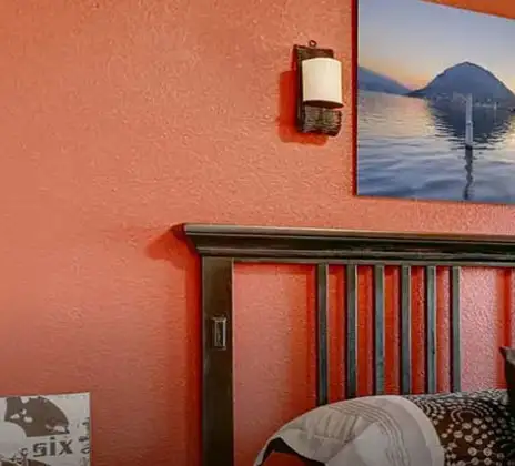
Orange and Purple Interior Colour Combination
A complementary-adjacent pairing with genuine energy. Orange provides warmth and forward presence; purple supplies depth and keeps the scheme from becoming merely bright.
Features and Why It Works Indoors
Used in a muted register, terracotta orange with a dusty purple, the combination feels classy rather than loud. Purple holds its depth under artificial light, where many blues flatten, making this a strong color scheme for home interior spaces used mainly in the evening, such as dining areas and lounges.
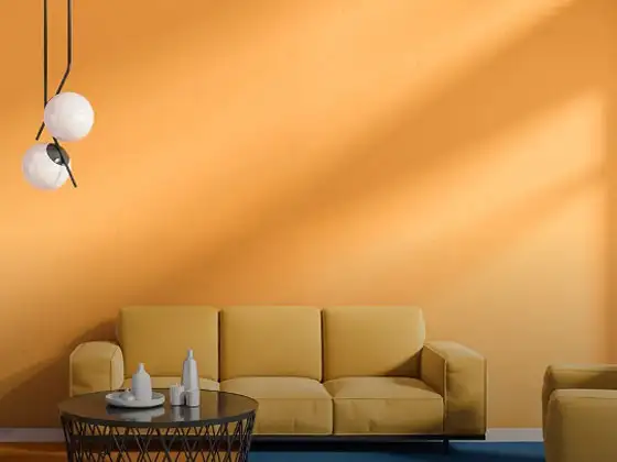
Yellow and White Interior Colour Schemes
A classic, high-reflectance pairing. Yellow carries the dominant field while white frames, contains and lightens.
Features and Why It Works Indoors
Yellow returns light into rooms that receive limited daylight, which makes it valuable for internal corridors and rooms overlooked by neighbouring buildings. White ceilings stop the warmth from feeling enclosing, and the pairing is forgiving on uneven plaster.
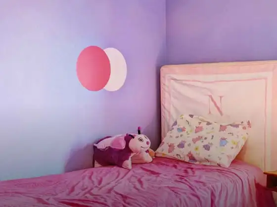
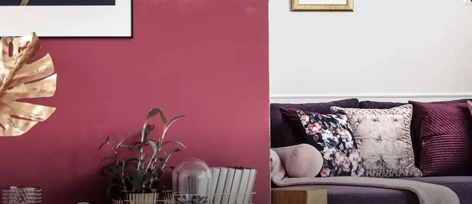
Red and Pink Color Scheme For Home Interior
An analogous scheme built from neighbouring hues, producing a soft gradient rather than a sharp contrast.
Features and Why It Works Indoors
Because the two shades fall close on the colour wheel, transitions stay gentle, and the room is not visually divided into blocks. A deep red on one wall with softer pink elsewhere creates warmth without the heaviness that a single saturated red would impose.
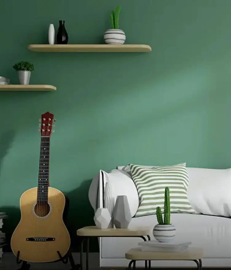
Grey and Green Home Interior Colour Combinations
The most contemporary of the four. Grey does the structural work; green introduces a natural, restful accent.
Features and Why It Works Indoors
Green is restful at close viewing distance, which suits bedrooms and study areas, while grey keeps the scheme disciplined. This is among the most adaptable home interior colour combinations available, since it works equally with timber, cane and metal finishes.
Home Interior Two Colour Combinations, Room by Room
Different rooms are used at different times of day and for different lengths of time, which should influence both tone and finish. The table below maps the four pairings to suitable spaces.
|
Combination |
Best Suited Room |
Dominant Colour |
Recommended Finish |
|
Orange + Purple |
Dining room, lounge |
Orange |
Matt |
|
Yellow + White |
Passages, kitchens |
Yellow |
Washable sheen |
|
Red + Pink |
Bedroom, child's room |
Pink |
Matt |
|
Grey + Green |
Living room, study |
Grey |
Soft sheen |
Two Colour Combinations for Interior Rooms
Beyond the choice of shade, placement determines the result. In bedrooms, the headboard wall is the natural home for the secondary tone, since it falls behind you rather than in your line of sight. In living rooms, the wall carrying the television or a display unit absorbs a deeper shade well. Kitchens benefit from a lighter dominant colour with the accent restricted to a single stretch of wall. Careful attention to placement is what turns a suitable colour combination for interior walls into a room that feels deliberately composed.
Nerolac Paint Recommendations for Interior Walls
The following Nerolac shade pairings translate the combinations above into specific, ready-to-use options:
- Tulip Field + Purple Tourmaline: An orange and purple scheme, rich and evening-friendly
- Saffron Pie + Windchill: A warm yellow with a clean neutral, bright without glare
- Red Dragonfruit + Sweet William: A red and pink gradient, softened for bedrooms
- Stunning Grey + Pistachio Nut: A calm, contemporary grey and green pairing
Each of these functions as a complete house interior colour combination, requiring only a matching ceiling tone to finish the scheme.
Book a Free Nerolac Colour Consultation
Selecting between shortlisted shades is considerably easier with professional assessment on site. You can book a free site visit and expert colour consultation through Nerolac NXTGen Painting Services.
NXTGen Home Painting Services offers:
- Free colour consultancy
- Eco-friendly products
- Trained and certified painters
- Furniture and floor masking
- Mechanised tools
Visit the Nerolac website or contact your nearest Nerolac dealer to schedule a visit.
Unique Two Colour Combinations to Try
Experiment with these beautiful two colour combo and transform your space
Trending Colour Shades
Find the Perfect Colour Shades for you walls
Products in this shade
Browse through our wide range of paints to find the one that accentuates your home's beauty
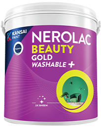
Beauty Gold Washable Plus
Nerolac Beauty Gold Washable Plus is an interior emulsion paint has a rich sheen finish, with highes...
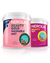
Beauty Gold washable and Beauty Gold Washable NXT
Nerolac Beauty Gold Washable paint has a soft sheen finish, with excellent stain-cleanability at an a...
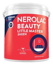
Beauty Little Master Sheen
Nerolac Beauty Little Master Sheen is an Economy Interior Wall Emulsion with very good sheen, smooth...
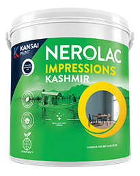
Impressions Kashmir
Nerolac Impressions Kashmir Luxury Emulsion is a superior quality 100% acrylic emulsion based interi...
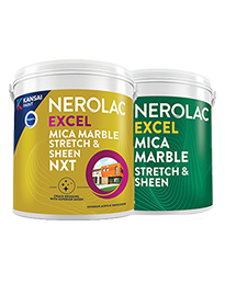
Neroalc Excel Mica Marble Strech Sheen & Mica Marble Stretch Sheen NXT
Nerolac Excel Mica marble stretch sheen Nxt & Mica Marble Strech Sheen is an extremely durable water...
FAQs
What is a good interior colour combination for a home?
Grey with green is the most adaptable option, suiting living rooms, studies and bedrooms without dating quickly.
What are popular interior color schemes right now?
Muted neutrals paired with a single natural accent, greens, clays and soft ochres, are currently the most widely chosen.
What is a good colour scheme for a home interior?
A dominant light tone across most walls with one deeper accent wall, in roughly a 70:30 proportion, works in almost any layout.
What are good home interior colour combinations?
Orange with purple, yellow with white, red with pink, and grey with green cover expressive and restrained preferences alike.
What is the best colour combination for interior walls?
Yellow with white is the safest all-round choice, particularly in rooms that receive limited natural light.
What is a good house interior colour combination?
Cream or ivory with a warm accent shade remains the most dependable scheme for Indian homes.
How do I choose a wall interior color combination?
Begin with fixed elements such as flooring and furniture, assess the room's light, then test a large patch before confirming.
What is a good interior room colour combination?
Red with pink suits bedrooms, while grey with green is better for living rooms and study spaces.
Which Nerolac paint finish works best for interior walls?
Matt finishes suit bedrooms and living rooms, while washable sheens are preferable for kitchens and passages.
How can I book a free Nerolac colour consultation for my interior walls?
Book a free site visit through Nerolac NXTGen Painting Services on the Nerolac website, or contact an authorised Nerolac dealer in your city.
Need Professional Home Painting Services?
Nerolac also offers professional home painting services in Two Colour Combination For Interior Walls , from interior and exterior wall painting to protective exterior coatings that keep your walls looking new for years to come.


Find an Expert Painter Near You
Enjoy a holistic painting experience with Nerolac NxtGen Services
Create magic with our inspiring Two Colour Combinations!
-
White And Pink Colour Combination
-
White And Purple Colour Combination
-
White And Lilac Colour Combination
-
White And Peach Colour Combination
-
White And Cream Colour Combination
-
White And Grey Colour Combination
-
White And Gold Colour Combination
-
White And Brown Colour Combination
-
Pink And Red Colour Combinations
-
Pink And Orange Colour Combination
-
Pink And Yellow Colour Combination
-
Pink And Green Colour Combination
-
Pink And Blue Colour Combination
-
Pink And Violet Colour Combination
-
Pink And Beige Colour Combination
-
Pink And Neutral Colour Combination
-
Pink And White Colour Combination
-
Pink And Purple Colour Combination
-
Pink And Lilac Colour Combination
-
Pink And Peach Colour Combination
Paint shop near you
Looking for paint shop near me? A Nerolac paint shop may be just down the street!
Nerolac paint shops are spread across India and offer the widest range of wall paint colours for all your painting needs big or small. Along with huge variety of wall paint and painting supplies you will find great service, expert advice and inspiration to bring your ideas and passion to life. We are committed to deliver high-quality paints and supplies to all customers including homeowners and professional painters or contractors. Visit a paint store nearby today!
-
Find a Paint Store Near Your Location
- or
Get in Touch
Looking for something else? Drop your query and we will contact you.
Latest Happenings in the Paint World
Get some inspiration from these trending articles


Popular Searches
What’s Trending in Bedrooms
Explore Trending Living Room Ideas
- Living Room Colour Combination
- Modern Two Colour Combination for Living Room
- Wall Texture for Living Room
- Vastu Colours for Living Room
- Wall Texture Design for Living Room
- Living Room Paint Ideas
- Living Room Design Ideas
- Paint Colour Ideas for Living Room
- Living Room TV Wall Designs
- Green Living Room Walls
Kitchen Ideas People Love
Explore Trending Ceiling Ideas
Study Room Ideas in Demand
Explore Wall Paint Categories
Handpicked Colour Inspirations
- Accent Wall Design
- Bedroom Design Ideas
- Exterior Wall Colour Design Ideas
- Interior Wall Colour Design Ideas
- Kitchen Design Ideas
- Living Room Interior Design
- Geometric Wall Design Ideas
- Home Colour Combination Ideas
- Home Décor Ideas
- Mural Wall Paint Design Ideas
- Office Space Design Ideas
- Puja Room Design Ideas
- Texture Design Ideas
- Festival Painting Ideas
- Paint Colour Chart
- Wall Painting Designs
- Wood Wall Décor Ideas
- Mural Wall Paint Design
- Hall Design Ideas
- Gate Colour Design
- Exterior Wall Colour Design
- Door Colour Design Ideas
-
 Get in Touch
-
Store Locator
-
 Download App
×
Get in Touch
Looking for something else? Drop your query and we will contact you.

