

Neutral Colour
Discover neutral colour shades to add a dynamic touch to your space.
Explore 16 Trending Neutral Colour Combination for Walls
Products in this shade & Palette of Neutral Colour
Browse through our wide range of paints to find the one that accentuates your home's beauty
Trending Colour Shades
Find the Perfect Colour Shades for you walls


Find an Expert Painter Near You
Enjoy a holistic painting experience with Nerolac NxtGen Services
About Neutral Colour
Neutral colors, a versatile and timeless palette, encompass a range of muted hues such as beige, gray, and white, fostering an aesthetic of understated elegance and flexibility. These colors serve as a backdrop, allowing other shades to shine while creating a harmonious and balanced visual appeal. Neutral tones, often associated with simplicity and sophistication, are the chameleons of design, seamlessly adapting to diverse styles and settings. Whether adorning interiors with a calming ambiance or providing a clean canvas for fashion, neutral colors form the foundation of aesthetic cohesion. Their ability to transcend passing trends and blend effortlessly into various color schemes makes neutrals a perennial choice for those seeking a refined, enduring, and adaptable color palette.
Stunning Neutral Colour Designs, Shades & Combinations for Your Home
If you want walls that feel calm today and still look fresh five years from now, neutrals are an easy choice. The neutral colour family creates rooms that breathe. It lets furniture, art, and everyday life stand out without noise. Open a window on a warm afternoon and see how these tones soften the light. Close the curtains at night and you get the same steady comfort.
Neutrals are not only white and cream. There are soft ivories, warm beiges, quiet greys, stone-inspired tones, and wall putty shades that sit right between warm and cool. This range suits Indian homes well. In a compact flat, pale neutrals make rooms feel bigger. In a large house, deeper tan and taupe add grounded warmth. Families also love that neutral walls match changing décor. You can switch cushions in winter, add a bright rug for summer, or bring in a new chair without repainting.
Designers use neutrals for flow. A living room in warm beige that leads to a dining space in light taupe feels connected. Bedrooms in ivory with a gentle grey headboard wall look relaxed. Kitchens stay tidy when cabinets sit against a soft stone shade. With the right neutral colour palette, the same home can look modern, classic, or earthy just by changing textures and accessories.
Why Neutral Colour Brings Calmness & Balance to Interiors?
Colours shape mood. Neutrals steady it. Warm beiges make spaces welcoming. Cool greys bring order. Ivory and cream give clarity without the glare of a pure white wall. In busy city homes packed with devices and furniture, these tones act like deep breaths. You walk in, and the rush slows.
There is also a practical reason. Neutral colour shades reflect light evenly. So a room gets a soft glow instead of a hard contrast. This helps older family members who prefer gentle light. It also helps children study without harsh reflections on screens. The same effect is helpful for video calls where the wall colour should not fight with skin tones.
Neutrals are problem solvers. If a living room has many wood tones, a balanced taupe ties them together. If a bedroom faces the west and gets warm light, a cooler grey beige stops the room from looking yellow at sunset. Kitchens that need a clean and easy mood can use an ivory colour that hides minor marks better than white. The best part is freedom. With neutral shades of colour, you can change curtains, art, or cushions throughout the year and the walls will still work.
Explore Neutral Colour Shades with Expert Insights
The neutral family is wide, and each group behaves differently in Indian light. Here is a simple guide to neutral colour in different shades and where they shine.
Ivory and Off White Colour:
Clean and bright, without the harshness of pure white. Use in compact rooms, corridors, and study nooks. Works beautifully with sheesham, teak, and cane. Pair with cotton curtains for a hotel-like feel. Nerolac impressions keeps these light shades crisp and pleasant to live with.
Cream and Warm Beige Colour:
These are comfort colours. A cream wall with a beige sofa gives a friendly living room. Add brass lamps, indoor plants, and a jute rug for a complete look. If you want an even finish that looks polished under both sunlight and warm lamps, Nerolac Beauty Smooth Finish delivers.
Taupe and Greige Colour:
Taupe sits between brown and grey. Greige sits between grey and beige. These different neutral colour shades are perfect for homes with mixed furniture tones. They reduce visual clutter and make the room look designed without much effort.
Grey and Stone Colour:
Cool greys look smart in city apartments. Stone-inspired shades feel natural in homes with exposed brick, Kota flooring, or black metal details. Use one darker grey on a single wall and lighter greys around it for depth.
Putty and Mushroom Colour:
These quiet mid-tones look modern and photograph well. They are good choices for TV walls, headboard walls, and spaces with statement art.
With Nerolac Impressions, you get a low odour, family-friendly interior paint that keeps neutral tones luminous. Beauty Smooth Finish gives the smoothness you want on elegant walls, especially in pale shades where unevenness can show.
Best Neutral Wall Design Ideas for Every Room
Living Room Wall Design Ideas:
Pick a warm beige for three walls and a taupe feature wall behind the sofa. Add a wooden centre table, cotton cushions, and a plant. The space will feel friendly and balanced. If the room is small, flip the plan to ivory walls and keep the taupe only on a narrow TV panel.
Bedroom Wall Design Ideas:
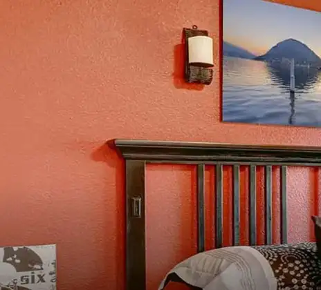
For sleep, the eye needs rest. Choose ivory for most surfaces and a soft grey beige for the headboard wall. Linen bedsheets in white or sand look calm against this backdrop. A rug in natural jute connects the room without crowding the floor.
Dining Room Wall Design Ideas:
Tan or mushroom tones help food and crockery look rich. Keep the ceiling white and add warm pendant lights. If you want a gentle sparkle, paint the niche or a narrow band with Impressions Metallic Finish in a champagne tint.
Kitchen Wall Design Ideas:
Ivory walls with stone-inspired backsplash tiles keep the kitchen bright. If cabinets are white, use a light greige on the walls to avoid a clinical look. Stainless steel and black hardware sit well with this set.
Kids’ Room Wall Design Ideas:
Use cream on walls and add colour through bedding and art. This keeps the room fresh even as tastes change. A soft putty wall behind the study desk limits distractions during study hours.
Puja or Meditation Corner:
Calm stone or sand shades create a clean base for brass diyas and flowers. Use soft light rather than intense cool light.
Exterior Wall Design Ideas:
For a timeless façade, use light stone or beige with white bands and a dark wooden door. In coastal or high pollution areas, Nerolac Excel Total helps the surface stay clean and colour fast across seasons.
When a space needs a small moment of drama without colour, Impressions Metallic Finish in soft silver or light gold adds a refined sheen to cornices, bands, or wall panels. This is an easy way to add interest while staying within shades in neutral colour.
Neutral Colour Combinations & Contrasts That Work Best
The right neutral colour combination can make a room look complete with very little décor.
Neutral with White:
Ivory walls, white trims, and pale curtains are classic. The room looks clean and bigger. Add a wood or rattan piece for warmth.
Neutral with Blue:
A favourite in blue colour schemes. Pair soft beige with navy cushions or a blue rug. In bedrooms, use light grey walls with powder blue bedding. The effect is airy and coastal without feeling theme-heavy.
Neutral with Black Accents:
Use black sparingly through lamps, frames, and cabinet handles. It sharpens the edges and makes the palette look modern.
Neutral with Green:
Plants love a neutral backdrop. Taupe walls with indoor greens and terracotta pots create a restful urban courtyard mood.
Two Neutrals Together:
Combine a mid-tone taupe feature wall with light cream around it. The eye reads depth even when the colours are close. For perfectly crisp borders and a fine neutral colour contrast, Impressions Ultra HD helps maintain precise edges and solid coverage.
Keep in mind that contrasts do not always mean dark against light. A matte greige wall paired with a satin ivory band also reads as a contrast because of the finish. This trick is useful when you want sophistication without firm colour shifts.
How to Make & Create Neutral Colour for Your Walls?
People often ask how to make neutral colour shades for a specific room. The answer is to start with the base undertone. Decide if you want warm or cool. Warm neutrals usually come from yellow, red, or brown tints. Cool neutrals lean on blue, green, or black tints.
Wondering how do you make neutral colour that matches the sofa or floor? Paint three sample squares on white chart paper and tape them to the wall. Try a warm beige, a balanced taupe, and a cool grey in the same depth. Watch them in daylight and at night. You will see how floors, furniture, and curtains influence the final read. If a colour looks yellow at sunset, pick the cooler option. If a colour looks flat under cool lamps, add a touch of warm tint.
For a digital test, use the Nerolac Colour Palette Tools. Upload a photo of the room and try closed shades. Save two or three picks and compare. This is the easiest way to answer how to create neutral colour that fits your home without wasting paint.
Neutral Texture & Accent Wall Designs
Textures bring depth to neutrals. They create interest without moving away from calm.
Stone Wash Effect: Looks natural in dining spaces, entry corridors, and balconies. Works with Kota, granite, or wooden floors. Choose a mid beige base with lighter strokes on top.
Brushed Metallic Neutral: A soft sheen in champagne or pearl adds elegance to a niche or a headboard panel. It moves with light and photographs well.
Concrete Inspired Grey: Modern and urban. Use on one wall behind the TV or in a study. Pair with black lamps and oak shelves. Keep the remaining walls light.
Sponged Ivory: A very gentle pattern for smaller rooms. It breaks monotony while keeping the space bright.
The Impressions Ideaz range includes trained application methods so patterns look even and last longer. When used with different neutral colour shades, these finishes give that designer feel while staying subtle.
Types of Neutral Colour Shades for Modern Homes
Here is a quick list of types of neutral colour shades and simple pairing ideas for Indian homes.
- Ivory Colour: Clean and bright. Pair with wood, cane, and cotton.
- Cream Colour: Warm and friendly. Great for family rooms with brass and plants.
- Beige Colour: The most flexible. Works with colourful cushions and patterned rugs.
- Taupe Colour: Balancer of mixed woods and finishes. Very useful in open-plan homes.
- Greige Colour: Modern and camera-friendly. Suitable for video calls and content creation corners.
- Light Grey Colour: Cool and clever. Suits city apartments and minimalist décor.
- Mid Grey Colour: Great for feature walls with black and glass.
- Stone Colour: Earthy. Use with natural materials and warm lights.
- Putty Colour: Quiet and contemporary. Perfect for TV walls and art galleries at home.
- Mushroom Colour: Soft mid tone that hides minor marks. A practical choice for busy households.
Remember that these are families, not strict names. Your perfect neutral could sit between two groups. Always test on the wall before you decide.
Neutral Colour Palette Inspiration for Modern Homes
Use these ready sets to build your own neutral colour palette.
Calm Living: Walls in cream, ceiling in white, sofa in sand, cushions in navy, and a jute rug. Add one brass lamp. The room feels relaxed and complete.
Modern City: Two walls in light grey, one wall in blue grey, trims in white, black lamps, and a glass centre table. Minimal yet warm.
Earth And Stone: Stone shade walls, wooden console, terracotta pots, cotton curtains. Bring in greenery for life.
Warm Dining: Mushroom feature wall, ivory around it, wooden table, cane chairs, warm pendant lights. Food looks rich against this set.
Soft Bedroom: Ivory walls, taupe headboard wall, white linen, beige throw, natural wood side tables. Very easy to live with.
If you enjoy bold accents, add a single colour item to these sets, like a teal cushion or an indigo throw. The neutral base will hold it calmly.
DIY or Professional? Choosing the Best Way to Design Neutral Walls
A single wall in ivory or beige is a good DIY weekend plan. Prepare the surface, use primer where needed, and apply two thin coats. Keep edges taped, open windows for ventilation, and allow proper drying between coats. Neutral finishes show roller marks if you rush, so slow and steady wins.
For full rooms, textures, and exteriors, work with professionals. A trained team keeps colour consistent across multiple buckets, fixes minor wall issues, and controls finish. They also help with choosing the right paint for the job. For interiors walls where you want a fresh, family-friendly finish, Impressions Eco Clean is a solid pick.
For a refined look on smooth walls, Beauty Smooth Finish works very well. For terraces and façades that face heat and rain, Excel Total brings durability. If you need crisp borders in a neutral colour contrast, Impressions Ultra HD helps lines look sharp. For accent walls, Impressions Metallic Finish and textures from Impressions Ideaz add designer detail without noise.
Nerolac painting services manages shade selection, scheduling, and clean up so you can focus on furniture and styling.
Frequently Asked Questions For Neutral Colour Shades & Palette
How to Make Neutral colour?
To make a neutral colour, mix equal parts of complementary colours (like blue and orange or red and green) until you achieve a balanced, muted tone, or blend brown with white.
Can I check how the neutral colour shades will look on the walls?
Before going ahead with a fresh coat of paint, it is necessary to see how the Neutral colour shades look on the walls. To make things easier, first, go to our neutral Colour Catalogue and browse through the colours you like the most. Pick your choice of shade, click on the home icon to visualize how it will look on the walls.
From where can I buy the paint after selecting the neutral colour shade?
After you have selected the shade, you can pick a store near you with the help of Store Locator and purchase interior, exterior neutral Colour shades, enamel paint and many more products of your choice.
What’s next after selecting neutral paint colours for my home?
NXTGEN painting service – our brand-new service gives you an exemplary neutral colour painting by our highly experienced and reliable painters. All you need to do - drop your details, and an expert will get in touch with you. Et Voila! Your space is redefined within 5 days.
I am not sure of my selection of neutral colour shade, can i watch a preview of it from my home?
Different light settings accentuate and enhance the colour on the walls. To visualize the neutral colour shade before finalizing, download our Colour My Space app on Apple or Google Play Store. Here you can watch presets for different rooms, select the right texture and then simply call a painter near your location. Also, our very own NVISION tool renders you with a visual, answering every speck of your concerns.
How much neutral colour paint will I require to repaint my home?
Check out the Paint Calculator tool to get the exact amount of paint required along with its cost in minutes.
How to decide which neutral colour combination works well on walls?
Our Colour Catalogue has vivid neutral colour shades. Each shade has 4 combinations picked from the colour palette that complements it best.
I am looking for some ideas for painting my home.
Head over to our inspiration section for trendy neutral wall painting ideas for your home. From sought-after ideas to newly bloomed ones, you have it all in one place.
What is Nerolac NXTGEN?
Painting your home is the last step before you see the dream colour on the interior wall paint or exterior wall paint of your home. NXTGEN is a home painting service, which primarily provides the fastest route to paint your home. Pick a suitable neutral colour, drop your details, and a certified expert will drop by your home to evaluate the home before painting.
What colours are in Neutral?
Neutral includes muted shades like beige, grey, and white. Nerolac’s Neutral palette offers over 200 options—ranging from warm beiges and taupe to cool greys and off‑whites—designed for calm, versatile interior walls.
What does Neutral colour symbolise?
Neutral colours symbolise understated elegance, balance, and flexibility. They create a calming, comfortable atmosphere without being overpowering, making spaces feel serene and timeless.
What is the code for Neutral?
Nerolac's Neutral palette doesn’t have a single code; it includes more than 200 distinct shades, each with its own number (like 4996 Rider Grey, 4995 Grey Post, 4994 Nodding Gray, etc.)
What is the contrast colour of the Neutral Colour palette?
To achieve the contrasting feature, Nerolac experts suggest that neutral colours should be coupled with colours that are solid and bright, such as deep reds, blues, or mustard yellow. This combination provides a sharp contrast and creates a vivid impression in the eyes of your guests.
What are the 10 shades of Neutral?
A few of the neutral colours one can find at Nerolac are Rider Gray (4996), Gray Post (4995), Nodding Gray (4994), Silverfish (4993), Silver Connection (4992), Dark Knight (4991), Earl's Gray (4990), Jogging Track (4989), Solid as a Rock (4988), Gray Locks (4987)
What is a Neutral colour called in Hindi?
In Hindi, "Neutral colour" is called (tatasth rang), meaning unbiased or balanced colour. It describes soft colours like grey, beige, white, or black that blend well with other colours, creating balance and harmony in design, art, and everyday aesthetics.
What is a Neutral colour called in Marathi?
In Marathi, the neutral colour is generally termed as (nispaks rang) or (udasin rang); both the terms mean an equal or impartial colour/tone.
What is a Neutral colour called in Kannada?
In Kannada, a neutral colour can be described as (tatastha banana), directly translating to a balanced or neutral tone.
Create magic with our inspiring Two Colour Combinations!
-
Orange And Lilac Colour Combination
-
Red And Brown Colour Combination
-
Yellow And Blue Colour Combination
-
Yellow And Green Colour Combination
-
Yellow And Orange Colour Combination
-
Yellow And Red Colour Combinations
-
Orange And Brown Colour Combination
-
Orange And Gold Colour Combination
-
Orange And Grey Colour Combination
-
Orange And Cream Colour Combination
-
Orange And Peach Colour Combination
-
Orange and Red Colour Combination
-
Orange And Purple Colour Combination
-
Orange And Pink Colour Combination
-
Orange And White Colour Combination
-
Orange And Neutral Colour Combination
-
Orange And Beige Colour Combination
-
Orange And Violet Colour Combination
-
Orange And Blue Colour Combination
-
Orange And Green Colour Combination
Latest Happenings in the Paint World
Get some inspiration from these trending articles

Cloud Dancer Colour of the Year – Meaning, Combinations, Interior Ideas and Trends

How To Make Yellow Colour: Tips for Perfect Wall Paint Shades & Home Décor Ideas

How To Make White Colour: Tips for Perfect Wall Paint Shades & Home Décor Ideas

How To Make Violet Colour: Tips for Perfect Wall Paint Shades & Home Décor Ideas

How To Make Turquoise Colour: Tips for Perfect Wall Paint Shades & Home Décor Ideas

How to Make Sky Blue Colour: Tips for Perfect Wall Paint Shades & Home Décor Ideas
Get in Touch
Looking for something else? Drop your query and we will contact you.
-
 Get in Touch
 -
Store Locator
-
 Download App
×
Get in Touch
Looking for something else? Drop your query and we will contact you.
