

Cloud Dancer Colour of the Year – Meaning, Combinations, Interior Ideas and Trends
Published: 26 Jun 2026 | Modified: 15 Jul 2026
Quick Summary
● Pantone colour of the year 2026 is Cloud Dancer (PANTONE 11-4201), a whisper-soft off-white chosen for its calming, versatile character.
● Use Cloud Dancer colour for home when you want rooms to look larger, lighter, and more “finished” with minimal effort.
● The best Cloud Dancer colour combination choices balance warmth (beige, taupe, gold) or add depth (charcoal, navy, black).
● For busy Indian households, pick washable interior emulsions and plan lighting before finalising Cloud Dancer colour walls.

Create Your Dream Home With Our Painting Experts
Fill the form below to book a free site evaluation by Nerolac Nxtgen painting Services expert
TABLE OF CONTENTS
If you're planning a refresh that feels brighter, calmer, and more timeless than "trendy", Cloud Dancer colour is a smart starting point. Named by Pantone as the Pantone colour of the year 2026, this soft off-white brings quiet luxury to Indian homes without looking stark or clinical. It pairs easily with wood, stone, metals, and bold accents, so you can keep your décor flexible as tastes change.
Introduction
Colour trends often swing between bold brights and deep moody shades, but 2026 is taking a quieter turn. Pantone describes Cloud Dancer as a structural neutral that supports the full colour spectrum, letting other colours shine while staying effortlessly elegant. For Indian homes, where we deal with mixed natural light, warm LEDs, monsoon humidity, and family life, this kind of off-white is more forgiving than pure white and more uplifting than many greys.
This blog breaks down what Cloud Dancer means, the colours that go with Cloud Dancer, how to use it room-wise, and which paint finishes make it last.
What Is Cloud Dancer Colour?
Cloud Dancer is a refined off-white with a gentle, balanced warmth – bright enough to feel airy, but softened so it doesn’t glare. Homes & Gardens describes it as a calming white that sits between brilliant white and heavily nuanced whites. Pantone positions it as PANTONE 11-4201, a versatile base that acts like “scaffolding” for the colour spectrum.
In paint terms, think of Cloud Dancer paint colour as a “clean” neutral that works across:
● North-facing rooms that need help feeling brighter
● South-facing rooms where strong sun can make whites look harsh
● Open layouts where you want one shade to connect living, dining, and passages
Before you commit, paint two A4-sized sample patches on different walls and watch them through the day. In many Indian homes, a north wall can pull slightly grey while a south wall can look warmer. Check it under tube lights, warm LEDs, and daylight, and also next to your flooring and curtains. This quick test helps you decide whether to keep the trims the same shade or go a step brighter for ceilings.
Why Cloud Dancer Colour Is Popular in Home?
The appeal is simple: Cloud Dancer makes a home feel fresh without feeling cold. It also matches the way Indian families actually live – multiple functions in one room, frequent cleaning, and décor that changes with festivals.
Key reasons it’s trending as the colour of the year:
● Light-boosting: Off-whites reflect light, so spaces feel larger and more open – useful for compact city flats.
● Decor flexibility: Your cushions, art, curtains, and rugs can be changed without repainting.
● Balanced undertone: It avoids the “hospital white” look, especially under warm lighting.
● Modern, not minimal only: It suits Scandinavian, contemporary Indian, Japandi, and even classic wooden furniture.
● Photo-friendly interiors: For social media or listing photos, Cloud Dancer colour interiors read clean and premium.
Also Read: 8 Stunning Colour Ideas for Your Walls
Top 10 Cloud Dancer Colour Combinations
A simple way to make these pairings look intentional is to follow a 70/20/10 balance: about 70% Cloud Dancer on walls and larger surfaces, 20% for a supporting tone in furniture or an accent wall, and 10% for highlights in décor. Also mix finishes so the palette doesn’t look flat – matte walls, a satin cabinet, a textured rug, or a carved wooden piece. In India, natural materials like cane, marble, Kota stone, and sheesham wood sit beautifully against Cloud Dancer.
1. Cloud Dancer + Warm Beige Colour Combinations
Warm beige adds comfort and keeps the off-white from feeling too crisp.
● Try beige on one accent wall, or through upholstery and curtains.
● Best for living rooms with wooden flooring or teak furniture.
● Add cane, jute, and linen for a relaxed Indian-modern look.
2. Cloud Dancer + Charcoal Grey Colour Combinations
Charcoal brings depth and a more architectural finish.
● Use charcoal for TV units, metal frames, or one niche wall.
● Pair with warm lights (3000K) to avoid a chilly feel.
● Works well in apartments with black aluminium windows.
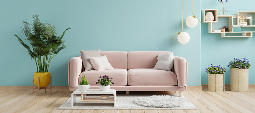
3. Cloud Dancer + Blush Pink Colour Combinations
Blush makes Cloud Dancer look softer and more welcoming.
● Ideal for bedrooms, dressing areas, and cosy reading corners.
● Keep blush in small doses: cushions, art, one panel, or headboard wall.
● Add brushed brass or rose-gold accessories for polish.
4. Cloud Dancer + Olive Green Colour Combinations
Olive adds an earthy calm that suits Indian homes beautifully.
● Use olive in dining chairs, a console, or a feature wall behind plants.
● Pair with terracotta pots, rattan, and natural stone.
● Great for homes that want warmth without bright colours.
5. Cloud Dancer + Midnight Blue Colour Combinations
Midnight blue is dramatic yet classic, and Cloud Dancer keeps it fresh.
● Use blue on lower half walls, wardrobes, or a study corner.
● Add lighter woods and warm metals to keep it inviting.
● A strong option for WFH backdrops and libraries.
Also Read: 6 Beautiful Blue Wall Paint Combinations
6. Cloud Dancer + Soft Gold Colour Combinations
Soft gold makes the palette festive without being loud.
● Use gold in lighting, mirrors, handles, and décor accents.
● Works especially well for pooja corners and formal living spaces.
● Keep finishes satin or brushed, not overly shiny.
7. Cloud Dancer + Taupe Colour Combinations
Taupe is the bridge between warm and cool, so it’s very safe.
● Use taupe in sofas, rugs, or wall panelling for a premium look.
● Add layered textures: boucle, suede, and matte ceramics.
● Perfect for rental-friendly styling where you want timelessness.
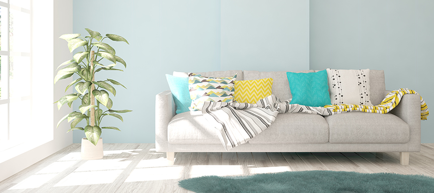
8. Cloud Dancer + Teal Colour Combinations
Teal adds colour without overwhelming the off-white base.
● Use teal in art, cushions, or a dining-wall highlight.
● Pair with cane chairs and warm woods for a coastal-Indian vibe.
● Keep teal deeper rather than bright to maintain elegance.
9. Cloud Dancer + Misty Lavender Colour Combinations
Lavender offers a gentle colour story that still feels grown-up.
● Works well in kids’ rooms that you don’t want to “outgrow” fast.
● Pair with light oak, white wardrobes, and soft grey textiles.
● Choose matte finishes to avoid shine.
10. Cloud Dancer + Matte Black Colour Combinations
Black gives instant contrast and a modern edge.
● Use black in frames, railings, hardware, and statement lights.
● Keep walls mostly Cloud Dancer so the look stays airy.
● Add one warm element (wood or beige) to prevent harshness.
Cloud Dancer Colour Walls: Where to Use in Your Home?
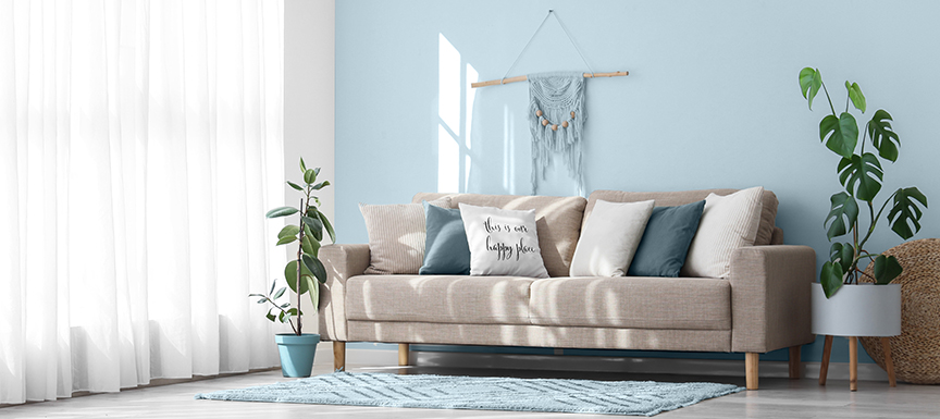
Cloud Dancer Colour for Living Room
Living rooms benefit from the way off-white brightens without competing with décor.
● Use it on all walls for a seamless, premium backdrop.
● Add one deeper accent (charcoal, navy, or olive) through furniture or a single wall.
● Choose washable finishes if you entertain often or have kids.
Cloud Dancer Colour for Bedroom
Bedrooms look serene with Cloud Dancer, especially with layered textiles.
● Pair with taupe, blush, or warm beige for a softer mood.
● Keep lighting warm and dimmable for a cosy feel.
● Add headboard panels or textured wallpaper if you want depth without colour.
Also Read: 14 Colour Combinations with Blue
Cloud Dancer Colour for Kids' Room
It’s a practical base for playful décor that changes as children grow.
● Use colourful storage, stickers, and soft furnishings instead of bold paint everywhere.
● Plan a washable interior paint for easy stain removal.
● Add a chalkboard corner or art wall in a darker shade.
Cloud Dancer Colour for Kitchen & Dining
In kitchens, light neutrals keep the space looking clean and open.
● Pair with wood-grain laminates, muted greens, or black hardware.
● Use easy-clean paint around dining zones where splashes happen.
● Keep a slightly higher sheen on walls for better wipe-down.
Nerolac Paint Finish Recommendations
To make Cloud Dancer paint colour look premium, finish matters as much as shade. For Indian homes, prioritise cleanability, stain resistance, and low odour during application.
●Nerolac Impressions Eco Clean is a premium interior emulsion designed for new or previously painted interior surfaces. It is positioned as low-VOC with almost no odour, and it offers high fungal and bacterial resistance – helpful for humid seasons and closed-window AC months.
●Nerolac Beauty Gold Washable is highlighted for stain resistance and suitability for busy homes, making it a strong choice for living rooms and kids’ spaces.
●If you plan to extend the theme outdoors, Nerolac Excel Total is positioned for exterior durability against weathering while maintaining colour vibrancy.
Finish tip: In high-traffic rooms, a soft sheen or satin finish often looks richer than dead-matte and is easier to wipe clean.
Maintenance Tips for Cloud Dancer Colour Walls
Light shades stay beautiful when you build small habits into your routine.
● Dust walls gently every 1-2 weeks, especially near windows and fans.
● Wipe marks quickly with a soft sponge and mild soap solution; avoid harsh scrubbers.
● In monsoon months, keep ventilation strong to reduce damp patches.
● Use door stoppers and furniture pads to prevent scuffing near switches and corners.
● Keep touch-up paint labelled and stored properly for quick fixes.
Conclusion
Nerolac Paints, a leading paint company in India offers a wide range of wall paint colours & painting services & solutions for homes & offices.
-

Best Colour Combination For Walls To Elevate Your Home Interiors Best Colour Combination For Walls To Elevate Your Home Interiors
Intoduction:In 2025, harmonious colour schemes for individuality and…
-

What Colours Match with Blue? 14 Colour Combinations with Blue for Your Home What Colours Match with Blue? 14 Colour Combinations with Blue for Your Home
Blue is a universally popular colour for décor and design; choosing a colour…
-

What Are The Different Types Of Paint For Home And Interior Walls? What Are The Different Types Of Paint For Home And Interior Walls?
Introduction:When it comes to home decor, nothing transforms a room as…
-
Recent Blogs
- Cloud Dancer Colour of the Year – Meaning, Combinations, Interior Ideas and Trends
- How To Make Yellow Colour: Tips for Perfect Wall Paint Shades & Home Décor Ideas
- How To Make White Colour: Tips for Perfect Wall Paint Shades & Home Décor Ideas
- How To Make Violet Colour: Tips for Perfect Wall Paint Shades & Home Décor Ideas
- How To Make Turquoise Colour: Tips for Perfect Wall Paint Shades & Home Décor Ideas
-
Get in Touch
Looking for something else? Drop your query and we will contact you.
FAQs
What shade is Cloud Dancer Colour?
It’s a soft off-white from Pantone – PANTONE 11-4201 – designed to sit between stark white and heavily tinted whites.
Is Cloud Dancer a warm white or cool white?
It reads as balanced and gently warm rather than icy, which is why it works well with warm Indian lighting.
Does Cloud Dancer Colour work in Indian homes?
Yes, because it reflects light well, pairs with wood and stone, and stays flexible across décor styles common in India.
Which colours pair best with Cloud Dancer?
The most reliable colours that go with Cloud Dancer are warm beige, taupe, charcoal, midnight blue, olive green, and soft gold.
Is Cloud Dancer Colour good for living room walls?
Absolutely. Cloud Dancer colour for home works especially well in living rooms because it makes the space look open while keeping the décor centre-stage.
Does Cloud Dancer look yellowish under warm lighting?
Under very warm bulbs, any off-white can look slightly warmer. Test a sample patch in day and night lighting before final painting.
Does Cloud Dancer Colour make a room look bigger?
Yes. Lighter neutrals bounce light and reduce visual clutter, so rooms often feel larger.
What is the best finish for Cloud Dancer Colour walls?
For most families, a washable soft-sheen finish balances elegance and easy cleaning, especially in living, dining, and kids’ areas.
Is Cloud Dancer suitable for modular kitchens
It can work well, especially when paired with wood or matte black hardware – just choose easy-clean finishes near the dining zone.
Can Cloud Dancer be used as an exterior wall colour?
It can, but pick an exterior-grade paint system. For example, Nerolac Excel Total is positioned for exterior durability and weathering resistance.


Get in Touch
Looking for something else? Drop your query and we will contact you.
Latest Happenings in the Paint World
Get some inspiration from these trending articles


Popular Post
Popular Searches
What’s Trending in Bedrooms
Explore Trending Living Room Ideas
- Living Room Colour Combination
- Modern Two Colour Combination for Living Room
- Wall Texture for Living Room
- Vastu Colours for Living Room
- Wall Texture Design for Living Room
- Living Room Paint Ideas
- Living Room Design Ideas
- Paint Colour Ideas for Living Room
- Living Room TV Wall Designs
- Green Living Room Walls
Kitchen Ideas People Love
Explore Trending Ceiling Ideas
Study Room Ideas in Demand
Explore Wall Paint Categories
Handpicked Colour Inspirations
- Accent Wall Design
- Bedroom Design Ideas
- Exterior Wall Colour Design Ideas
- Interior Wall Colour Design Ideas
- Kitchen Design Ideas
- Living Room Interior Design
- Geometric Wall Design Ideas
- Home Colour Combination Ideas
- Home Décor Ideas
- Mural Wall Paint Design Ideas
- Office Space Design Ideas
- Puja Room Design Ideas
- Texture Design Ideas
- Festival Painting Ideas
- Paint Colour Chart
- Wall Painting Designs
- Wood Wall Décor Ideas
- Mural Wall Paint Design
- Hall Design Ideas
- Gate Colour Design
- Exterior Wall Colour Design
- Door Colour Design Ideas
-
 Get in Touch
 -
Store Locator
-
 Download App
×
Get in Touch
Looking for something else? Drop your query and we will contact you.
