
Velvet Colour
Velvet
Colour code - 2262
A timeless shade that dates back to the Victorian Era. Velvet colour is a dreamy hue that fills your space in a dewy haze. A pastel shade of pink that soothes your mind and invites light into your space.
It’s like a feeling of magic and passion all around you. A dynamic shade which transforms your room with the slightest of touches.
Match Velvet with neutral and dewy shades such as Ballet Shoes or Dusty Green.
Disclaimer: Actual wall paint colour applied may differ from the on-screen representation above. Please confirm your colour choices prior to purchase by viewing a physical colour shade card or a painted sample.
Still confused ? Explore all our shades from our colour catalogue
Paint your life's canvas with our painting experts
Fill the form below to book a free site evaluation by Nerolac Express Painting Service expert
Trending Colour Shades
Find the Perfect Colour Shades for you walls


Find an Expert Painter Near You
Enjoy a holistic painting experience with Nerolac NxtGen Services
About Velvet Colour
Velvet Colour Designs, Shades & Combinations for Your Home
Velvet colour is commonly used in interior walls as a rich, high-depth pink family tone with a soft purple influence, selected for its refined intensity rather than brightness. On the colour wheel, it appears in the range between red colour and magenta, moving toward purple colour depending on undertone and lighting. It is often associated with confidence, a premium finish, and a well-planned sense of style, which is why it works best when the room has clear supporting neutrals. In daylight, it can look cleaner and more vivid, while under warm artificial light, it tends to feel deeper and more settled. The right choice depends on depth, finish, and placement.Key Characteristics of Velvet Colour
High Depth With A Polished Look
Velvet colour shades typically have strong pigment, so they create a designed surface even when the decor is minimal. This depth is useful when you want the wall to carry the visual identity of the room.Undertones That Influence Warmth Or Coolness
Within different velvet colour shades, some options feel warmer (more red-pink), while others feel cooler (more purple-pink). That undertone affects how well the shade aligns with flooring, wood tones, and lighting temperature.Strong Response To Finish Selection
Matte finishes can soften the overall appearance, while a soft sheen can make the surface look cleaner and slightly more vivid. With deeper colours, the finish choice also changes how texture and patchwork appear on the wall.Clear Interaction With Lighting Angles
Because velvet tones are saturated, side lighting from windows or wall lamps can reveal surface variation more easily. For best results, the wall should be smooth, and the lighting plan should be considered before finalising the shade. Velvet shades of colour can work with warm off-whites, soft greys, white colours and selected metallic accents when the palette is limited. The colour looks more refined when the room avoids too many competing prints and bright accessory colours.Practical Uses of Velvet Colour
Living Rooms As A Statement Backdrop
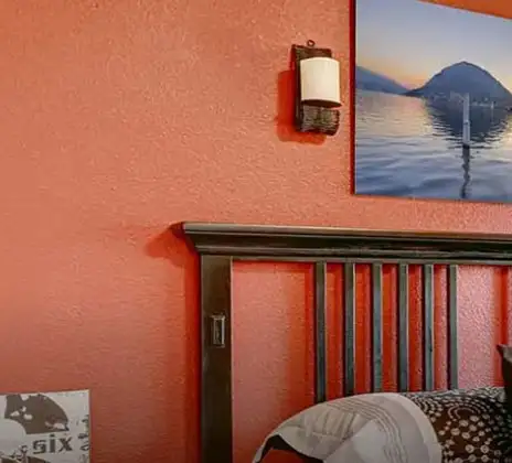
Velvet can define a main seating wall and help the room feel more planned. Use it behind a sofa or a console wall, then keep the remaining walls in a calm neutral colours.Bedrooms For A Feature Headboard Wall
In bedrooms, velvet works best as a single focal surface rather than all four walls. Pair it with light bedding and a restrained decor plan to keep the space comfortable for daily use.Dining Spaces That Need A Dressed-Up Finish
A velvet-toned wall can add a premium feel in dining rooms, especially when you use a limited number of decor pieces and keep the furniture finishes consistent.Dressing Areas, Vanity Corners, And Walk-In Wardrobes
Velvet suits spaces that benefit from a defined, styled backdrop. In these areas, ensure lighting is adequate so the colour stays clear and does not look overly heavy.Compact Spaces Where Bold Colour Looks Deliberate
Powder rooms, reading nooks, and study room walls can handle saturated shades well because the area is limited. In these smaller zones, the colour can feel structured rather than overwhelming.Velvet Paint Choices for Your Walls
Before you commit, shortlist by depth and undertone, then test a sample in two wall locations - one close to daylight and one farther from it. Different velvet colour shades can appear similar on a card but separate clearly on a full wall, especially in the evening. The three options below cover practical directions, from lighter to deeper looks.Fresh, Lighter Tones
- Bubblegum: It suits rooms where you want a velvet influence without maximum intensity. Bubblegum colour works well in a guest bedroom or dressing area, especially with simple textiles.
Balanced Tones
- Sweet William: It is a steady choice for everyday spaces because it gives presence without becoming visually heavy. Sweet William colour can suit living rooms and bedrooms when furniture stays neutral, and the lighting is layered.
Deeper, Stronger Tones
- Pink Bangles: It fits homes that want a defined statement wall. Use Pink Bangles colour where the wall surface is smooth, and lighting is planned so the finish looks even across the entire area.
Velvet Wall Colour Combinations for Your Home
A successful pairing keeps velvet as the focus and uses one supporting shade to maintain structure. Plan your velvet colour combination or two colour combinations around the room’s function, then repeat the supporting tone through curtains, rugs, or a few decor items. If you want a velvet colour contrast, create it with stable neutrals and controlled accents rather than multiple bright colours.| Room/space | Recommended colour combination |
|---|---|
| Living room (main focal wall) | Pink Carat – 4785 |
| Master bedroom (headboard wall) | Light Hearted – 4768 |
| Dining nook/dining wall | Crocheted Scarf – 4813 |
| Study corner/reading wall | Pink Aura – 4784 |
| Walk-in closet/vanity wall | Light Hearted – 4768 |
| Entryway highlight wall | Pink Aura – 4784 |
Velvet + Pink Carat Colour Combination
Velvet and Pink Carat Colour pairing suits living rooms that need a confident focal surface. Keep the remaining walls light and use limited decor so the wall feels clean and planned.Velvet + Light Hearted Colour Combination
Light Hearted colour supports velvet with a softer balance that works well in bedrooms. Choose calm bedding and avoid heavy patterns so the room remains settled.Velvet + Crocheted Scarf Colour Combination
Crocheted Scarf Colour can add warmth and depth in dining corners and social spaces. Use simple furniture finishes and a restrained table setting to keep the look refined.Velvet + Pink Aura Colour Combination
Pink Aura Colour is suitable for reading corners, studies, or entryways where you want a styled impression without filling the space with accessories. Keep lighting consistent so the wall colour appears even.Best Velvet Shades for Accent Walls
If you are unsure about full-room coverage, start with a single accent wall and observe it for two days. When comparing shades in velvet colour, pick the smoothest wall surface and the most evenly lit wall for the feature.| Colour | Location |
|---|---|
| Pink Carat | Behind the sofa (living room) |
| Light Hearted | Behind the bed (bedroom) |
| Crocheted Scarf | Dining feature wall |
| Pink Aura | Vanity or closet wall |
Simple Tips for Using Velvet at Home
Velvet colours look best when the room has a defined plan for balance. Decide early whether the colour should lead the room or support it. If the shade feels too strong at night, keep it to one wall and increase the number of light neutral surfaces. Practical tips you can apply:- Start with one feature wall if you are uncertain; it gives a designed result with less risk.
- Keep ceiling paint bright so the room does not look visually saturated.
- Keep patterns controlled; keep wall decor minimal.
- Add layered lighting so deeper walls do not look flat in the evening.
How Nerolac Can Help You Paint Your Walls Velvet?
Velvet is a high-depth colour, so the final finish depends on preparation and even application. Uneven wall bases, incorrect primers, and rushed coats can cause patchiness or inconsistent depth, especially under mixed lighting. Nerolac’s professional home painting service helps by evaluating the room, recommending an appropriate shade for the wall size and light levels, and planning the work so the colour remains rich without overpowering the space. The service approach focuses on creating a uniform base through levelling and priming, which reduces streaks, roller marks, and visible variation that can show up more clearly with deeper tones. Application is then managed with consistent methods to maintain even colour density across the wall, so the result stays clear in daylight and stable under warm artificial lighting. With end-to-end oversight from preparation to finish checks, Nerolac helps deliver a refined, long-lasting velvet wall without repeated trial and error.Plan, Design and Paint Your Walls with Nerolac Tools
Ready to plan your Velvet colour makeover? Use the tools below to explore shades, visualise rooms and estimate paint and budget.Colour Visualiser
Use the Nerolac Colour Visualiser to try out different shades and textures from our colour and texture palette on the walls of our ‘room presets.’ You can also see how each colour will look under various lighting conditions, such as natural sunlight, cool white light and warm yellow light, before finalising a shade.Colour Catalogue
Use the Nerolac Colour Catalogue to browse over 1,500 Nerolac wall paint shades. Search by colour name or code, or filter by colour family to quickly discover options that match your décor. Shortlist your favourite shades and pair them with the other Nerolac tools to finalise the perfect colour scheme for your home.Paint Calculator
Use the Nerolac Paint Calculator to estimate the area to be painted and the required paint volume for your décor project. Enter wall dimensions, room count, and preferred product to get an approximate paint quantity and cost, helping you plan your project with greater confidence.Frequently Asked Questions For Velvet
What colour goes with velvet walls?
Velvet walls pair well with shades of brown, Gray, blue, soft pastels and teals.
Is velvet colour warm or cool?
Velvet colour is a warm colour because of undertones of red.
Is velvet a good colour for a bedroom?
Velvet is a dark, bold and rich colour for a bedroom making it a good choice.
Is velvet a neutral colour?
No, velvet is not a neutral tone because it is rich in colour.
What colour curtains go with velvet painted walls?
Velvet painted walls work well with curtain colours like white, teal, burgundy and orange-red.
How do you style furniture in a room with velvet walls?
The velvet colour is already a rich and sophisticated backdrop to have. To compliment that, neutral-toned furniture and lavender accents work well to balance aesthetics.
Can I use velvet colour in a living room?
Velvet colour may be a bold choice in a living room. You can choose velvet for a statement or highlight wall in the living room to balance the colours out.
Is velvet colour in the violet or blue family?
Velvet colour falls in the dark crimson family.
How can you get velvet colour?
Start by identifying whether you want a red-pink velvet or a purple-pink velvet, then select a shade that matches your lighting. A sample patch checked across daytime and evening is usually the most reliable way to confirm the final look.
Is velvet a deeper shade of purple?
Velvet is not always purple. Many velvet-style wall shades sit in the deeper pink family and can shift toward purple depending on undertone and lighting.
Can I use velvet in my room to make it feel airy?
Yes, if you limit coverage and keep the rest of the room light. Use velvet on one wall, keep ceilings bright, and choose simple furniture lines.
What kind of furniture should I use with velvet coloured walls?
Neutral furniture is the safest choice, including warm whites, beige, light greys, and natural wood. Keep finishes consistent and avoid mixing many strong colours in the same space.
Can velvet be used in rooms with limited natural light?
Yes, but it should be controlled. In low-light rooms, use velvet as an accent wall, strengthen the lighting plan, and avoid very deep options unless the room is large.
How does velvet interact with decor colours?
Velvet generally works best with stable neutrals and a limited accessory palette. If you add accent colours, keep them muted and repeat them sparingly so the room remains structured.
Create magic with our inspiring Two Colour Combinations!
-
Orange And Lilac Colour Combination
-
Red And Brown Colour Combination
-
Yellow And Blue Colour Combination
-
Yellow And Green Colour Combination
-
Yellow And Orange Colour Combination
-
Yellow And Red Colour Combinations
-
Orange And Brown Colour Combination
-
Orange And Gold Colour Combination
-
Orange And Grey Colour Combination
-
Orange And Cream Colour Combination
-
Orange And Peach Colour Combination
-
Orange and Red Colour Combination
-
Orange And Purple Colour Combination
-
Orange And Pink Colour Combination
-
Orange And White Colour Combination
-
Orange And Neutral Colour Combination
-
Orange And Beige Colour Combination
-
Orange And Violet Colour Combination
-
Orange And Blue Colour Combination
-
Orange And Green Colour Combination
Latest Happenings in the Paint World
Get some inspiration from these trending articles

Cloud Dancer Colour of the Year – Meaning, Combinations, Interior Ideas and Trends

How To Make Yellow Colour: Tips for Perfect Wall Paint Shades & Home Décor Ideas

How To Make White Colour: Tips for Perfect Wall Paint Shades & Home Décor Ideas

How To Make Violet Colour: Tips for Perfect Wall Paint Shades & Home Décor Ideas

How To Make Turquoise Colour: Tips for Perfect Wall Paint Shades & Home Décor Ideas

How to Make Sky Blue Colour: Tips for Perfect Wall Paint Shades & Home Décor Ideas
Get in Touch
Looking for something else? Drop your query and we will contact you.
Popular Searches
What’s Trending in Bedrooms
Explore Trending Living Room Ideas
- Living Room Colour Combination
- Modern Two Colour Combination for Living Room
- Wall Texture for Living Room
- Vastu Colours for Living Room
- Wall Texture Design for Living Room
- Living Room Paint Ideas
- Living Room Design Ideas
- Paint Colour Ideas for Living Room
- Living Room TV Wall Designs
- Green Living Room Walls
Kitchen Ideas People Love
Explore Trending Ceiling Ideas
Study Room Ideas in Demand
Explore Wall Paint Categories
Handpicked Colour Inspirations
- Accent Wall Design
- Bedroom Design Ideas
- Exterior Wall Colour Design Ideas
- Interior Wall Colour Design Ideas
- Kitchen Design Ideas
- Living Room Interior Design
- Geometric Wall Design Ideas
- Home Colour Combination Ideas
- Home Décor Ideas
- Mural Wall Paint Design Ideas
- Office Space Design Ideas
- Puja Room Design Ideas
- Texture Design Ideas
- Festival Painting Ideas
- Paint Colour Chart
- Wall Painting Designs
- Wood Wall Décor Ideas
- Mural Wall Paint Design
- Hall Design Ideas
- Gate Colour Design
- Exterior Wall Colour Design
- Door Colour Design Ideas
-
 Get in Touch
 -
Store Locator
-
 Download App
×
Get in Touch
Looking for something else? Drop your query and we will contact you.
