
Disclaimer: Actual wall paint colour applied may differ from the on-screen representation above. Please confirm your colour choices prior to purchase by viewing a physical colour shade card or a painted sample.
Still confused ? Explore all our shades from our colour catalogue
Paint your life's canvas with our painting experts
Fill the form below to book a free site evaluation by Nerolac Express Painting Service expert
Trending Colour Shades
Find the Perfect Colour Shades for you walls


Find an Expert Painter Near You
Enjoy a holistic painting experience with Nerolac NxtGen Services
About Violette Colour
Violette Colour Combinations for Beautiful Home Walls
Violette takes its name from the Violette flower, and appears at the nd of the visible spectrum, between blue colour light and invisible ultraViolette (roughly 380-450 nm). That border-position gives it a distinctive character: cooler, sharper, richer and expressive. Violette is often linked with imagination, individuality, and a confident, intelligent mood. The colour imparts a bold, yet . Violette pairs beautifully with its complementary family of yellow colours (from muted mustard to warm butter tones) and also layers well with blues and green colour combinations to create depth.Key Characteristics of Violette Colour
Balanced red–blue placement
Violette is exactly between red colour and blue on the colour wheel. Sometimes it appears crisp and bluish; other times it looks softer and slightly rosy, depending on the undertone and what’s around it.Mood influence
Violette is frequently associated with a thoughtful, quiet vibe, but it’s never dull. It’s the sort of colour that can help a room feel quieter while still giving ideas space to breathe.Range of depth
Pale lilac and lavender colour shades feel light and gentle. Deeper plum tones look richer and more “dressed up.” So, Violette can work as either a subtle background or a confident statement.Light sensitivity
Violette is one of those colours that changes a lot with lighting. Warm bulbs can pull it toward red and make it feel cosier. Cool lighting can bring out bluer notes, so a test patch on the actual wall is worth the effort.Practical Uses of Violette Colour
Luxury and sophistication
If you want a premium look without going full dark neutral colours, try a deeper plum or royal-leaning Violette on a feature wall, an arch, or a niche.Calm and spaciousness
In compact bedrooms or bathrooms, soft lavender usually feels safest. It keeps things airy and comfortable. It also plays nicely with white colour ceilings, simple tiles, and low-pattern styling.Creativity and focus
For study room walls and home offices, mid Violettes can feel steady and “in the zone” without being harshViolette Paint Choices for Your Walls
Violette is not a single colour but a wide range of shades, from soft lavenders to deep, saturated plums. Choosing the right Violette shade or tone depends on the room size, light, and the mood you want to create. Below are five key Violette families with recommended Nerolac shades and clear guidance on where each works best on your walls.1.Soft Lavender And Mauve
These colours are on the lighter side of Violette, often with a touch of pink colour or blue colour, and they usually bring a sense of calmness, lightness and quiet romance to a room. This colour family includes light and powdery tones such as:- Mauve Melody: Use Mauve Melody colour in bedrooms if you like a soft, restful atmosphere; pair it with white ceilings and pale wood furniture.
- Gentle Wave: Gentle Wave colour works well in study rooms or home offices with white or light grey storage units.
- Wisteria Wish: For children’s rooms, try Wisteria Wish colour on one wall and keep the others in the shade of off-white to maintain brightness.
2.Warm Pink-Violette Tones
The following colours come between Violette and soft pink:- Raspberry Swirl: Raspberry Swirl colour can be used on a living room walls with beige sofas and cream side walls.
- Falling In Love: Falling In Love colour looks pleasant in a dining room walls, especially with warm wooden table sets and soft yellow lighting.
- Passionate Hug: Passionate Hug colour can give a cheerful note to an entry passage or a small sitting corner.
3.Deep Plum And Wine Violettes
The deeper plum and wine family includes shades such as:- Lush Plum: Use Lush Plum colour on a single living room wall behind the main sofa and keep other walls in an off-white or light beige.
- Plum Tree: Plum Tree colour looks elegant behind the bed in a master bedroom, especially with light bedding and minimal prints.
- Wine Bottle: Wine Bottle colour can give dining rooms a cosy yet sophisticated feel when matched with dark wood.
4.Strong Royal And Jewel Violettes
If you want Jewel-like Violettes that are highly saturated and make a clear style statement, take a look at:- Violette Valet: Try Violette Valet colour on the living room’s TV wall, paired with light grey or white on surrounding walls and simple media furniture.
- Sapphire Grape: Sapphire Grape colour can be used behind a reading chair with a slim floor lamp and a small bookshelf.
5.Muted Grey-Violette Tones
If you seek softer, slightly greyed Violettes, opt for:- Renaissance Dream: Renaissance Dream colour is ideal for bedrooms where you want a quiet, hotel-like feel.
- Sophistication: Sophistication colour pairs well with straight-line sofas and simple decor in modern living rooms.
- Guardian Angel: Guardian Angel colour can be used in passages and hallways to keep continuity without drawing too much attention.
Violette Wall Colour Combinations for Your Home
Use this chart as a quick room-wise guide. Start with the room you’re planning, then see which Violette colour combination suits best there.| Type of Room or Space | Recommended Violette Colour Combination |
|---|---|
| Bedrooms, study rooms, compact living rooms | Violette and white |
| Master bedrooms, guest rooms, reading corners | Violette and lilac |
| Modern living rooms, home offices, media rooms | Violette and grey |
| Dining rooms and feature nooks | Violette and red |
| Living rooms, balconies, informal lounges, kids’ study corners | Violette and green |
1.Violette And White Colour Combination
Violette and White colour combination is a clean, classic pairing that keeps rooms bright and spacious. Light Violettes with white ceilings and trims work beautifully in bedrooms, studies and small apartments without overwhelming the space.2.Violette And Lilac Colour Combination
Violette and Lilac colour combination combining deep Violette with lighter lilac creates gentle depth within the same colour family. Use deeper shades on one wall and softer tones on others for a coordinated, layered look in bedrooms or sitting rooms.3.Violette And Grey Colour Combination
Violette and Grey colour combination Grey balances Violette nicely, especially in modern or minimalist homes. Mid-tone Violettes with light grey walls and white accents create a calm, sophisticated atmosphere in living rooms and home offices.4.Violette And Red Colour Combinations
Violette and Red colour combinations Warm Violettes with soft reds or berry tones feel rich and inviting. This pairing suits dining rooms or accent corners, but keep one colour dominant and use the other sparingly in cushions or artwork.5.Violette And Green Colour Combination
Violette and green colour combination sit opposite on the colour wheel, creating natural contrast. Soft sage or mint green with muted Violette works well in eclectic or nature-inspired interior walls, balanced with neutral furniture.Best Violette Shades For Accent Walls
Violette offers a rare blend of richness and calm, making it an excellent choice for accent walls across different rooms. The table below shows the best Violette shades and where to use them.| Violette Shade | Best Room/Placement |
|---|---|
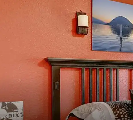
| Blessing | Bedroom - behind the headboard |
| Flights of Fancy | Bedroom - feature wall |
| Foxglove Bouquet | Living room - behind the TV or the main sofa |
| Mon Cher | Dining area - single accent wall |
Simple Tips for Using Violette At Home
Violette is sensitive to light, and the same shade can look different in the morning, afternoon and evening. Always test a small patch on the wall and check it throughout the day before final painting. When you are considering Violette colour options, keep these quick tips in mind:- In very small rooms, use lighter Violettes on main walls and reserve deeper tones for niches or trims.
- In rooms with little daylight, choose slightly warm Violettes with a touch of red rather than very cool bluish tones.
- In very sunny rooms, cooler bluish Violettes help reduce glare and feel fresher.
- Balance strong Violette walls with plenty of white, beige or light grey on ceiling paints, floors, and large furniture pieces.
- If you use a deep Violette accent wall, keep patterns minimal so the colour remains the hero.
- To create flow in open-plan spaces, stick to one Violette family (warm or cool), use it as your colour inspiration, and repeat it in softer or deeper versions.
How Nerolac Can Help You Paint Your Walls Violette?
Home painting is a task that requires professional expertise and creativity from experienced painters. That’s exactly wherePlan, Design and Paint Your Walls With Nerolac Tools
Ready to plan your Violette makeover? Use the tools below to explore shades, visualise rooms and estimate paint and budget. Use the Nerolac Colour Visualiser to try out different shades and textures from our colour and texture palette on the walls of our ‘room presets.’ You can also see how each colour will look under various lighting conditions, such as natural sunlight, cool white light and warm yellow light, before finalising a shade.Colour Catalogue
Use the Nerolac Colour Catalogue to browse over 1,500 Nerolac wall paint shades. Search by colour name or code, or filter by colour family to quickly discover options that match your décor. Shortlist your favourite shades and pair them with the other Nerolac tools to finalise the perfect colour scheme for your home.Paint Calculator
Use the Nerolac Paint Calculator to estimate the area to be painted and the required paint volume for your décor project. Enter wall dimensions, room count, and preferred product to get an approximate paint quantity and cost, helping you plan your project with greater confidence.Frequently Asked Questions For Violette
Is Violette a warm or cool colour?
Violette is generally considered a cool colour on the colour wheel, but it can feel warmer when it leans more toward red (plum-like) and cooler when it leans toward blue.
Which colours are mixed to get Violette?
In pigments, Violette comes from mixing red and blue, usually with slightly more blue; adding white lightens it, while black or grey deepens the shade.
Does Violette make a room look smaller or larger?
Lighter Violette shades, such as lavender and mauve, can make a bedroom or living room feel more open and airy. Deep plums and wine Violettes tend to visually pull walls in, so they work best on a single accent wall or in larger, well-lit rooms.
What is the contrast colour of Violette?
Green is typically treated as Violette’s strongest contrast (a complementary pairing on the colour wheel), which is why Violette-and-green combinations tend to look vivid and balanced together.
Is Violette suitable for kids’ rooms?
Yes, softer Violette tones with a hint of pink or lilac work very well in kids’ rooms. They feel gentle and playful without being too bright, and they pair nicely with white furniture and colourful décor.
Can I use Violette on exterior walls?
Muted or greyed Violettes can look elegant on select exterior elements such as balcony walls, entrance features or boundary walls. For a balanced look, combine them with neutrals like off-white, beige or light grey.
What types of spaces is Violette best suited for?
Violette works well in bedrooms, meditation corners, studies, formal living rooms, feature walls, and selective exterior accents where calmness, creativity or quiet luxury are desired.
Can I check how the shades will look on the walls?
Before going ahead with a fresh coat of paint, it is necessary to see how the shades look on the walls. To make things easier, first, go to our Colour Catalogue and browse through the colours you like the most. Pick your choice of shade, click on the home icon to visualize how it will look on the walls.
From where can I buy the paint after selecting the shade?
After you have selected the shade, you can pick a store near you with the help of Store Locator and purchase interior, exterior shades, enamel paint and many more products of your choice.
What’s next after selecting paint colours for my home?
NXTGEN painting service – our brand-new service gives you an exemplary painting service by our highly experienced and reliable painters. All you need to do - drop your details, and an expert will get in touch with you. Et Voila! Your space is redefined within 5 days.
I am not sure of my selection of shade, can I watch a preview of it from my home?
Different light settings accentuate and enhance the colour on the walls. To visualize the shade before finalizing, download our Colour My Space app on Apple or Google Play Store. Here you can watch presets for different rooms, select the right texture and then simply call a painter near your location. Also, our very own Product Comparison Tool renders you with a visual, answering every speck of your concerns.
What is the hex code of Violette colour? Which colour family does Violette belongs to?
Violette is one of the shades of white colour and its hex code is #EAE8EC.
Create magic with our inspiring Two Colour Combinations!
-
Orange And Lilac Colour Combination
-
Red And Brown Colour Combination
-
Yellow And Blue Colour Combination
-
Yellow And Green Colour Combination
-
Yellow And Orange Colour Combination
-
Yellow And Red Colour Combinations
-
Orange And Brown Colour Combination
-
Orange And Gold Colour Combination
-
Orange And Grey Colour Combination
-
Orange And Cream Colour Combination
-
Orange And Peach Colour Combination
-
Orange and Red Colour Combination
-
Orange And Purple Colour Combination
-
Orange And Pink Colour Combination
-
Orange And White Colour Combination
-
Orange And Neutral Colour Combination
-
Orange And Beige Colour Combination
-
Orange And Violet Colour Combination
-
Orange And Blue Colour Combination
-
Orange And Green Colour Combination
Latest Happenings in the Paint World
Get some inspiration from these trending articles


Get in Touch
Looking for something else? Drop your query and we will contact you.
Popular Searches
What’s Trending in Bedrooms
Explore Trending Living Room Ideas
- Living Room Colour Combination
- Modern Two Colour Combination for Living Room
- Wall Texture for Living Room
- Vastu Colours for Living Room
- Wall Texture Design for Living Room
- Living Room Paint Ideas
- Living Room Design Ideas
- Paint Colour Ideas for Living Room
- Living Room TV Wall Designs
- Green Living Room Walls
Kitchen Ideas People Love
Explore Trending Ceiling Ideas
Study Room Ideas in Demand
Explore Wall Paint Categories
Handpicked Colour Inspirations
- Accent Wall Design
- Bedroom Design Ideas
- Exterior Wall Colour Design Ideas
- Interior Wall Colour Design Ideas
- Kitchen Design Ideas
- Living Room Interior Design
- Geometric Wall Design Ideas
- Home Colour Combination Ideas
- Home Décor Ideas
- Mural Wall Paint Design Ideas
- Office Space Design Ideas
- Puja Room Design Ideas
- Texture Design Ideas
- Festival Painting Ideas
- Paint Colour Chart
- Wall Painting Designs
- Wood Wall Décor Ideas
- Mural Wall Paint Design
- Hall Design Ideas
- Gate Colour Design
- Exterior Wall Colour Design
- Door Colour Design Ideas
-
 Get in Touch
 -
Store Locator
-
 Download App
×
Get in Touch
Looking for something else? Drop your query and we will contact you.
