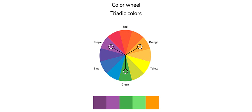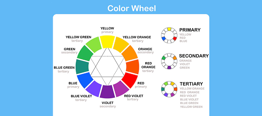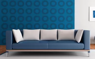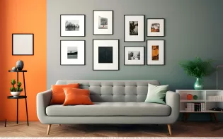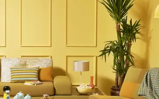
Understanding Triadic Colour Schemes with Examples and Palettes
Published: 03 Apr 2023 | Modified: 11 Sep 2025

Create Your Dream Home With Our Painting Experts
Fill the form below to book a free site evaluation by Nerolac Nxtgen painting Services expert
TABLE OF CONTENTS
Nerolac Paints, a leading paint company in India offers a wide range of wall paint colours & painting services & solutions for homes & offices.
-
Best Colour Combination For Walls To Elevate Your Home Interiors Best Colour Combination For Walls To Elevate Your Home Interiors
Intoduction:In 2025, harmonious colour schemes for individuality and…
-
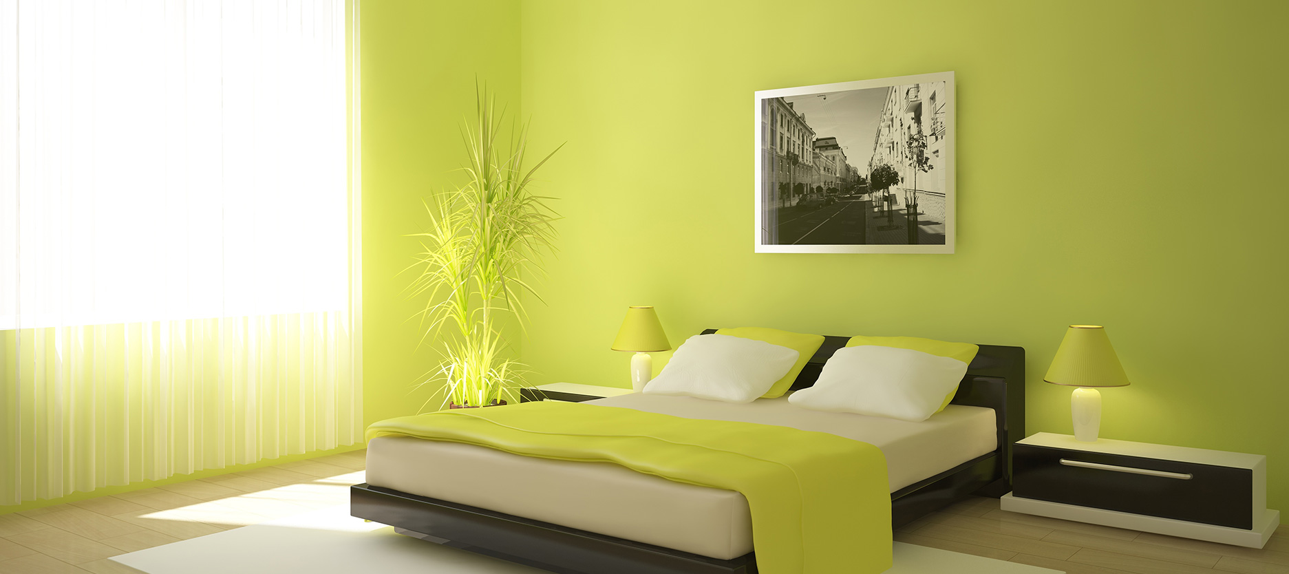
Best Green Colour Combinations for Walls – Schemes & Design Ideas Best Green Colour Combinations for Walls – Schemes & Design Ideas
Introduction:Green has long been a favourite choice in home decor…
-
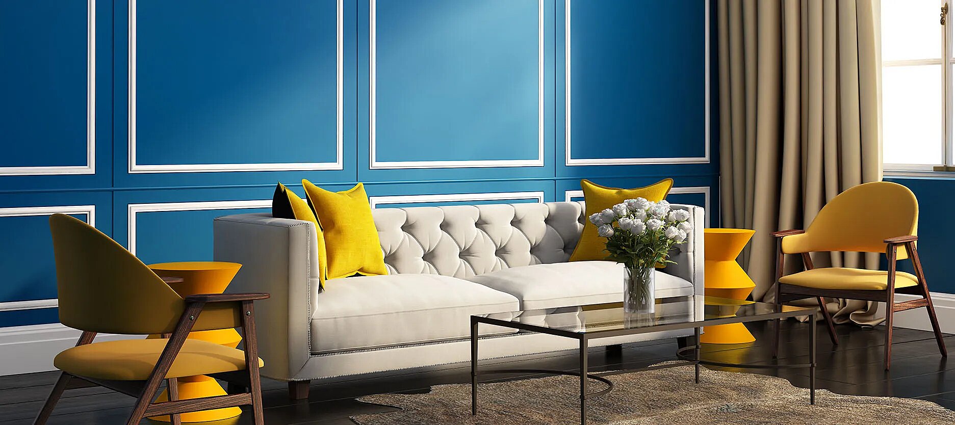
What Colours Match with Blue? 14 Colour Combinations with Blue for Your Home What Colours Match with Blue? 14 Colour Combinations with Blue for Your Home
Blue is a universally popular colour for décor and design; choosing a colour…
-
Recent Blogs
- Friday Colour to Wear – Lucky Colours, Astrology Meaning, Outfit & Wall Colour Guide
- Thursday Colour to Wear – Lucky Colours, Astrology Meaning, Outfit & Wall Colour Guide
- Tuesday colour to wear – Lucky Colours, Astrology Meaning & Outfit & Wall Colour Guide
- Monday Colour to Wear – Lucky Colours, Astrology Meaning, Outfit & Wall Colour Guide
- Wednesday Colour to Wear – Lucky Colours, Astrology Meaning & Outfit & Wall Colour Guide
-
Get in Touch
Looking for something else? Drop your query and we will contact you.
Get in Touch
Looking for something else? Drop your query and we will contact you.
Popular Post
Popular Searches
What’s Trending in Bedrooms
Explore Trending Living Room Ideas
- Living Room Colour Combination
- Modern Two Colour Combination for Living Room
- Wall Texture for Living Room
- Vastu Colours for Living Room
- Wall Texture Design for Living Room
- Living Room Paint Ideas
- Living Room Design Ideas
- Paint Colour Ideas for Living Room
- Living Room TV Wall Designs
- Green Living Room Walls
Kitchen Ideas People Love
Explore Trending Ceiling Ideas
Study Room Ideas in Demand
Explore Wall Paint Categories
Handpicked Colour Inspirations
- Accent Wall Design
- Bedroom Design Ideas
- Exterior Wall Colour Design Ideas
- Interior Wall Colour Design Ideas
- Kitchen Design Ideas
- Living Room Interior Design
- Geometric Wall Design Ideas
- Home Colour Combination Ideas
- Home Décor Ideas
- Mural Wall Paint Design Ideas
- Office Space Design Ideas
- Puja Room Design Ideas
- Texture Design Ideas
- Festival Painting Ideas
- Paint Colour Chart
- Wall Painting Designs
- Wood Wall Décor Ideas
- Mural Wall Paint Design
- Hall Design Ideas
- Gate Colour Design
- Exterior Wall Colour Design
- Door Colour Design Ideas
-

Get in Touch Get in Touch -

Store Locator Store Locator -

Download App Download App
×
Get in Touch
Looking for something else? Drop your query and we will contact you.

