

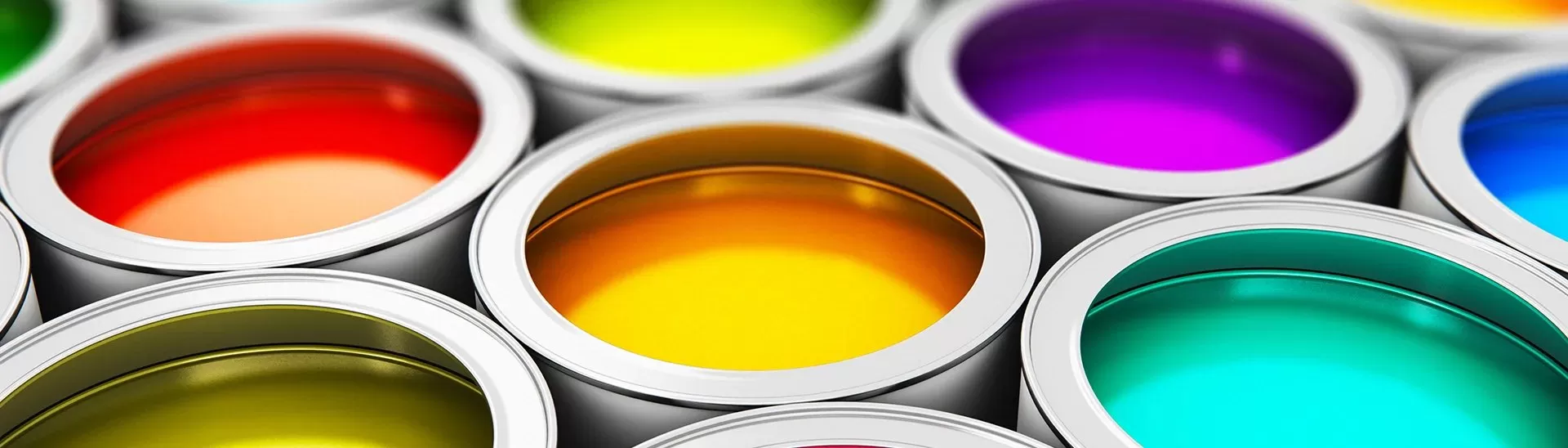
Nerolac Beauty Little Master Sheen Interior Emulsion - Smoothness and Durability with 3 coat Paint
Published: 25 Sep 2023 | Modified: 17 Aug 2026
Quick Summary
Nerolac Beauty Little Master Sheen Interior Emulsion is presented as an interior emulsion designed to provide a smooth matte finish, good coverage and a wide choice of interior paint colours. The article explains the recommended surface preparation, primer, putty and paint application sequence, including a 2–3 coat finish. It also covers application precautions, colour selection, drying requirements and post-application wall care.

Create Your Dream Home With Our Painting Experts
Fill the form below to book a free site evaluation by Nerolac Nxtgen painting Services expert
TABLE OF CONTENTS
Selecting the appropriate paint is vital for improving the appearance and longevity of your indoor walls. Nerolac Beauty Little Master Sheen Interior Emulsion is a dependable option favored by both homeowners and experts. In this article, we will examine the notable characteristics and advantages of this high-quality paint and explore the extensive spectrum of interior paint colours.
Performance Features and Benefits
Nerolac Beauty Little Master Sheen Interior Emulsion stands as a premium plastic emulsion paint with a range of performance attributes and advantages:
-
Exceptional Whiteness
Nerolac Beauty Little Master Sheen Interior Emulsion offers outstanding whiteness, providing a flawless canvas for your interior decor. The bright and vibrant white enhances the overall ambiance of your living spaces.
-
Silky Smooth Matte Finish
This emulsion stands out with its silky smooth matte finish, bringing a touch of elegance to your walls while preserving their visual allure.
-
Effortless Application
The application process for Nerolac Beauty Little Master is effortlessly straightforward. Its user-friendly qualities guarantee that even DIY enthusiasts can attain results that rival professional standards.
-
Impressive Coverage
This emulsion offers remarkable coverage, enabling you to attain your desired finish with fewer coats.
-
Budget-Friendly Product with Optimal Performance
Striking a balance between affordability and performance, Nerolac Beauty Little Master Interior Emulsion provides a cost-effective solution without compromising on quality. It exemplifies Nerolac's dedication to delivering value to its customers.
Surface Preparation

To ensure the durability and effectiveness of your paint application, it's crucial to undertake proper surface preparation. Follow these steps before using Nerolac Interior Emulsion:
Surface Cleaning

Begin the procedure by confirming that the surface is free from any defects or materials that don't adhere well. Gently sand the surface with suitable abrasive paper to achieve a smooth texture, and afterward, ensure it's thoroughly cleaned.
Also Read: How a Disinfectant Can Be Used for All Surface Protection Including Walls and Fabric
Fungus Treatment

In cases where the fungus has affected any areas, it's crucial to administer Nerolac Fungicidal Solution and allow it to react for 6-8 hours. This essential step serves as a preventive measure against future fungal growth.
Primer and Wall Putty Application
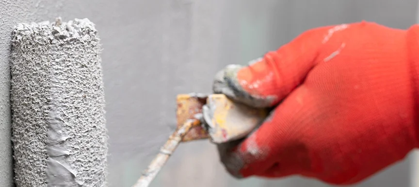
Apply a single coat of the appropriate primer followed by Nerolac Wall Putty to rectify any surface imperfections and ensure a uniform texture. Subsequently, use emery paper (180) to gently sand the surface and then thoroughly wipe it clean.
Second Primer Coat
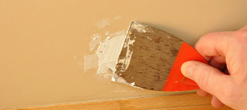
Apply an additional coat of the suitable primer and proceed to sand the surface with emery paper (320) before wiping it clean, preparing it for the subsequent paint application.
Nerolac Beauty Little Master Application

Wrap up the process by applying two to three coats of Nerolac Beauty Little Master Sheen Interior Emulsion, ensuring a minimum drying period of 4-6 hours between each coat for optimal results.
Recommended System for Application
To achieve the finest results, adhere to this recommended procedure for applying Nerolac Beauty Little Master Sheen Interior Emulsion:
- Primer (1 coat): Allow it to dry for 4-6 hours.
- Putty (1 coat): Let it dry for 6-8 hours.
- Primer (1 coat): Allow it to dry for 4-6 hours.
- Finish with Nerolac Beauty Little Master (2-3 coats): Ensure a minimum of 4-6 hours of drying time between each coat.
If you're repainting on smooth lime or enamel masonry surfaces, you can omit steps 1 and 2. Simply commence with step 3, sand the surface using emery paper, and clean it before applying the successive coat.
Also Read: What is wall putty & how to use it the best way?
Utilize +1200 Interior Colours for Your Shades
Nerolac Beauty Little Master Sheen Interior Emulsion provides an impressive selection of over 1200 home interior colours. This broad palette ensures that you can discover the ideal shade to harmonize with your interior decor and individual taste. Whether you favor classic neutrals or dynamic, modern tones, Nerolac offers a comprehensive range to cater to your preferences.
Precautions to Ensure a Seamless Process
For a seamless painting process and your safety, it's essential to take these precautions into consideration:
Consult MSDS
Always consult the Material Safety Data Sheet (MSDS) for Nerolac Beauty Little Master Sheen Interior Emulsion to understand safety guidelines and precautions.
Paint Storage
Store the paint in well-ventilated areas away from ignition sources.
Safety Gear

When handling this paint, wear appropriate safety gear such as rubber or polythene gloves, safety goggles or glasses, and face masks to protect yourself.
Avoid Low Temperatures
Refrain from applying the paint if the ambient temperature is expected to drop below 10°C within 4 hours of application.
New Plaster
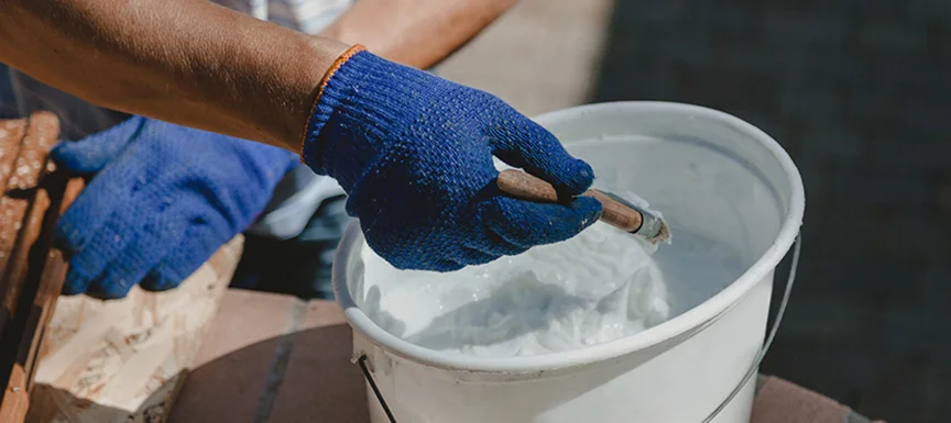
Allow newly plastered surfaces to cure for a minimum of 12 weeks before applying the paint.
Minimal Thinning

Avoid excessive thinning of the paint for optimal results. If tinting is necessary, use Nerolac Hi-Power Universal Stainer and do not exceed 5% of the total paint volume. Thoroughly stir the tinted paint before application.
Container Closure
Always securely seal the paint container when not in use, and ensure thorough stirring before each use.
Also Read: 6 Trending 2023 Interior Paint Colours to Inspire You
Post Application Guidance
To maintain the impeccable appearance of walls coated with Nerolac Beauty Little Master Sheen Interior Emulsion, it's essential to follow a simple yet effective post-application cleaning regimen. After allowing a minimum of 2 weeks for the paint to thoroughly dry and set, take a soft sponge and gently clean the painted surfaces using a mild soap and water solution.
This method streamlines the process of stain removal, effortlessly dealing with common stains and daily dirt accumulation. By adhering to this routine, you ensure that your walls consistently exude freshness and appeal with minimal effort. This not only preserves their vibrant aesthetics but also simplifies the ongoing maintenance of your interior spaces. In essence, it's a practical and efficient way to keep your indoor areas in their best possible condition.
Conclusion
Nerolac Beauty Little Master Sheen Interior Emulsion unlocks a path to achieving both smoothness and durability through its 3-coat paint system. With outstanding features, a user-friendly application, and an extensive array of house interior colours, it emerges as the premier choice for elevating the visual appeal of your living spaces.
By adhering to the suggested application process and essential precautions, you can guarantee a hassle-free painting endeavor and relish in the beauty of walls that endure for years to come. Opt for Nerolac Beauty Little Master Sheen Interior Emulsion to embark on a genuinely transformative interior painting journey.
Key Takeaways
- Nerolac Beauty Little Master Sheen Interior Emulsion is positioned as an interior paint with a smooth matte finish and emphasis on whiteness and coverage.
- Proper surface preparation, including cleaning, fungus treatment, putty and primer application, is an important part of the recommended painting system.
- The recommended system finishes with two to three coats of Nerolac Beauty Little Master Sheen Interior Emulsion.
- The product is presented with a broad selection of more than 1200 interior paint colours for different home interior colour preferences.
- Drying time, temperature, thinning, storage and safety precautions should be considered during application.
- Following the recommended application and post-painting care can help maintain the appearance of painted interior walls.
Nerolac Paints, a leading paint company in India offers a wide range of wall paint colours & painting services & solutions for homes & offices.
-
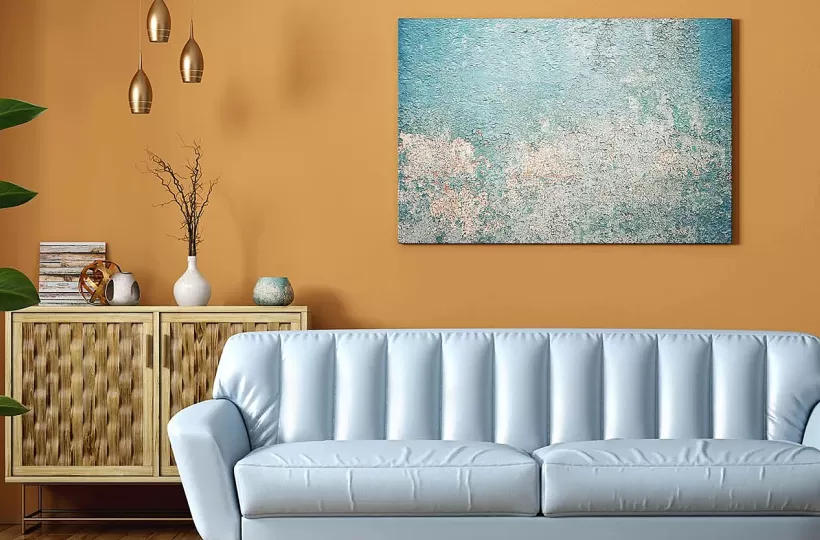
Best Colour Combination For Walls To Elevate Your Home Interiors Best Colour Combination For Walls To Elevate Your Home Interiors
Intoduction:In 2025, harmonious colour schemes for individuality and…
-
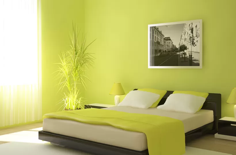
Best Green Colour Combinations for Walls – Schemes & Design Ideas Best Green Colour Combinations for Walls – Schemes & Design Ideas
Introduction:Green has long been a favourite choice in home decor…
-

What Colours Match with Blue? 14 Colour Combinations with Blue for Your Home What Colours Match with Blue? 14 Colour Combinations with Blue for Your Home
Blue is a universally popular colour for décor and design; choosing a colour…
-
Recent Blogs
- Wooden House Design: 8 Kashmiri-Inspired Ideas for Warm and Elegant Homes
- Kashmiri Home Interior Design: 5 Ideas to Bring Kashmir's Beauty Into Your Home
- 7 Beautiful Kashmiri Home Design Ideas Inspired by Noor-e-Kashmir
- Cloud Dancer Colour of the Year – Meaning, Combinations, Interior Ideas and Trends
- How To Make Yellow Colour: Tips for Perfect Wall Paint Shades & Home Décor Ideas
-
Get in Touch
Looking for something else? Drop your query and we will contact you.
FAQs
How do I choose an interior paint colour based on room lighting?
Start by observing how much natural and artificial light enters the room throughout the day. Warm lighting can make beige, cream and other warm house interior colours appear richer, while cooler lighting can change how some neutral shades look. Before committing to a colour, test a sample on the wall and observe it at different times. This is especially useful when selecting from a large range of interior paint colours.
Which home interior colour combinations work well with white ceilings?
White or near-white ceilings can be paired with a wide range of wall colours. Soft neutrals, beige, cream, light grey, pastel blue and muted green can create a balanced appearance. For stronger contrast, deeper blue, green or grey walls can be combined with a light ceiling. The choice should also consider flooring, furniture, natural light and the overall style of the room rather than selecting the wall colour independently.
How many interior paint colours should I use in one room?
There is no fixed number, but a controlled palette generally makes a room easier to coordinate. One main wall colour can form the base, while a complementary shade can be introduced through an accent wall, furniture or décor. Neutral shades can help balance stronger colours. Before finalising the house interior colour scheme, consider the existing flooring, furniture, curtains and lighting so that the different elements work together.
How should I test an interior paint colour before painting the whole room?
Apply a small sample to a suitable section of the wall or use a sample board. Observe the colour in natural daylight as well as under the room's artificial lighting. Check it against flooring, furniture and other fixed elements because surrounding colours can influence how a paint shade is perceived. Testing before the full application is particularly useful when choosing subtle whites, creams, greys or other shades with noticeable undertones.
Can the same interior paint colour be used throughout a house?
Yes, a single interior paint colour can create a consistent visual flow between rooms. However, different rooms may have different lighting conditions, furniture and functional requirements, so the same shade may appear different from one space to another. An alternative is to use closely related shades from the same colour family. This maintains cohesion while allowing bedrooms, living areas, studies and other spaces to have their own character.
What should I consider before choosing a washable interior paint colour?
Consider both the shade and the practical requirements of the room. High-use areas such as living rooms, hallways and children's spaces may benefit from a finish designed for easier maintenance. Also assess the amount of natural light, existing furniture and the desired visual effect. The colour should be tested before application, while the paint's product instructions should be followed for cleaning, drying and maintenance after painting.


Get in Touch
Looking for something else? Drop your query and we will contact you.
Latest Happenings in the Paint World
Get some inspiration from these trending articles




Popular Post
Popular Searches
What’s Trending in Bedrooms
Explore Trending Living Room Ideas
- Living Room Colour Combination
- Modern Two Colour Combination for Living Room
- Wall Texture for Living Room
- Vastu Colours for Living Room
- Wall Texture Design for Living Room
- Living Room Paint Ideas
- Living Room Design Ideas
- Paint Colour Ideas for Living Room
- Living Room TV Wall Designs
- Green Living Room Walls
Kitchen Ideas People Love
Explore Trending Ceiling Ideas
Study Room Ideas in Demand
Explore Wall Paint Categories
Handpicked Colour Inspirations
- Accent Wall Design
- Bedroom Design Ideas
- Exterior Wall Colour Design Ideas
- Interior Wall Colour Design Ideas
- Kitchen Design Ideas
- Living Room Interior Design
- Geometric Wall Design Ideas
- Home Colour Combination Ideas
- Home Décor Ideas
- Mural Wall Paint Design Ideas
- Office Space Design Ideas
- Puja Room Design Ideas
- Texture Design Ideas
- Festival Painting Ideas
- Paint Colour Chart
- Wall Painting Designs
- Wood Wall Décor Ideas
- Mural Wall Paint Design
- Hall Design Ideas
- Gate Colour Design
- Exterior Wall Colour Design
- Door Colour Design Ideas
-
 Get in Touch
 -
Store Locator
-
 Download App
×
Get in Touch
Looking for something else? Drop your query and we will contact you.

