

Two Colour Combinations For Exterior Walls
Two Colour Combination for Exterior Walls: House Paint Colour Ideas
When it comes to accentuating the beauty of your dream abode, it's the exteriors that play a pivotal role. While you can always choose a single shade for that understated look, it's the exterior wall paint colour combination that adds depth and intensity. From the balcony to the recessed window bay, two colour combinations add a unique style and appearance to your home exteriors. The right colour combination for exterior walls can also define your home's elevation, hide everyday weathering and make the house stand out on the street.
Quite naturally, choosing the right colour palette is important. From neutral shades to exciting contrasts, the options are endless. However, while selecting two colour combinations for exterior walls, it is imperative to keep in mind the practical dimension too. Exteriors face UV, monsoon staining and dust accumulation. As a result, your choice of shades should be such that they enhance the visual appeal without disrupting the balance. This guide covers practical house painting colour combinations for Indian homes, from classic neutral pairings to modern exterior house paint colour combos, with tips on choosing the right outdoor wall paint colour for your climate and orientation. Let's take a look at the most popular colour combos for outer walls.
Create Your Dream Home With Our Painting Experts
Fill the form below to book a free site evaluation by Nerolac Nxtgen painting Services expert
How to Choose an Exterior Wall Paint Two-Colour Combination
Begin with what you cannot repaint. Roof tiles, exposed stone, timber shutters, MS railings and the compound wall already fix part of your palette, and a sensible exterior wall paint color combination is designed around them rather than against them.
- Consider orientation: South and west elevations in India face harsh light that visually lifts every shade by a step, so a mid-tone chosen from a fan deck indoors will often finish lighter on site. North-facing walls hold shadow and can carry saturation comfortably.
- Decide proportion: Most successful schemes follow roughly a 70:30 split, a dominant field colour with a secondary tone reserved for bands, columns, balcony recesses or the entrance mass. Splitting a façade evenly between two strong shades usually looks like indecision. Finally, test a one-metre patch on the actual wall and observe it across a full day before making the final choice.
Best Two Colour Combinations for Exterior Walls
The colour combos mentioned below have been suitable across climates, plot sizes and architectural styles, from compact urban plots to larger independent builds.
Grey and White Exterior Wall Paint Colour Combination
Grey and white is the most architecturally neutral pairing available. Grey imparts mass and shadow; white returns light to the recesses, keeping the elevation from turning heavy.
Features and Why It Works Outdoors
Grey conceals dust films and rain streaks far better than beige. White soffits sharpen the building's outline against the sky, which matters on narrow plots where the façade has quite a few neighbouring structures around. It also ages gracefully, weathering shifts grey slightly, never unpleasantly.
Yellow and White Colour Combinations For Painting Outside Of House
A warm, hospitable pairing with strong daylight presence. Yellow carries the main field while white adds the perfect balance.
Features and Why It Works Outdoors
Yellow is a naturally high-reflectance outdoor wall paint color, so it keeps a façade bright even on overcast monsoon days. White borders stop the warmth from becoming overwhelming, and this pairing is perfect for older buildings where wall surfaces are uneven.
Pink and Violet Exterior House Paint Colour Combos
These two contemporary, neighbouring hues blend quite well rather than creating a contrast, producing a soft gradient across the elevation.
Features and Why It Works Outdoors
Because the two shades fall close on the colour wheel, the transition between them stays gentle at a distance instead of creating a visual of the façade being divided into blocks. Muted pink handles strong sunlight without glare, while violet on lower masses or side walls adds grounding weight.
Purple and Grey Outdoor Wall Paint Colour
A restrained, distinctly modern combination. Grey does the structural work; purple appears as an accent on feature walls, entrance porches or vertical fins.
Features and Why It Works Outdoors
Purple retains depth in shadow where blues tend to go flat. Paired with grey, it produces one of the more sophisticated color combination for outer walls, and it suits homes with large glazed openings and clean horizontal lines.
|
Combination |
Position on the Colour Wheel |
Dominant Colour |
Best Suited To |
|
Grey + White |
Neutral, achromatic |
Grey |
Urban plots, minimal façades |
|
Yellow + White |
Warm primary with neutral |
Yellow |
Traditional and mid-sized homes |
|
Pink + Violet |
Analogous (adjacent hues) |
Pink |
Soft, contemporary elevations |
|
Purple + Grey |
Cool accent with neutral |
Grey |
Modern villas, glazed frontages |
House Painting Colour Combinations for Indian Homes
Indian weather conditions have their own requirements. Dust load, nine months of intense sun and a heavy monsoon season all reward lighter dominant shades with darker secondary tones at the base.
Regional habit matters as well: coastal homes tend toward whites and cooler greys that resist salt-laden humidity, while inland and desert-edge cities carry warmer yellows and terracotta-adjacent shades comfortably. Compound walls and gate pillars are worth treating as part of the scheme rather than afterthoughts, since they are the first surfaces visitors encounter.
Modern and Latest Exterior Two Colour Trends 2026
The colour trend direction for 2026 emphasises subtle, warmer, and neutral shades. Grey and white continue to dominate new construction, but purple and grey have moved from experimental to mainstream on architect-designed homes.
Pink and violet are appearing on boutique residences and weekend properties, where a softer gradient suits the colour scheme. Yellow and white, meanwhile, are being revived in homes with cleaner and less saturated versions. For most homeowners, the priority is choosing color combinations for painting outside of house that are refinements of familiar shades, and not strikingly different ones.
Nerolac Excel Total Recommendations for Exterior Walls
Nerolac Excel Total is formulated for long-term exterior protection, with resistance to algae, dirt pickup and weathering. The following pairings are worth considering:
- Silver Grey + Snow Storm: A grey and white scheme, crisp and low-maintenance
- Amazon Blaze + Precious Gem: A warm, high-visibility pairing for bold elevations
- Mademoiselle + Plum Petal: A pink and violet gradient, softened for daylight
- Purple Tourmaline + Laser Grey: A modern accent scheme for contemporary homes
Book a Free Nerolac Exterior Colour Consultation
Choosing between shortlisted shades is far easier with professional input and on-site visualisation. Nerolac offers a free exterior colour consultation in which an expert assesses your elevation, orientation and existing materials before recommending a suitable colour combination for exterior walls. Visit the Nerolac website or contact your nearest Nerolac dealer to schedule a visit.
Unique Two Colour Combinations to Try
Experiment with these beautiful two colour combo and transform your space
Trending Colour Shades
Find the Perfect Colour Shades for you walls
Products in this shade
Browse through our wide range of paints to find the one that accentuates your home's beauty
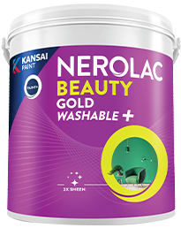
Beauty Gold Washable Plus
Nerolac Beauty Gold Washable Plus is an interior emulsion paint has a rich sheen finish, with highes...
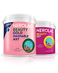
Beauty Gold washable and Beauty Gold Washable NXT
Nerolac Beauty Gold Washable paint has a soft sheen finish, with excellent stain-cleanability at an a...
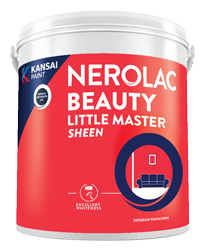
Beauty Little Master Sheen
Nerolac Beauty Little Master Sheen is an Economy Interior Wall Emulsion with very good sheen, smooth...
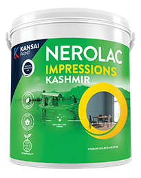
Impressions Kashmir
Nerolac Impressions Kashmir Luxury Emulsion is a superior quality 100% acrylic emulsion based interi...
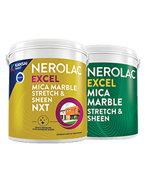
Neroalc Excel Mica Marble Strech Sheen & Mica Marble Stretch Sheen NXT
Nerolac Excel Mica marble stretch sheen Nxt & Mica Marble Strech Sheen is an extremely durable water...
FAQs
What is the best exterior wall paint colour combination?
Grey with white remains the most reliable choice, as it suits most architectural styles and hides weathering effectively.
What is a good exterior wall paint colour combination?
Yellow with white works well for homes that need warmth and daylight presence without heavy maintenance.
What are good colour combinations for painting the outside of a house?
Pairings that use one dominant field tone and one secondary accent, roughly a 70:30 split, consistently outperform evenly divided schemes.
What are the best exterior house paint color combos?
Grey and white, yellow and white, pink and violet, and purple and grey cover the widest range of requirements.
What outdoor wall paint colour works best?
Light to mid-tone shades with high reflectance perform best in Indian conditions, with darker tones reserved for plinths and accents.
What are popular house painting colour combinations in India?
White with grey, cream with brown, and yellow with white are the most widely used across residential projects.
What is a good colour combination for exterior walls?
Purple with grey suits modern elevations, while pink with violet works on softer, low-rise designs.
What colour combination works best for an outer wall?
For a boundary or outer wall, a darker base with a lighter upper section resists splash staining and keeps the wall visually connected to the house.
Which Nerolac paint is best for exterior walls?
Nerolac Excel Total is recommended for its weather, algae and dirt-pickup resistance.
How can I book a free Nerolac exterior colour consultation?
Request one through the Nerolac website or by contacting an authorised Nerolac dealer in your city.
Need Professional Home Painting Services?
Nerolac also offers professional home painting services in Two Colour Combinations For Exterior Walls , from interior and exterior wall painting to protective exterior coatings that keep your walls looking new for years to come.


Find an Expert Painter Near You
Enjoy a holistic painting experience with Nerolac NxtGen Services
Create magic with our inspiring Two Colour Combinations!
-
Red And Brown Colour Combination
-
Orange And Lilac Colour Combination
-
Orange And Yellow Colour Combination
-
Orange And Green Colour Combination
-
Orange And Blue Colour Combination
-
Orange And Violet Colour Combination
-
Orange And Beige Colour Combination
-
Orange And Neutral Colour Combination
-
Orange And White Colour Combination
-
Orange And Pink Colour Combination
-
Orange And Purple Colour Combination
-
Orange and Red Colour Combination
-
Orange And Peach Colour Combination
-
Orange And Cream Colour Combination
-
Orange And Grey Colour Combination
-
Orange And Gold Colour Combination
-
Orange And Brown Colour Combination
-
Yellow And Red Colour Combinations
-
Yellow And Orange Colour Combination
-
Yellow And Green Colour Combination
Paint shop near you
Looking for paint shop near me? A Nerolac paint shop may be just down the street!
Nerolac paint shops are spread across India and offer the widest range of wall paint colours for all your painting needs big or small. Along with huge variety of wall paint and painting supplies you will find great service, expert advice and inspiration to bring your ideas and passion to life. We are committed to deliver high-quality paints and supplies to all customers including homeowners and professional painters or contractors. Visit a paint store nearby today!
-
Find a Paint Store Near Your Location
- or
Get in Touch
Looking for something else? Drop your query and we will contact you.
Latest Happenings in the Paint World
Get some inspiration from these trending articles


Popular Searches
What’s Trending in Bedrooms
Explore Trending Living Room Ideas
- Living Room Colour Combination
- Modern Two Colour Combination for Living Room
- Wall Texture for Living Room
- Vastu Colours for Living Room
- Wall Texture Design for Living Room
- Living Room Paint Ideas
- Living Room Design Ideas
- Paint Colour Ideas for Living Room
- Living Room TV Wall Designs
- Green Living Room Walls
Kitchen Ideas People Love
Explore Trending Ceiling Ideas
Study Room Ideas in Demand
Explore Wall Paint Categories
Handpicked Colour Inspirations
- Accent Wall Design
- Bedroom Design Ideas
- Exterior Wall Colour Design Ideas
- Interior Wall Colour Design Ideas
- Kitchen Design Ideas
- Living Room Interior Design
- Geometric Wall Design Ideas
- Home Colour Combination Ideas
- Home Décor Ideas
- Mural Wall Paint Design Ideas
- Office Space Design Ideas
- Puja Room Design Ideas
- Texture Design Ideas
- Festival Painting Ideas
- Paint Colour Chart
- Wall Painting Designs
- Wood Wall Décor Ideas
- Mural Wall Paint Design
- Hall Design Ideas
- Gate Colour Design
- Exterior Wall Colour Design
- Door Colour Design Ideas
-
 Get in Touch
-
Store Locator
-
 Download App
×
Get in Touch
Looking for something else? Drop your query and we will contact you.

