
Gold Colour
Discover Gold colour shades to add a dynamic touch to your space.
Explore 16 Trending Gold Colour Combination for Walls
Products in this shade & Palette of Gold Colour
Browse through our wide range of paints to find the one that accentuates your home's beauty
Beauty Little Master Sheen
Nerolac Beauty Little Master Sheen is an Economy Interior Wall Emulsion with very good sheen, smoothness, coverage &
Beauty Gold Washable Plus
Nerolac Beauty Gold Washable Plus is an interior emulsion paint has a rich sheen finish, with highest washability (1.
Neroalc Excel Mica Marble Strech Sheen & Mica Marble Stretch Sheen NXT
Nerolac Excel Mica marble stretch sheen Nxt & Mica Marble Strech Sheen is an extremely durable water based high perfo
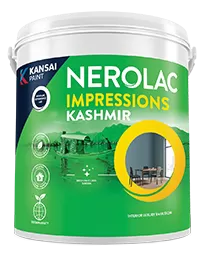
Impressions Kashmir
Nerolac Impressions Kashmir Luxury Emulsion is a superior quality 100% acrylic emulsion based interior wall paint wit
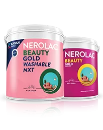
Beauty Gold washable and Beauty Gold Washable NXT
Nerolac Beauty Gold Washable paint has a soft sheen finish, with excellent stain-cleanability at an affordable price.
Trending Colour Shades
Find the Perfect Colour Shades for you walls


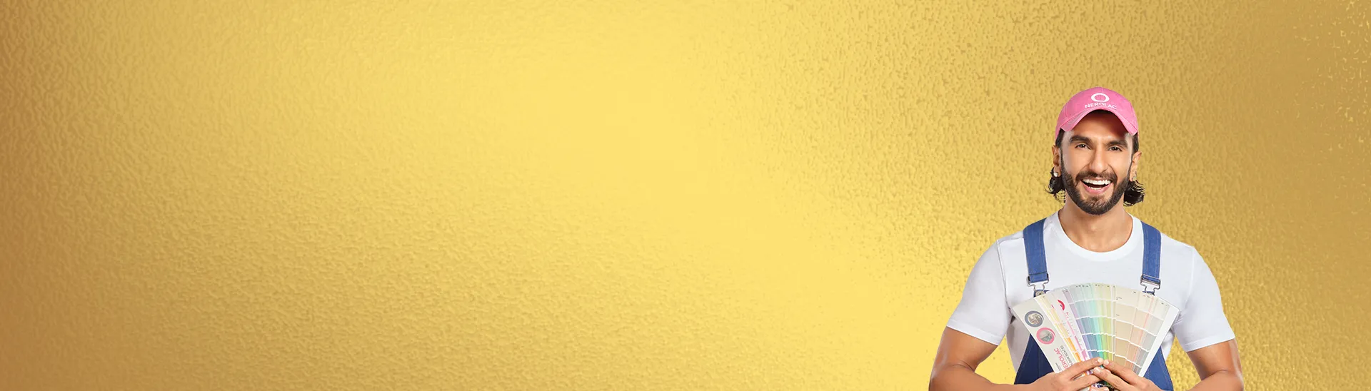
Find an Expert Painter Near You
Enjoy a holistic painting experience with Nerolac NxtGen Services
About Gold Colour
Gold, the luminous and opulent hue that echoes the brilliance of precious metal, radiates a sense of luxury, warmth, and timeless allure. Symbolizing wealth and prosperity, gold has long been associated with prestige and grandeur. Whether illuminating the intricate details of art and design or adorning regal garments, gold commands attention with its rich and vibrant glow. Its ability to evoke a sense of celebration and splendor makes it a symbol of achievement and success. Beyond its aesthetic appeal, gold carries cultural and historical significance, representing power and divine connection in various traditions. As a color that transcends trends and stands the test of time, gold remains a timeless choice for adding a touch of glamour and prestige to both the material and visual realms.
Stunning Gold Colour Designs, Shades & Combinations for Your Home
Gold can uplift a space in seconds. Used with intent, it reads luxurious without feeling flashy, and warm without turning orange. Think of gold colour as a sophisticated neutral with personality: it partners well with wood, stone, glass, textured fabrics, and warm metals. In compact Indian homes, carefully chosen gold colour shades can bounce light, soften harsh lines, and create a polished backdrop for art and furniture. This guide explains how to select gold colour in different shades, build balanced schemes, handle sheen and texture, and maintain a timeless look that feels welcoming every day.
Why Gold Colour Brings Luxury & Warmth to Interiors
Gold works because it captures warmth while remaining versatile. In daylight it looks radiant; under evening lamps it glows softly. When used on main walls in low to mid sheen, it creates an inviting field that flatters skin tones during gatherings and makes rooms feel finished. As an accent, it adds definition to niches, headboards, archways, or panelling.
Gold colour pairs easily with natural materials common in Indian homes: teak and oak, cane and rattan, marble and terrazzo. It also supports both traditional and contemporary décor. Pair it with carved wood and patterned textiles for a classic look, or set it against charcoal lines and clean furniture for a modern edge. The key is undertone control and placement. Choose cooler or warmer gold shades of colour based on your flooring, trims, and bulb temperatures. With warm floors or yellow lighting, lean slightly cooler; with grey tiles or cool daylight, lean warmer to avoid a flat look.
Explore Gold Colour Shades with Expert Insights
Designers evaluate gold by undertone, depth, and clarity. Shortlist two to four options, then test them at the morning, afternoon, and evening. That simple habit prevents surprises.
Soft Champagne Colour Shades:
A subdued gold with a hint of beige or grey colour. Elegant in living rooms and bedrooms where you want calm with a touch of luxury. It takes black frames and stone surfaces beautifully.
Classic Brushed Gold Colour Shades:
Balanced warmth with a clear golden note. Reliable for living rooms, dining zones, and hallways. It harmonises with teak, cane, and brass accents.
Antique Gold Colour Shades:
Slightly muted with a green or brown whisper. Perfect for traditional décor, patterned rugs, and carved pieces. Works well where you want depth without glare.
Sunlit Gold Colour Shades:
A brighter, cheerier tone that suits kitchens, breakfast nooks, and play spaces. Keep surrounding elements simple to avoid visual clutter.
Deep Metallic Gold Colour Shades:
Rich and reflective, best used sparingly on a single plane or detail. Pair with off white or stone to keep balance.
For large interior fields where you want even, radiant gold tones that appear smooth and consistent, many homeowners choose refined interior emulsions. Finishes comparable to Nerolac Impressions Eco Clean or Nerolac Beauty Smooth Finish can help gold read uniform across big walls, especially in living rooms and bedrooms where subtlety matters.
Best Gold Wall Design Ideas for Every Room
Here are the popular gold colour wall design ideas you must know:
Living Room Wall Design Ideas
- Feature field with restraint. Paint a main wall in soft champagne or classic brushed gold, then add neutral furniture and a jute or wool rug. Use matte black frames or a stone console for contrast.
- Panel detailing. Create shallow picture-frame mouldings and paint the inner panels a half-step deeper than the field. This adds structure without heavy carpentry.
- Media wall balance. If the TV wall is gold, keep the media unit simple in light wood or matte black to avoid glare.
Dining Room Wall Design Ideas
- Glow without dazzle. Choose a low-sheen antique gold behind a buffet or art cluster. Tableware, mirrors, and glass pendants pick up the warm note, so the room looks festive without feeling bright.
- Metallic highlight. Where you want a subtle sparkle, apply a controlled metallic coat to one panel or arch. Interior metallic systems similar to Nerolac Impressions Metallic Finish help deliver that soft shimmer with repeatable results.
Bedroom Wall Design Ideas
- Headboard anchor. A slightly deeper gold behind the bed makes the room feel cocooned. Keep adjacent walls a calmer champagne. Layer linen, boucle, or cotton throws to lower sheen perception.
- Wardrobe sync. Gold walls pair well with warm wood wardrobes and brushed brass pulls; if the carpentry is dark, keep the gold lighter to prevent heaviness.
Kitchen Wall Design Ideas
- Warm and clean. A gentle sunlit gold on the dining side of an open kitchen can warm the space; keep the working backsplash and cabinetry neutral for practicality.
- Hardware harmony. Chrome can cool a warm gold; brass or bronze continues the warmth. Pick one direction to avoid undertone clashes.
Entry and Hallway Wall Design Ideas
- First impression. A gold panel behind a console and round mirror pulls the eye inward. Under line-of-sight lighting, choose mid sheen to glow rather than reflect.
For exterior features such as balcony soffits or small façade inserts where you want the warmth of gold without premature fading, look for robust exterior emulsions. Options in the class of Nerolac Excel Total are commonly selected to keep colour fresh under varied weather. Reserve high-reflective metallics for small, sheltered accents.
Gold Colour Combinations & Contrasts That Work Best
A good gold colour combination always begins with undertone alignment and then considers contrast. Here are reliable families:
- Gold + warm white + oak: Airy and welcoming. Works for living rooms with good daylight. Keep fabrics textured rather than glossy.
- Gold + charcoal + brushed brass: Urban luxe. Use charcoal in slim lines—frames, lamp bases, side tables—so the room stays light.
- Gold + stone grey + black: Minimal and modern. Stone or concrete textures cool the warmth, black outlines sharpen the look.
- Gold + terracotta + cream: Earthy and grounded. Great for homes with clay accents, planters, or patterned textiles.
- Gold + navy + crisp white (colour schemes blue): Graphic and festive. The navy defines edges; the white prevents heaviness. This pairing is especially popular on entry or media walls.
If you plan stripes, geometric breaks, or a bold navy-gold pairing, clean demarcation is crucial. Crisp-edge interior coats similar to Nerolac Impressions Ultra HD are often chosen for high-definition lines that make a gold colour contrast look intentional, not accidental. Use quality tape, burnish edges lightly, and remove tape while the paint is just dry.
How to Make & Create Gold Colour for Your Walls?
Even if you choose ready-made shades, understanding the mix helps you read undertones and answer practical questions like how to make gold colour, how do you make gold colour behave in your light, and how to create gold colour variations for different rooms.
Step 1. Build the base
Start with a clean white base. Add yellow slowly; then add a very small amount of red to warm the mix. You are aiming for a golden ochre. If it looks too yellow, the red will steer it toward a balanced gold; if it tips orange, add more yellow and white to pull it back.
Step 2. Control depth
Add white to reach the lightness you want: softer for bedrooms and corridors, mid for living rooms, slightly deeper for accents. Keep adjustments small and stir thoroughly.
Step 3. Tune undertone
- Cooler, sophisticated gold: fold in a tiny touch of umber or grey.
- Warmer, festive gold: add a drop of red or a warmer yellow colour.
- Antique gold: add a minute amount of green or brown to mute brightness.
Step 4. Manage sheen
Sheen affects perception. Matte reduces glare and hides minor wall texture; eggshell or low sheen adds a gentle glow; higher sheen reads more metallic and shows surface flaws. Choose a sheen based on room use and wall condition.
Step 5. Test in real light
Paint two-coat swatches on A4 cards, label them, and view near floors, curtains, and furniture at morning, afternoon, and evening. Note which sample stays pleasant across lighting changes.
Step 6. Record ratios
Write down proportions and keep a labelled jar. Future touch-ups and coordination across rooms will be faster and more consistent.
If you are shortlisting shades digitally, an in-browser visualizer in the style of the Nerolac Colour Palette Tools is helpful for first-pass screening. Always confirm finalists with physical swatches under your actual lights before committing to a full room. This two-step approach saves time and ensures a dependable gold colour palette.
Gold Texture & Accent Wall Designs
Texture turns a pleasant wall into a memorable surface, especially with gold. Use it to add depth without overwhelming the room.
- Limewash or brushed effect : Creates a soft movement that feels artisanal. Works best with champagne or antique tones where variation is subtle.
- Ombre panels : Shift from a deeper base near the floor to a lighter gold at the ceiling. Ideal for tall walls or staircases.
- Geometric panelling : Shallow frames with the inner panel a half-step deeper than the field. Gold rewards shadow play and looks rich without high sheen.
- Metallic glaze : A controlled metallic layer over a matte gold field catches evening light. Use on one plane, a dining wall, foyer niche, or arch.
- Patterned stencil, tone on tone: Botanical or geometric motifs a half step darker or lighter than the field. Adds rhythm without loud contrast.
For ready, repeatable textures, linen weaves, brushed metallics, artisan patterns—many homeowners opt for curated systems comparable to Nerolac Impressions Ideaz, applied by trained painters for consistent results. Always preview a sample board in the room’s actual light.
Types of Gold Colour Shades for Modern Homes
To narrow choices quickly, map the types of gold colour shades to room function and light:
- Champagne gold: Light, refined, and versatile. Suits living rooms, bedrooms, and open-plan spaces. Friendly to black accents and stone textures.
- Ivory gold: A warm cream-gold hybrid for rooms that need subtle lift. Good with pale oak and greige textiles.
- Antique gold: Muted with green-brown whispers. Ideal for traditional décor, patterned rugs, and carved furniture.
- Brushed gold: Balanced and modern. Works across living, dining, and hallways; pairs with brass, bronze, and teak.
- Sunlit gold: Livelier and brighter. Use in small doses or in cheerful zones like breakfast nooks.
- Deep accent gold: Rich, metallic, and statement-making. Reserve for a single feature plane, headboard, or archway; keep adjacent walls soft.
These categories cover shades in gold colour from quiet to dramatic, helping you place gold colour in different shades thoughtfully rather than uniformly throughout the home.
Gold Colour Palette Inspiration for Modern Homes
Use these ready-to-apply palettes as starting points, then tune depth to your light and materials
Palette A. Urban Luxe
- Walls: champagne gold
- Trim/Ceiling: warm white
- Anchors: charcoal chairs, stone-top console
- Accents: brushed brass lamp, black frames
- Why it works: neutral anchors sharpen a soft gold field for a clean, city feel.
Palette B. Heritage Warmth
- Walls: antique gold
- Trim: off white
- Anchors: teak sideboard, patterned rug
- Accents: bronze hardware, earthenware planters
- Why it works: muted gold supports rich textures without glare.
Palette C. Contemporary Easy
- Walls: brushed gold
- Trim: crisp white
- Anchors: pale oak table, greige sofa
- Accents: linen cushions, glass pendants
- Why it works: balanced undertones feel modern yet relaxed.
Palette D. Graphic Contrast
- Feature: deep accent gold panel
- Surround: champagne gold
- Anchors: navy cushions within blue colour schemes, matte black coffee table
- Accents: white ceramics, striped throw
- Why it works: controlled gold colour contrast delivers drama; navy defines edges.
Palette E. Breezy Bright
- Walls: ivory gold
- Trim: neutral white
- Anchors: cane chairs, sand-toned rug
- Accents: sage cushions, light terrazzo
- Why it works: a soft gold field supports airy textures and greenery.
When finalising a gold colour combination, collect fabric swatches, floor samples, and metal finishes and view them together against painted cards. Confirm that the palette remains coherent when lights are dimmed; evenings are the real-world test.
DIY or Professional? Choosing the Best Way to Design Gold Walls
Choose your route based on scope, wall condition, and desired finish quality.
Go DIY when
- You are painting a single room or accent wall.
- Walls are sound with minimal repairs.
- You can dedicate time for prep: washing, filling, sanding, dust removal, priming where needed, and two thin topcoats.
- You’re comfortable cutting clean edges around trims, sockets, and mouldings.
Hire professionals when
- Multiple rooms, ceilings, or exteriors are involved.
- You want specialty finishes such as metallic glazes, textures, or crisp geometric breaks.
- There are repairs, damp patches, or timelines to meet.
- You need exacting lines for contrasts or panelling.
Application pointers
- Prep is everything. Gold exaggerates surface waves at higher sheens; smooth the substrate.
- Choose sheen intentionally. Matte or low sheen reads sophisticated; higher sheen is for controlled accents.
- Tape like a pro. Burnish edge and remove tape while paint is just dry for clean lines.
- Respect drying windows. Rushing coats can cause patchiness and sheen variation.
- Balance accessories. Let the walls breathe; a few considered pieces will look more refined than many.
If you want a managed experience—from shade selection and sampling to application and finishing, consider professional services similar to Nerolac Painting Solutions. Experienced teams coordinate timelines, surface preparation, and specialised effects, especially useful when orchestrating several different gold colour shades across a home.
Frequently Asked Questions For Gold Colour Shades & Palette
How to Make Gold colour?
To make gold colour, mix yellow with a small amount of brown and a touch of black for depth; adding metallic gold paint or using a gold pigment can enhance the effect.
Can I check how the gold colour shades will look on the walls?
Before going ahead with a fresh coat of paint, it is necessary to see how the Gold colour shades look on the walls. To make things easier, first, go to our gold Colour Catalogue and browse through the colours you like the most. Pick your choice of shade, click on the home icon to visualize how it will look on the walls.
From where can I buy the paint after selecting the gold colour shade?
After you have selected the shade, you can pick a store near you with the help of Store Locator and purchase interior, exterior gold Colour shades, enamel paint and many more products of your choice.
What’s next after selecting gold paint colours for my home?
NXTGEN painting service – our brand-new service gives you an exemplary gold colour painting by our highly experienced and reliable painters. All you need to do - drop your details, and an expert will get in touch with you. Et Voila! Your space is redefined within 5 days.
I am not sure of my selection of gold colour shade, can i watch a preview of it from my home?
Different light settings accentuate and enhance the colour on the walls. To visualize the gold colour shade before finalizing, download our Colour My Space app on Apple or Google Play Store. Here you can watch presets for different rooms, select the right texture and then simply call a painter near your location. Also, our very own NVISION tool renders you with a visual, answering every speck of your concerns.
How much gold colour paint will I require to repaint my home?
Check out the Paint Calculator tool to get the exact amount of paint required along with its cost in minutes.
How to decide which gold colour combination works well on walls?
Our Colour Catalogue has vivid gold colour shades. Each shade has 4 combinations picked from the colour palette that complements it best.
I am looking for some ideas for painting my home.
Head over to our inspiration section for trendy gold wall painting ideas for your home. From sought-after ideas to newly bloomed ones, you have it all in one place.
What is Nerolac NXTGEN?
Painting your home is the last step before you see the dream colour on the interior wall paint or exterior wall paint of your home. NXTGEN is a home painting service, which primarily provides the fastest route to paint your home. Pick a suitable gold colour, drop your details, and a certified expert will drop by your home to evaluate the home before painting.
What colours are in Gold?
Nerolac Gold range has more than 200 tones of golden shades—ranging from pale yellow-gold to deeper antique and aged shades—providing suitable options for warm accessories as well as sophisticated interior finishes.
What does Gold colour symbolise?
The colour gold symbolises wealth, luxury, cosiness and dignity. It also adds a tinge of royalty and warmth to any room, therefore hitting the balance between looks, convenience and luxury.
What is the code for Gold?
There is no specific code for Gold colour, but each shade has a unique code. One notable shade is “Aged Gold” having the code 4604. Another favoured shade is “Royale Gold”, which uses the code 4016.
What is the contrast colour of the Gold Colour palette?
Gold looks attractive when blended with other neutral colours, such as grey, black, beige and off-white. It also integrates well with deep browns and dull greens to deliver lavish, well-rounded mixtures.
What are the 10 shades of Gold?
Gold shades include Aged Gold, Royale Gold, Beauty Gold, Yellow Custard, Sunlit Bliss, Masterpiece Gold, Exotic Escape Gold, Sugee Cookie, Gold Washable, and Hyped Up.
What is Gold colour called in Hindi?
In Hindi, Gold colour is generally referred to as(sona), directly meaning the precious metal stimulating richness and brilliance.
What is the Gold colour of gold in Marathi?
In Marathi, Gold is called (sone), having the same definitions of wealth, zeal, and celebration.
What is the Gold colour of gold in Kannada?
In Kannada, Gold is termed (sone), reflecting the significance of indulgence, cultural relevance, and warmth associated with golden shades.
Create magic with our inspiring Two Colour Combinations!
-
Red And Brown Colour Combination
-
Orange And Lilac Colour Combination
-
Orange And Yellow Colour Combination
-
Orange And Green Colour Combination
-
Orange And Blue Colour Combination
-
Orange And Violet Colour Combination
-
Orange And Beige Colour Combination
-
Orange And Neutral Colour Combination
-
Orange And White Colour Combination
-
Orange And Pink Colour Combination
-
Orange And Purple Colour Combination
-
Orange and Red Colour Combination
-
Orange And Peach Colour Combination
-
Orange And Cream Colour Combination
-
Orange And Grey Colour Combination
-
Orange And Gold Colour Combination
-
Orange And Brown Colour Combination
-
Yellow And Red Colour Combinations
-
Yellow And Orange Colour Combination
-
Yellow And Green Colour Combination
Latest Happenings in the Paint World
Get some inspiration from these trending articles

Cloud Dancer Colour of the Year – Meaning, Combinations, Interior Ideas and Trends

How To Make Yellow Colour: Tips for Perfect Wall Paint Shades & Home Décor Ideas

How To Make White Colour: Tips for Perfect Wall Paint Shades & Home Décor Ideas

How To Make Violet Colour: Tips for Perfect Wall Paint Shades & Home Décor Ideas

How To Make Turquoise Colour: Tips for Perfect Wall Paint Shades & Home Décor Ideas

How to Make Sky Blue Colour: Tips for Perfect Wall Paint Shades & Home Décor Ideas
Get in Touch
Looking for something else? Drop your query and we will contact you.
-
 Get in Touch
 -
Store Locator
-
 Download App
×
Get in Touch
Looking for something else? Drop your query and we will contact you.
