

Two Colour Combinations For Home Office / Study Room
Colour Combination for Office and Study Room Walls with Vastu Tips
A home office or study room should feel calm enough for concentration and polished enough for everyday work or video calls. A thoughtful two-tone palette can bring that balance without making the room feel formal. Choosing the right colour combination for office and study room walls can help you stay focused through long working hours or exam preparation.
It can define the desk area, brighten darker corners and create a cleaner screen background. The key is to pair shades that sit comfortably together while working with your furniture, lighting and available space. The ideas below cover office room colour combinations, modern study room colour combinations and Vastu study room colour combinations, along with tips for creating a neat video-call backdrop.
Create Your Dream Home With Our Painting Experts
Fill the form below to book a free site evaluation by Nerolac Nxtgen painting Services expert
Wall Paint Colour for Focus and Video Calls
Wall colour can shape how focused and comfortable a home office feels. Soft, balanced shades help reduce visual distraction, while a slightly deeper backdrop can look neater during video calls.
- Choose soft blues, greens or warm neutrals.
- Avoid bright colours behind the desk.
- Keep the call background simple and uncluttered.
How to Choose a Two-Colour Combination for a Home Office
Start with how the room is used. A full-time workspace usually benefits from soft, low-distraction shades, while a study corner can handle a slightly stronger accent.
Keep these points in mind:
- Use the lighter shade across larger walls.
- Reserve the deeper colour for one feature wall.
- Check shades in daylight and artificial light.
- Match undertones with furniture and flooring.
- Keep the video-call background visually tidy.
A balanced colour combination for office spaces should support the room rather than dominate it.
Best Colour Combinations for an Office
A good office palette combines freshness with a settled backdrop.
Useful pairings include:
- Soft blue and warm white for an airy look.
- Sage green and cream for natural warmth.
- Light grey and muted blue for a professional feel.
- Beige and olive for a grounded setting.
- Off-white and charcoal for modern contrast.
The right office room colour combination should also suit the room size. Compact spaces often feel more open when the lighter shade remains dominant.
Colour Combination Ideas for a Study Room
Books, screens, stationery and storage already add visual detail, so wall colours can stay simple. A colour combination for study room walls may pair soft blue with white, pale green with cream, or muted yellow with warm white.
Grey with dusty green also works well for older students or adults who prefer something understated. Keep stronger colours to one wall or a smaller section so the study zone stays comfortable.
Study Room Colour Combination Ideas
A useful study room colour combination should suit the person using the space, not just current décor trends.
Try these pairings:
- Mint green with ivory.
- Powder blue with soft grey.
- Peach with cream.
- Beige with muted teal.
- Lavender with off-white.
These combinations bring enough personality to the room while keeping the overall setting easy on the eyes.
Two Colour Combinations for Office Walls
Placement matters as much as shade selection. A colour combination for office walls can define the desk zone, separate a shared room or create a neater background for online meetings.
For a simple approach, paint the desk wall in the deeper shade and keep surrounding walls lighter. A wall colour combination for office interiors can also use a half-wall treatment where shelving or cabinetry creates a natural visual line.
Modern Study Room Colour Combination Ideas
Modern interiors usually work well with restrained palettes and clean contrast. A modern study room colour combination could pair warm white with sage, pale grey with navy, beige with charcoal, or soft blue with muted taupe.
For a balanced finish:
- Keep the overall palette limited.
- Repeat one wall shade through small accessories.
- Use deeper tones where natural light is sufficient.
- Let furniture provide additional contrast.
This keeps the space current without making it feel overly trend-led.
Vastu-Friendly Study Room Colour Combinations
For homeowners who follow Vastu, lighter blues, greens, beige and lavender are commonly suggested for study spaces. Some Vastu guidance also links blue and light green with east, north and northeast-facing study directions.
A Vastu study room colour combination could pair:
- Light green with white.
- Pale blue with cream.
- Beige with soft yellow.
- Lavender with off-white.
Vastu can guide the palette, but the room's actual light and existing interiors should still influence your final choice.
Nerolac Paint Recommendations for Home Office Walls
For a home office used regularly, a finish that can handle routine cleaning is practical. Nerolac Beauty Gold Washable is described as an interior emulsion with soft sheen, washability, stain cleanability, low VOC and low odour. You can also explore our Impressions HD and Impressions Sheen options for your interior walls.
Test the chosen pairing beside your desk, shelves and curtains before finalising it, as physical paint can appear different from a screen.
Book a Free Nerolac Colour Consultation
Choosing between similar blues, greys, greens, or neutrals can become easier when the entire room is considered together. With Nerolac’s NXTGEN Painting service, you can get a free colour consultation as part of your painting journey.
Keep these ready:
- Room photos taken in daylight.
- Furniture and flooring references.
- Preferred colour families.
- Your usual video-call background.
Unique Two Colour Combinations to Try
Experiment with these beautiful two colour combo and transform your space
Trending Colour Shades
Find the Perfect Colour Shades for you walls
Products in this shade
Browse through our wide range of paints to find the one that accentuates your home's beauty
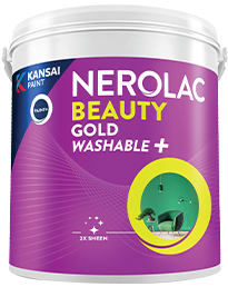
Beauty Gold Washable Plus
Nerolac Beauty Gold Washable Plus is an interior emulsion paint has a rich sheen finish, with highes...
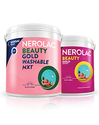
Beauty Gold washable and Beauty Gold Washable NXT
Nerolac Beauty Gold Washable paint has a soft sheen finish, with excellent stain-cleanability at an a...
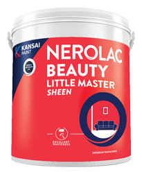
Beauty Little Master Sheen
Nerolac Beauty Little Master Sheen is an Economy Interior Wall Emulsion with very good sheen, smooth...
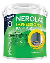
Impressions Kashmir
Nerolac Impressions Kashmir Luxury Emulsion is a superior quality 100% acrylic emulsion based interi...
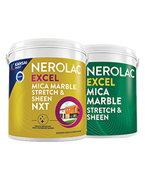
Neroalc Excel Mica Marble Strech Sheen & Mica Marble Stretch Sheen NXT
Nerolac Excel Mica marble stretch sheen Nxt & Mica Marble Strech Sheen is an extremely durable water...
FAQs
What is a good colour combination for an office?
Soft blue with warm white, sage with cream, or light grey with muted blue can create a calm and polished workspace.
What is a good colour combination for a study room?
Light blue with white or pale green with cream works well where you want a bright, settled study environment.
What is a good study room colour combination?
Try one soft dominant shade with a neutral, such as mint with ivory or powder blue with soft grey.
What is a good colour combination for office walls?
Use a light neutral across most walls with a deeper blue, green or charcoal behind the desk for subtle definition.
What wall colour combination works best for an office?
Warm white with sage, soft grey with blue, and beige with olive are versatile choices for a comfortable home office.
What is a good office room colour combination?
Cream or light grey paired with muted teal, olive, blue or charcoal can create a clean and comfortable office setting.
What is a modern study room colour combination?
Warm white with sage, pale grey with navy, or beige with charcoal can create a simple contemporary look.
What is a good Vastu-friendly study room colour combination?
Light green with white, pale blue with cream, or beige with soft yellow are suitable Vastu-inspired combinations.
Which Nerolac paint finish works best for a home office?
Nerolac Beauty Gold Washable Plus is a practical option where washability, stain cleanability and a soft sheen finish are preferred.
How can I book a free colour consultation for my home office?
You can book a free colour consultation for your home office through Nerolac’s NXTGEN Painting service on our official website.
Need Professional Home Painting Services?
Nerolac also offers professional home painting services in Two Colour Combinations For Home Office / Study Room , from interior and exterior wall painting to protective exterior coatings that keep your walls looking new for years to come.


Find an Expert Painter Near You
Enjoy a holistic painting experience with Nerolac NxtGen Services
Create magic with our inspiring Two Colour Combinations!
-
Orange And Purple Colour Combination
-
Orange And Lilac Colour Combination
-
Orange And Peach Colour Combination
-
Orange And Cream Colour Combination
-
Orange And Grey Colour Combination
-
Orange And Gold Colour Combination
-
Orange and Red Colour Combination
-
Yellow And Red Colour Combinations
-
Yellow And Orange Colour Combination
-
Yellow And Green Colour Combination
-
Yellow And Blue Colour Combination
-
Yellow And Violet Colour Combination
-
Yellow And Beige Colour Combination
-
Yellow And Neutral Colour Combination
-
Yellow And White Colour Combination
-
Yellow And Pink Colour Combination
-
Yellow And Purple Colour Combination
-
Yellow And Lilac Colour Combination
-
Yellow And Peach Colour Combination
-
Yellow And Cream Colour Combination
Paint shop near you
Looking for paint shop near me? A Nerolac paint shop may be just down the street!
Nerolac paint shops are spread across India and offer the widest range of wall paint colours for all your painting needs big or small. Along with huge variety of wall paint and painting supplies you will find great service, expert advice and inspiration to bring your ideas and passion to life. We are committed to deliver high-quality paints and supplies to all customers including homeowners and professional painters or contractors. Visit a paint store nearby today!
-
Find a Paint Store Near Your Location
- or
Get in Touch
Looking for something else? Drop your query and we will contact you.
Latest Happenings in the Paint World
Get some inspiration from these trending articles


Popular Searches
What’s Trending in Bedrooms
Explore Trending Living Room Ideas
- Living Room Colour Combination
- Modern Two Colour Combination for Living Room
- Wall Texture for Living Room
- Vastu Colours for Living Room
- Wall Texture Design for Living Room
- Living Room Paint Ideas
- Living Room Design Ideas
- Paint Colour Ideas for Living Room
- Living Room TV Wall Designs
- Green Living Room Walls
Kitchen Ideas People Love
Explore Trending Ceiling Ideas
Study Room Ideas in Demand
Explore Wall Paint Categories
Handpicked Colour Inspirations
- Accent Wall Design
- Bedroom Design Ideas
- Exterior Wall Colour Design Ideas
- Interior Wall Colour Design Ideas
- Kitchen Design Ideas
- Living Room Interior Design
- Geometric Wall Design Ideas
- Home Colour Combination Ideas
- Home Décor Ideas
- Mural Wall Paint Design Ideas
- Office Space Design Ideas
- Puja Room Design Ideas
- Texture Design Ideas
- Festival Painting Ideas
- Paint Colour Chart
- Wall Painting Designs
- Wood Wall Décor Ideas
- Mural Wall Paint Design
- Hall Design Ideas
- Gate Colour Design
- Exterior Wall Colour Design
- Door Colour Design Ideas
-
 Get in Touch
-
Store Locator
-
 Download App
×
Get in Touch
Looking for something else? Drop your query and we will contact you.

