

Two Colour Combinations For Living Room
Two Colour Combinations for Living Room Walls: Modern Drawing Room Ideas
Visitors form an opinion of a home within seconds of entering the living room, and colour is what they register before they notice the furniture, the layout or anything else. A single flat tone across every wall gives that first glance nothing to hold onto; the room simply recedes into the background. Two colours change that instantly, because the eye naturally sees a junction between shades as structure, and structure is what makes a room feel welcoming rather than merely painted.
There is also a matter of how living rooms actually get used. This is the one space in a home that hosts both quiet evenings and larger gatherings, and a well-judged colour combination for living room walls can support both moods at once. Whether you want a modern two colour combination for living room walls or a classic drawing room colour combination, the right choice depends on your light, furniture and how the space is used. Below, you'll find practical colour schemes for living room walls, along with dedicated ideas for sitting rooms, lounges and formal drawing rooms.
Create Your Dream Home With Our Painting Experts
Fill the form below to book a free site evaluation by Nerolac Nxtgen painting Services expert
How to Choose a Two Colour Combination for Your Living Room
The right pairing depends less on personal taste than on the fixed elements already present in the room. Work with what exists before introducing anything new, and the decision becomes considerably simpler.
- Identify the room's fixed materials first: Flooring, upholstery and wooden furniture all carry undertones, and a good color combo for living room walls should appear comfortably beside them rather than compete.
- Account for the direction the room faces: Rooms with strong afternoon sun can carry deeper, cooler shades without feeling closed in; north-facing rooms hold warmth better.
- Choose where the accent goes: A single feature wall behind the seating, the wall facing the entrance, or a media unit wall are the usual options.
- Consider how the room is lit in the evening: Warm artificial light shifts cool tones slightly, so test any shortlist under lamp light, not only daylight.
Best Colour Combinations for Living Room Walls
The four pairings below span a wide range of moods, from energetic to restrained, and each has proved dependable across different room sizes and lighting conditions.
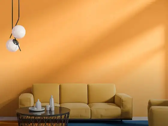
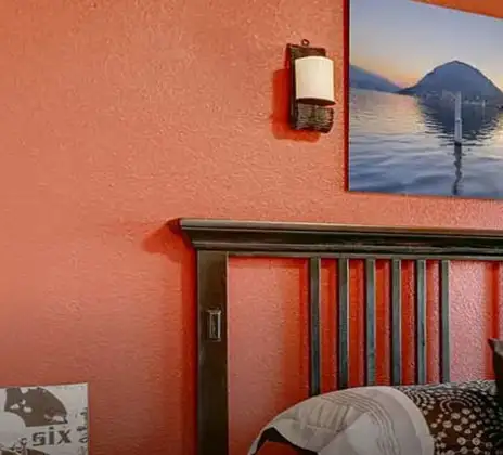
Orange and Brown Colour Combination For Living Room
An earthy, grounded pairing. Orange brings warmth and visual energy, while brown anchors the scheme and keeps it from feeling too bright for daily use.
Features and Why It Works in a Living Room
Brown appears as furniture-adjacent, which means it blends naturally with wooden shelving and upholstery rather than competing with them. Orange, used as an accent rather than the dominant tone, adds life to the seating wall without overwhelming a room used for long stretches of time.
Yellow and Blue Color Combo For Living Room
A confident, complementary pairing that balances warmth against coolness. Yellow lifts the room; blue restrains it.
Features and Why It Works in a Living Room
The contrast between the two keeps the eye engaged without becoming tiring, which is useful in a room where people rest for extended periods. Blue also photographs well under both daylight and warm evening lighting, making this one of the more dependable colors schemes for living room settings that host guests in the evening.
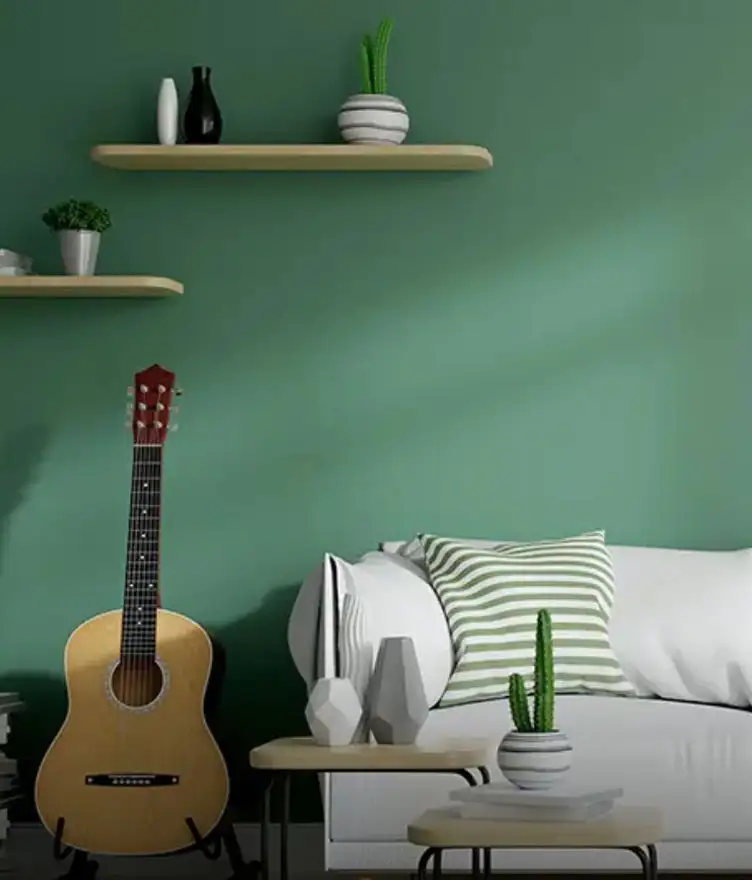
Green and White Colors Schemes For Living Room
A calm, restorative combination. Green supplies a natural, grounding presence; white keeps the room feeling open and well lit.
Features and Why It Works in a Living Room
Green performs particularly well at close viewing distance, which matters in a room where people are seated rather than passing through. Paired with white ceilings, it prevents the space from feeling heavy, even when the green itself is a deeper shade.
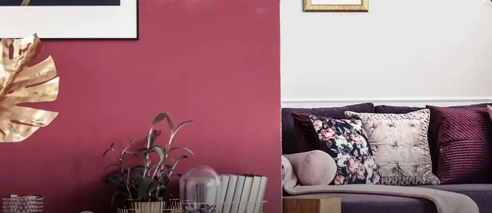
Red and Violet Colour Combination For Sitting Room
An analogous, expressive scheme built from adjacent hues rather than sharp opposites.
Features and Why It Works in a Living Room
Because red and violet come close together on the colour wheel, the transition between them is gentle rather than jarring, allowing a single feature wall to carry real depth without dividing the room. Used sparingly, this pairing suits living rooms designed for entertaining rather than quiet daily use.
Colour Combinations for Sitting Room and Lounge
A sitting room or lounge is typically smaller and used more informally than a full living room, which shifts the priorities slightly. A colour combination for sitting room walls generally benefits from a lighter dominant tone to preserve a sense of space, with the accent shade confined to one wall or a defined architectural feature such as an alcove.
For colour combinations for lounge areas that open onto a balcony or garden, tones that echo the view outside, soft greens or warm neutrals, tend to create the most cohesive result between indoors and out.
Colour Combination Ideas for Drawing Room Walls
A drawing room carries a slightly more formal character than the rest of the living space, which allows for pairings that feel refined rather than purely practical.
Grey and Violet Colour Combinations For Lounge
A composed, contemporary pairing. Grey provides structure; violet appears as a classy accent rather than a dominant presence.
Features and Why It Works in a Living Room
Violet retains its depth under artificial light where warmer accent colours can appear muddy, and grey keeps the overall scheme adaptable to changing furniture and decor over time.
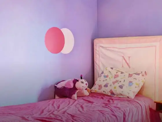
Pink and Purple Living Room Wall Colour Combination
An analogous scheme with a distinctly modern character, built from two closely related hues.
Features and Why It Works in a Living Room
The closeness of the two shades on the colour wheel produces a soft gradient effect rather than a hard boundary.
Modern Two Colour Combinations for Living Room
Grey and violet is currently the most requested for contemporary interiors, largely because it pairs easily with both metal and wood finishes. Green and white follows closely behind, favoured for its calm, uncluttered character. Together, these represent the clearest direction in modern two colour combination for living room choices at present: restrained bases with a single accent, rather than two competing bold tones.
Nerolac Paint Recommendations for Living Room Walls
The following Nerolac shade pairings translate the combinations above into ready-to-use options:
- Campfire's Burning + Brown Rice: An orange and brown scheme, warm and grounded
- Yellow Cab + Pacific Bay: A yellow and blue pairing, confident and balanced
- Pastel Pine + Raft White: A soft green and white combination for a restful room
- Vivacious Red + Spanish Song: A red and violet pairing, suited to a feature wall
Book a Free Nerolac Colour Consultation for Your Living Room
Turning a shortlist into a finished scheme is far simpler with an expert assessment of the actual room. A free site visit and colour consultation for your living room is available through Nerolac NXTGen Painting Services, which brings trained and certified painters, complimentary colour guidance, environmentally responsible products, careful masking of furniture and flooring, and mechanised application tools to the job. Visit the Nerolac website or reach out to your nearest Nerolac dealer to arrange a visit.
Unique Two Colour Combinations to Try
Experiment with these beautiful two colour combo and transform your space
Trending Colour Shades
Find the Perfect Colour Shades for you walls
Products in this shade
Browse through our wide range of paints to find the one that accentuates your home's beauty
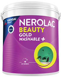
Beauty Gold Washable Plus
Nerolac Beauty Gold Washable Plus is an interior emulsion paint has a rich sheen finish, with highes...

Beauty Gold washable and Beauty Gold Washable NXT
Nerolac Beauty Gold Washable paint has a soft sheen finish, with excellent stain-cleanability at an a...
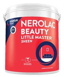
Beauty Little Master Sheen
Nerolac Beauty Little Master Sheen is an Economy Interior Wall Emulsion with very good sheen, smooth...
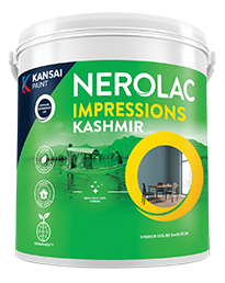
Impressions Kashmir
Nerolac Impressions Kashmir Luxury Emulsion is a superior quality 100% acrylic emulsion based interi...
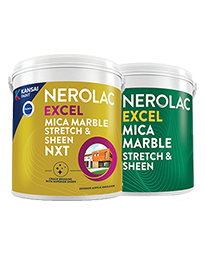
Neroalc Excel Mica Marble Strech Sheen & Mica Marble Stretch Sheen NXT
Nerolac Excel Mica marble stretch sheen Nxt & Mica Marble Strech Sheen is an extremely durable water...
FAQs
What is the best colour combination for a living room?
Grey with violet is currently the most versatile choice, working well with both modern and traditional furnishings.
What is a good colour combo for a living room?
Green with white suits most living rooms, offering a calm base that still allows for a defined accent wall.
What are good colour schemes for a living room?
A dominant neutral or muted tone paired with one richer accent shade, in roughly a seventy-thirty split, works reliably across room sizes.
What is a good colour combination for a sitting room?
Lighter dominant tones with a single accent wall keep smaller sitting rooms feeling open rather than enclosed.
What colour combinations work well for a lounge?
Tones that connect with an adjoining outdoor view, such as soft greens or warm neutrals, tend to suit lounge spaces best.
What is the best living room wall colour combination?
Yellow with blue offers a confident, balanced option that reads well under both daylight and evening lighting.
What is a good color combination for drawing room walls?
Pink with purple gives a refined, contemporary result suited to formal drawing rooms.
What are good colour schemes for living room walls?
Orange with brown creates a warm, grounded scheme that pairs comfortably with wooden furniture.
What is a good drawing room colour combination?
Grey with violet remains the most consistently favoured option for a composed, modern drawing room.
What is a modern two colour combination for a living room?
Grey and violet, alongside green and white, represent the current preference for restrained bases with a single accent tone.
How can I book a free Nerolac colour consultation for my living room?
A free consultation can be booked through Nerolac NXTGen Home Painting Services on the Nerolac website, or by contacting an authorised Nerolac dealer.
Need Professional Home Painting Services?
Nerolac also offers professional home painting services in Two Colour Combinations For Living Room , from interior and exterior wall painting to protective exterior coatings that keep your walls looking new for years to come.


Find an Expert Painter Near You
Enjoy a holistic painting experience with Nerolac NxtGen Services
Create magic with our inspiring Two Colour Combinations!
-
Orange And Purple Colour Combination
-
Orange And Lilac Colour Combination
-
Orange And Peach Colour Combination
-
Orange And Cream Colour Combination
-
Orange And Grey Colour Combination
-
Orange And Gold Colour Combination
-
Orange and Red Colour Combination
-
Yellow And Red Colour Combinations
-
Yellow And Orange Colour Combination
-
Yellow And Green Colour Combination
-
Yellow And Blue Colour Combination
-
Yellow And Violet Colour Combination
-
Yellow And Beige Colour Combination
-
Yellow And Neutral Colour Combination
-
Yellow And White Colour Combination
-
Yellow And Pink Colour Combination
-
Yellow And Purple Colour Combination
-
Yellow And Lilac Colour Combination
-
Yellow And Peach Colour Combination
-
Yellow And Cream Colour Combination
Paint shop near you
Looking for paint shop near me? A Nerolac paint shop may be just down the street!
Nerolac paint shops are spread across India and offer the widest range of wall paint colours for all your painting needs big or small. Along with huge variety of wall paint and painting supplies you will find great service, expert advice and inspiration to bring your ideas and passion to life. We are committed to deliver high-quality paints and supplies to all customers including homeowners and professional painters or contractors. Visit a paint store nearby today!
-
Find a Paint Store Near Your Location
- or
Get in Touch
Looking for something else? Drop your query and we will contact you.
Latest Happenings in the Paint World
Get some inspiration from these trending articles


Popular Searches
What’s Trending in Bedrooms
Explore Trending Living Room Ideas
- Living Room Colour Combination
- Modern Two Colour Combination for Living Room
- Wall Texture for Living Room
- Vastu Colours for Living Room
- Wall Texture Design for Living Room
- Living Room Paint Ideas
- Living Room Design Ideas
- Paint Colour Ideas for Living Room
- Living Room TV Wall Designs
- Green Living Room Walls
Kitchen Ideas People Love
Explore Trending Ceiling Ideas
Study Room Ideas in Demand
Explore Wall Paint Categories
Handpicked Colour Inspirations
- Accent Wall Design
- Bedroom Design Ideas
- Exterior Wall Colour Design Ideas
- Interior Wall Colour Design Ideas
- Kitchen Design Ideas
- Living Room Interior Design
- Geometric Wall Design Ideas
- Home Colour Combination Ideas
- Home Décor Ideas
- Mural Wall Paint Design Ideas
- Office Space Design Ideas
- Puja Room Design Ideas
- Texture Design Ideas
- Festival Painting Ideas
- Paint Colour Chart
- Wall Painting Designs
- Wood Wall Décor Ideas
- Mural Wall Paint Design
- Hall Design Ideas
- Gate Colour Design
- Exterior Wall Colour Design
- Door Colour Design Ideas
-
 Get in Touch
-
Store Locator
-
 Download App
×
Get in Touch
Looking for something else? Drop your query and we will contact you.

