Burgundy Colour
Burgundy
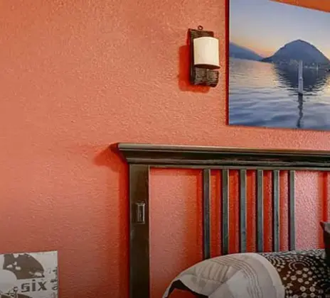
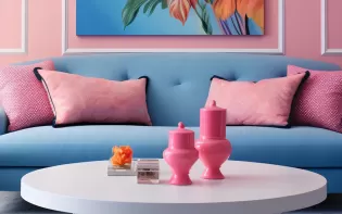
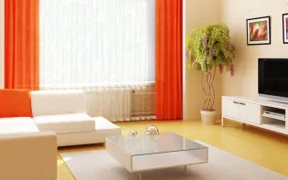
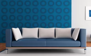
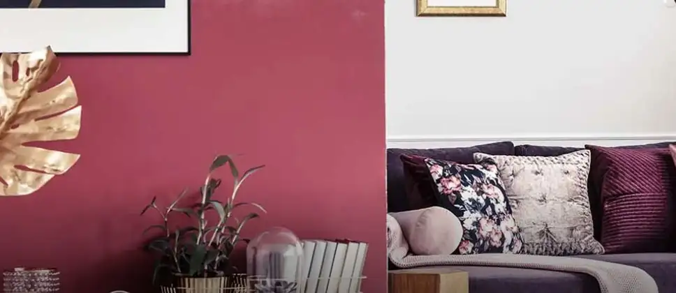
This picturesque colour is as mature as aged fine wine such as a Merlot. Its charm will take you back in time to an ancient world and transform your space completely. Burgundy will hold you close and enchant you with its regal elegance and unmatched beauty. This timeless colour defines passion laced with power and charisma. A touch of this full-bodied colour on your walls will let you discover the unique world which is created by merging two beautiful colours. Neutral shades of white, beige and soft yellow blend-in perfectly with this colour creating a magic on your walls.
Disclaimer: Actual wall paint colour applied may differ from the on-screen representation above. Please confirm your colour choices prior to purchase by viewing a physical colour shade card or a painted sample.
Still confused ? Explore all our shades from our colour catalogue
Paint your life's canvas with our painting experts
Fill the form below to book a free site evaluation by Nerolac Express Painting Service expert
Trending Colour Shades
Find the Perfect Colour Shades for you walls

Products in this shade
Browse through our wide range of paints to find the one that accentuates your home's beauty
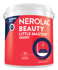
Beauty Little Master Sheen
Nerolac Beauty Little Master Sheen is an Economy Interior Wall Emulsion with very good sheen, smooth...
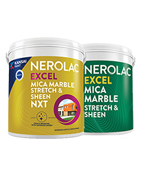
Neroalc Excel Mica Marble Strech Sheen & Mica Marble Stretch Sheen NXT
Nerolac Excel Mica marble stretch sheen Nxt & Mica Marble Strech Sheen is an extremely durable water...

Beauty Gold washable and Beauty Gold Washable NXT
Nerolac Beauty Gold Washable paint has a soft sheen finish, with excellent stain-cleanability at an a...

Beauty Gold Washable Plus
Nerolac Beauty Gold Washable Plus is an interior emulsion paint has a rich sheen finish, with highes...
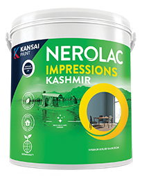
Impressions Kashmir
Nerolac Impressions Kashmir Luxury Emulsion is a superior quality 100% acrylic emulsion based interi...
About Burgundy Colour
Burgundy Colour Shades, Designs & Combinations for Your Home
Burgundy is a deep, rich shade inspired by red wine, carrying strong hints of red with subtle undertones of brown and purple. It is a colour known for its depth, warmth, and bold character. Unlike brighter reds, burgundy feels more grounded and mature, making it suitable for spaces where you want a sense of richness rather than brightness. Burgundy has a strong presence on walls. It instantly adds personality to a room and creates a sense of warmth and comfort. Because it is a darker shade, it is often used thoughtfully, either on feature walls or in rooms where you want a more intimate and enclosed feel. When paired correctly, burgundy can look elegant, modern, classic, or even dramatic.
This colour is often chosen for homes that want to move away from light neutrals and explore deeper, expressive tones without becoming overpowering. Burgundy works best when balanced with lighter shades, warm lighting, and the right textures.
Key Characteristics of Burgundy Colour
• Deep and intense
Burgundy is a dark, high-depth shade, so it absorbs more light than lighter colours. That’s why it creates a cosy, enclosed feel and makes spaces look more intimate. In paint terms, deeper shades like burgundy usually look best when you plan lighting well and keep at least one surface lighter (ceiling, trims, or adjacent walls) to maintain balance.
• Warm and grounding
Burgundy sits in the red family, but with a brown/purple influence that makes it feel richer and less “bright red.” This warm base is what gives it a comforting, grounded look, especially in rooms where you want warmth without loudness.
• Strong visual presence
Because burgundy is high in colour strength and depth, it naturally becomes the first thing the eye notices. Even a single burgundy wall can act like a focal point. This is why it’s commonly used for feature walls, TV backdrops, headboard walls, or areas where you want the room to feel more defined.
• Elegant and mature
Burgundy is often linked with luxury, tradition, and confidence because it resembles classic wine tones and heritage interiors. It looks premium with warm metals (brass, gold), dark wood, leather, and textured fabrics. In modern homes, it works best with clean shapes, minimal décor, and lighter neutral companions.
• Lighting-sensitive
Burgundy shifts with both daylight and artificial lighting. In strong daylight, the red side looks clearer and brighter. Under warm lighting, it looks deeper and more “wine-like.” Under cool white lighting, it can appear slightly sharper or show more of its darker undertone. A small test patch is important because darker colours also show changes more clearly across different walls.
Uses and Applications of Burgundy Colour
• Interior Design
Burgundy is commonly used to create statement walls, cosy rooms, and elegant interiors. It is popular in living rooms, dining areas, and bedrooms where warmth and depth are desired. When used carefully, it adds character without overwhelming the space.
• Furniture and Decor Styling
Burgundy works well with wooden furniture, leather sofas, brass accents, and soft fabrics like velvet or linen. It is often used to highlight shelving walls, TV units, or headboard walls.
• Art and Visual Design
In design and branding, burgundy is used to convey richness, seriousness, and premium appeal. It is often seen in packaging, hospitality interiors, and spaces meant to feel luxurious and intimate.
• Cultural and Traditional Spaces
Burgundy has long been associated with heritage interiors, libraries, formal dining rooms, and classic homes. It blends well with traditional décor and warm textures.
Burgundy Paint Choices for Your Walls
Choosing burgundy for your walls requires a slightly different approach compared to lighter colours. The depth of the shade means the room size, lighting, and surrounding colours play a big role in how it finally looks. Below are key burgundy shade families using the correct Nerolac shades you shared, along with guidance on where each works best.
Soft Burgundy-Inspired Tones
These shades are lighter and more muted, making them easier to use across larger wall areas without making the room feel too dark.
- Sweet Innocence: This shade has a gentle warmth and works well in bedrooms or quiet sitting areas. It gives a soft hint of burgundy without strong intensity.
- Delicate Blossom: A subtle, warm shade that suits smaller rooms or spaces with limited light. It keeps the room feeling warm while remaining comfortable and easy on the eyes.
Balanced Everyday Burgundy Shades
These shades sit comfortably between soft and deep burgundy tones, making them suitable for regular living spaces.
- Rosy Cloud: A balanced tone that works well in living rooms and shared spaces. It adds colour without dominating the room and pairs well with neutral furniture.
- Genteele Pink: A warmer shade that leans slightly lighter, making it suitable for homes that want colour without strong contrast. It works well with beige, cream, and light wood.
Deep and Rich Burgundy Shades
These shades are bold and dramatic, best used with planning and balance.
- Flo-Jo: A strong, rich shade ideal for feature walls in dining rooms or living rooms. It looks best when paired with light walls and warm lighting.
- Melody: A deeper shade that adds seriousness and depth. Suitable for study rooms, reading corners, or formal spaces where a strong visual impact is desired.
Dark Accent Burgundy Shades
These shades are best used in limited areas to create focus.
- Deep Pink: Despite the name, this shade carries strong burgundy depth. It works well for accent walls, niches, or areas you want to highlight without covering the entire room.
Burgundy Wall Colour Combinations for Your Home
Burgundy is a deep, bold wall colour, so it pairs best with shades that soften it, balance it, or add a gentle contrast. Here are the recommended Nerolac combinations (with codes) that work well with Burgundy.
| Type of Room / Space | Recommended Burgundy Combination |
|---|---|
| Bedrooms, reading corners, calm spaces | Burgundy + Dance Pointe (4812) |
| Living rooms, family rooms, common areas | Burgundy + Light Pink (02269) |
| Feature walls, TV wall, sofa backdrop | Burgundy + Rose Rosary (4816) |
| Dining rooms, study rooms, formal corners | Burgundy + Jujube (4809) |
Burgundy + Light Pink Colour Combination
This pairing softens burgundy and keeps the room feeling warm and welcoming. Use Light Pink on the larger wall areas and bring in Burgundy on a feature wall (TV unit wall, behind the sofa, or an accent niche) for a balanced look.
Burgundy + Rose Rosary Colour Combination
A richer combination that feels more layered and premium. Rose Rosary supports burgundy without making the space too bright. This works well for feature walls, especially when you want the wall to stand out but still feel refined.
Burgundy + Dance Pointe Colour Combination
A light, gentle shade that gives burgundy more breathing space. It is ideal for bedrooms, because the overall look stays calm and soft while burgundy adds depth. Keep Dance Pointe as the main shade, and use Burgundy on one wall.
Burgundy + Jujube Colour Combination
This is a deeper, moodier pairing for homes that like stronger colours. It works best in dining rooms, study areas, or formal spaces. Use it carefully; keep Burgundy as the main highlight, and use Jujube on a smaller wall or panel to avoid making the room feel too dark.
Best Burgundy Shades for Accent Walls
Burgundy works extremely well as an accent colour. Using it on a single wall or highlighted area allows you to enjoy its richness without darkening the entire room.
Accent walls work best when paired with lighter surrounding walls, warm lighting, and minimal clutter.
| Shade | Best Placement |
|---|---|
| Flo-Jo | Living room feature wall |
| Melody | Study room or reading area |
| Deep Pink | Dining room highlight wall |
| Rosy Cloud | Bedroom headboard wall |
Simple Tips for Using Burgundy at Home
Start by deciding the “hero” wall. Burgundy looks best when it has a clear job – behind the sofa, the TV unit, the bed, or a dining backdrop. When you treat it as the highlight, the room looks planned, not random.
- Keep the other walls quiet. Use softer, lighter shades on the remaining walls so the burgundy wall stands out and the space still feels open.
- Work with warm materials. Wood, cane, tan leather, beige fabrics, and brass details make burgundy look richer and more elegant.
- Use layered lighting, not just one ceiling light. A mix of ceiling light + wall lights + a lamp (warm white) keeps the shade looking even and avoids dark corners.
- Choose a finish that stays neat. A matt or soft-matt finish usually gives a smoother look and hides small wall marks better than a shiny finish.
- Make the wall look intentional with details. Panelling, an arch, a simple frame moulding, or a niche can lift the burgundy wall and make it feel premium without adding extra colours.
How Nerolac Can Help You Paint Your Walls Ivory?
Burgundy needs a cleaner application than lighter colours because uneven patches and roller marks can show up easily. That’s why the wall condition, base preparation, and method of painting matter a lot for the final look.
With Nerolac’s painting service, you get end-to-end support – starting from a shade shortlisting that suits your room and lighting, to a finish that looks even across the wall. The home painting service typically includes checking the surface, fixing minor cracks or dents, applying the appropriate primer/base coat, and painting to maintain the burgundy tone.
If you want a more guided approach, Nerolac’s expert painting service can help you decide where burgundy will look best – feature wall, dining backdrop, headboard wall, or a formal corner, so the room feels balanced. And with a professional painting service, you get sharper edges, smoother coverage, and a burgundy finish that looks rich instead of patchy.
Want a bold burgundy makeover? Book Nerolac’s professional painting service today for shade guidance, site evaluation, and a smooth, long-lasting finish.
Plan, Design and Paint Your Walls With Nerolac Tools
Ready to plan your burgundy makeover? Use the tools below to explore shades, visualise rooms and estimate paint and budget.
Colour Visualiser
Use the Nerolac Colour Visualiser to try out different shades and textures from our colour and texture palette on the walls of our ‘room presets.’ You can also see how each colour will look under various lighting conditions, such as natural sunlight, cool white light and warm yellow light, before finalising a shade.
Colour Catalogue
Use the Nerolac Colour Catalogue to browse over 1,500 Nerolac wall paint shades. Search by colour name or code, or filter by colour family to quickly discover options that match your décor. Shortlist your favourite shades and pair them with the other Nerolac tools to finalise the perfect colour scheme for your home.
Paint Calculator
Use the Nerolac Paint Calculator to estimate the area to be painted and the required paint volume for your décor project. Enter wall dimensions, room count, and preferred product to get an approximate paint quantity and cost, helping you plan your project with greater confidence.
Frequently Asked Questions For Burgundy
Can I check how the shades will look on the walls?
Before going ahead with a fresh coat of paint, it is necessary to see how the shades look on the walls. To make things easier, first, go to our Colour Catalogue and browse through the colours you like the most. Pick your choice of shade, click on the home icon to visualize how it will look on the walls.
From where can I buy the paint after selecting the shade?
After you have selected the shade, you can pick a store near you with the help of Store Locator and purchase interior, exterior shades, enamel paint and many more products of your choice.
What’s next after selecting paint colours for my home?
NXTGEN painting service – our brand-new service gives you an exemplary painting service by our highly experienced and reliable painters. All you need to do - drop your details, and an expert will get in touch with you. Et Voila! Your space is redefined within 5 days.
I am not sure of my selection of shade, can I watch a preview of it from my home?
Different light settings accentuate and enhance the colour on the walls. To visualize the shade before finalizing, download our Colour My Space app on Apple or Google Play Store. Here you can watch presets for different rooms, select the right texture and then simply call a painter near your location. Also, our very own Product Comparison Tool renders you with a visual, answering every speck of your concerns.
How much paint will I require to repaint my home?
Check out the Paint Calculator tool to get the exact amount of paint required along with its cost in minutes.
How to decide which colour combination works well on walls?
Our Colour Catalogue has vivid shades. Each shade has 4 combinations picked from the colour palette that complements it best.
I am looking for some ideas for painting my home?
Head over to our Two Colour Combinations for trendy wall painting ideas for your home. From sought-after ideas to newly bloomed ones, you have it all in one place.
What is Nerolac NXTGEN?
Painting your home is the last step before you see the dream colour on the interior or exterior wall paint for your home. NXTGEN is a painting service, which primarily provides the fastest route to paint your home. Pick a suitable colour, drop your details, and a certified expert will drop by your home to evaluate the home before painting.
What is the hex code of Burgundy colour? Which colour family does Burgundy belongs to?
Burgundy is one of the shades of red colour and its hex code is #714848.
What colour is burgundy?
Burgundy is a deep red shade with a wine-like look. It often has a slight brown or purple touch, which makes it feel richer than bright red.
Is burgundy a warm colour?
Yes. It belongs to the warm colour family because of its red base, even though it looks deep and intense.
Will burgundy make my room look smaller?
It can, if it’s used on all walls in a small room. For most homes, burgundy works best on one feature wall, with lighter shades on the other walls.
Which rooms suit burgundy walls the most?
Living rooms, dining areas, bedrooms, and study corners suit burgundy well, especially when the room has good lighting and balanced décor.
What colours go well with burgundy?
Soft light shades like cream, ivory, and light beige balance it well. It also pairs nicely with muted pinks, dusty pink tones, warm neutrals, and some darker accents when used carefully.
What kind of lighting looks best with burgundy walls?
Warm white lighting usually looks best because it brings out the rich, wine-like look of burgundy and makes the space feel cosy.
What finish should I choose for burgundy paint?
Matte or soft-matte is a safe choice for walls because it gives an even look and hides small wall flaws better than glossy finishes.
Can I use burgundy in a modern home?
Yes. Keep the styling clean – simple furniture, lighter surrounding walls, and minimal décor. Burgundy then becomes a strong, modern feature rather than a heavy traditional colour.
Create magic with our inspiring Two Colour Combinations!
-
Orange And Lilac Colour Combination
-
Red And Brown Colour Combination
-
Yellow And Blue Colour Combination
-
Yellow And Green Colour Combination
-
Yellow And Orange Colour Combination
-
Yellow And Red Colour Combinations
-
Orange And Brown Colour Combination
-
Orange And Gold Colour Combination
-
Orange And Grey Colour Combination
-
Orange And Cream Colour Combination
-
Orange And Peach Colour Combination
-
Orange and Red Colour Combination
-
Orange And Purple Colour Combination
-
Orange And Pink Colour Combination
-
Orange And White Colour Combination
-
Orange And Neutral Colour Combination
-
Orange And Beige Colour Combination
-
Orange And Violet Colour Combination
-
Orange And Blue Colour Combination
-
Orange And Green Colour Combination
Get in Touch
Looking for something else? Drop your query and we will contact you.
-

Get in Touch Get in Touch -

Store Locator Store Locator -

Download App Download App
Get in Touch
Looking for something else? Drop your query and we will contact you.

