

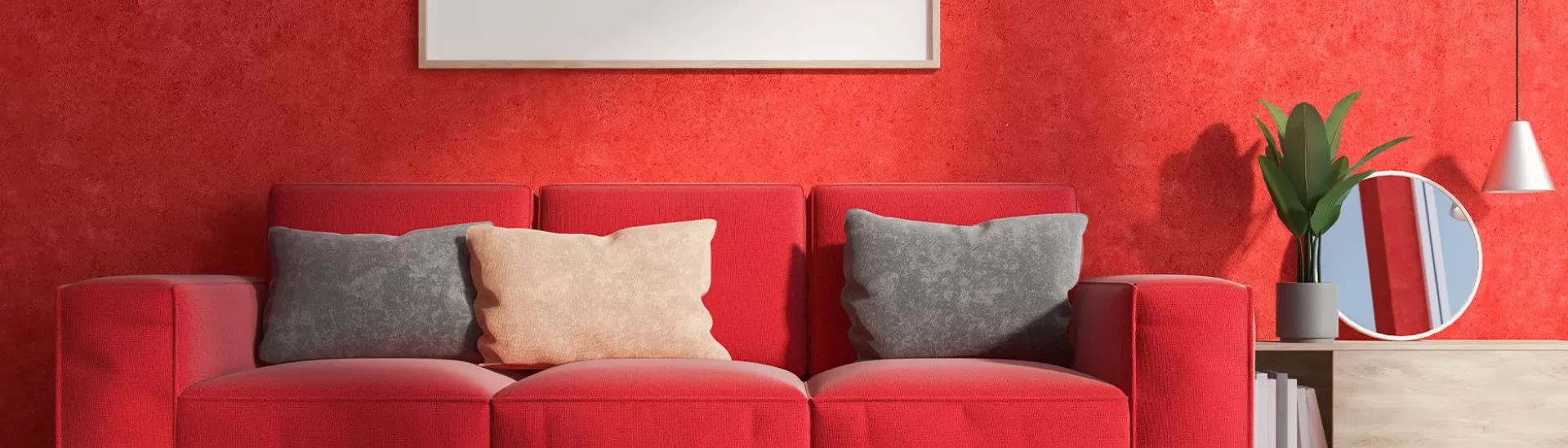
Top 5 Red Colour Shades – Wall Paint Palette & Types of Red
Published: 18 Nov 2019 | Modified: 07 Aug 2026
Quick Summary
Shades of red paint for walls can instantly add warmth, energy, and sophistication to your home interiors. From timeless true red and soft coral tones to deep ruby-inspired hues and luxurious berry reds, this guide explores five stylish red wall paint shades that work beautifully in living rooms, bedrooms, and modern accent-wall designs while helping you choose the right red colour shade for your space.
Create Your Dream Home With Our Painting Experts
Fill the form below to book a free site evaluation by Nerolac Nxtgen painting Services expert
TABLE OF CONTENTS
Red is exciting; red is energetic. And when you put this lively colour on your living room walls, your home instantly gets a rich makeover. Even though red paint is a bold choice for an interior, there's a tasteful way to make it work for your design scheme. And that is by selecting from abundant red wall paint shades. We’ve picked the five best shades we’d like for you to experiment with red colour wall paint.
-
True Red Wall Paint
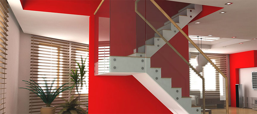
True Red The first red wall paint shade on our list is the usual timeless red. It's full of life, always fresh, always fun to wine, dine and entertain. So, paint your home walls with a classic red shade like Adventure (2189). The best part about this red paint colour is that it acts as a perfect backdrop for all your furnishings, upholstery, and accessories. So don’t think twice before painting your home with this bold shade of red colour wall paint.
-
Coraline Wall Paint
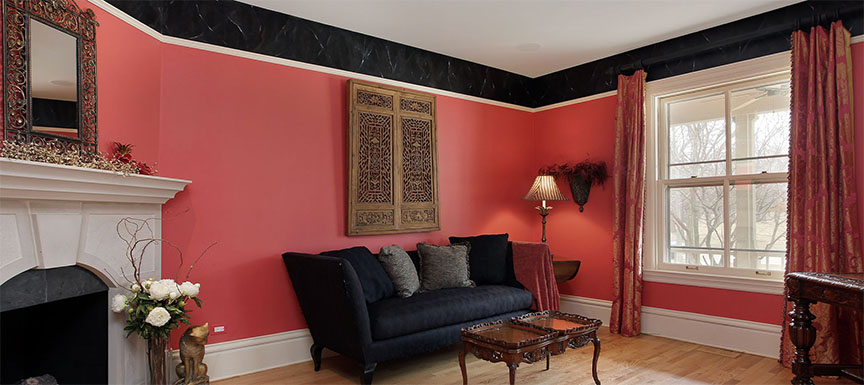
Coraline Talking about a different kind of red, you can try something with more pinkish tints. If you don’t wish to go for a very bold red, coral reds are just ideal for you. Just a tint of pink gives this red a mild glow, a glow that makes the colour look subtle. Some people may even call these tones pink or dark pink, which is not far from the truth. The pink undertones of this red shade make it prettier and an even more awesome colour to try. You can either pair the coral red colour walls with black detailing of wainscoting and skirting or go for something softer with white ceiling and flooring.
-
Passionné Wall Paint
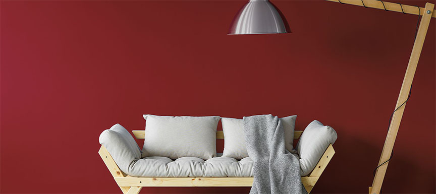
Passionné Some people like to keep things deeper and darker. Deep tones of red are perfect for them. Yes, even red has deeper shades - think ruby, garnet, and mahogany. For someone who rarely uses colour in interior spaces, passionate reds are the choices that can be paired with grey, beige, concrete and rich woods to add depth. And just like other red colour rooms, white can complete a wonderful living room or bedroom decor too. The bottom line is that deep reds can convert any room setting into a stunning one without doing anything much.
-
Tomatina Wall Paint
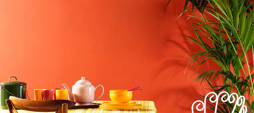
Tomatina We call this shade of red wall paint inspired by the local food market. Most ripe and luscious red vegetables and fruits have this tinge, tomatoes specifically. Tomatoes aren’t red exactly; they have a punch of orange to them. You can paint your home walls with tomato red if you want to experiment with a different kind of red wall colour paint. If you have wooden furniture and flooring, a tomato red shade like Swinging Sarees (4096) is perfect for your home walls. We love this shade of red wall paint colour because it’s balanced - neither too bright like red nor matte like crimsons or browns. And hence, the colour makes your home look balanced too.
-
Luxe Red Wall Paint
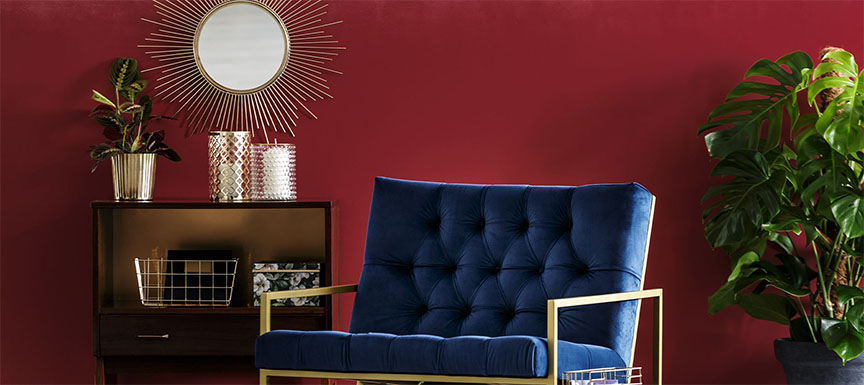
Luxe Red It’s time to talk about the luxe kinds of reds, the ones with a touch of opulence to them. Have you ever seen red colour walls with maroon or purple undertones? That’s exactly what we are talking about to give your home an unusual touch. These shades of red have a sophisticated mood to them. This berry-like take on the Passionné red wall paint colour makes your home modern and luxurious instantly. So if you want to be an inviting host, paint your home with reds that lean more towards pink or purple and are deep-toned. Decorate your room with an antique mirror, gilded furniture and a rock crystal chandelier. There are so many other red wall colour paints that you can try on. All you have to do is make up your mind if you are ready for the bold move or want to take a subtler step. And then you can always talk to our master painters to help you make the right choice for your house.
Also read: Top 11 Red Colour Combinations And Photos
Key Takeaways
- Shades of red paint for walls can create bold, warm, or luxurious interiors depending on the undertones you choose.
- True red wall paint shades work well as statement colours and pair beautifully with neutral furnishings.
- Coral and pink-tinted red colour shades for wall décor offer a softer and more contemporary alternative to classic red.
- Deep red wall paint shades such as ruby, garnet, and mahogany-inspired tones add richness and elegance to bedrooms and living rooms.
- Warm tomato-inspired reds complement wooden furniture and flooring while maintaining a balanced visual appeal.
- Different shades of red paint for walls look best when balanced with white ceilings, beige accents, grey textures, or metallic décor elements.
Nerolac Paints, a leading paint company in India offers a wide range of wall paint colours & painting services & solutions for homes & offices.
-
Best Colour Combination For Walls To Elevate Your Home Interiors Best Colour Combination For Walls To Elevate Your Home Interiors
Intoduction:In 2025, harmonious colour schemes for individuality and…
-
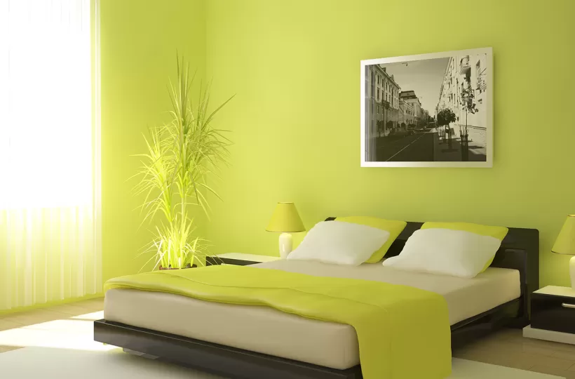
Best Green Colour Combinations for Walls – Schemes & Design Ideas Best Green Colour Combinations for Walls – Schemes & Design Ideas
Introduction:Green has long been a favourite choice in home decor…
-
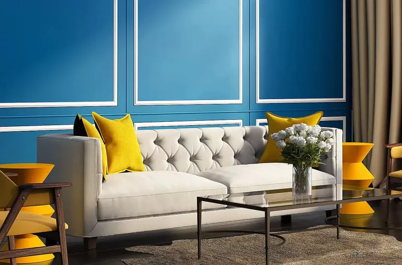
What Colours Match with Blue? 14 Colour Combinations with Blue for Your Home What Colours Match with Blue? 14 Colour Combinations with Blue for Your Home
Blue is a universally popular colour for décor and design; choosing a colour…
-
Recent Blogs
- Wooden House Design: 8 Kashmiri-Inspired Ideas for Warm and Elegant Homes
- Kashmiri Home Interior Design: 5 Ideas to Bring Kashmir's Beauty Into Your Home
- 7 Beautiful Kashmiri Home Design Ideas Inspired by Noor-e-Kashmir
- Cloud Dancer Colour of the Year – Meaning, Combinations, Interior Ideas and Trends
- How To Make Yellow Colour: Tips for Perfect Wall Paint Shades & Home Décor Ideas
-
Get in Touch
Looking for something else? Drop your query and we will contact you.
FAQs
Which shades of red paint for walls are best for a small room?
For smaller rooms, softer coral reds, terracotta reds, or muted tomato-inspired shades work better than dark crimson or maroon tones. These colours add warmth and personality without making the space feel too enclosed. Pair them with white ceilings, light flooring, and natural lighting to maintain an airy appearance.
How do I choose between warm and cool red wall paint shades?
Warm reds have orange or terracotta undertones and create an energetic, welcoming atmosphere, making them ideal for living rooms and dining spaces. Cool reds contain pink, berry, or purple undertones, which feel more sophisticated and work well in bedrooms, lounges, or modern accent-wall designs.
What colours pair well with different shades of red paint for walls?
Different shades of red paint for walls pair beautifully with white, beige, cream, charcoal grey, natural wood finishes, black accents, and muted gold or brass décor. Neutral companions help balance the intensity of red while allowing the wall colour to remain the focal point of the room.
Can red wall paint shades work in modern minimalist interiors?
Yes. Modern minimalist interiors often use deep wine reds, berry reds, or muted brick reds on a single accent wall rather than painting the entire room red. Combining these shades with clean-lined furniture, grey textures, and soft lighting creates a contemporary and refined look.
What finish is best for red colour shades for wall interiors?
A satin or soft-sheen finish is usually the best choice for red interiors because it enhances colour depth without creating excessive glare. Matte finishes can look elegant in bedrooms, while satin finishes are easier to clean and better suited for living rooms and high-traffic areas.
How can I prevent red wall paint shades from looking too overwhelming?
Use red strategically on one feature wall, balance it with light-coloured ceilings and adjacent walls, incorporate natural textures such as wood or cane, and add soft furnishings in neutral tones. Good lighting—both natural and warm artificial lighting—also helps red shades appear rich and inviting rather than overpowering.


Get in Touch
Looking for something else? Drop your query and we will contact you.
Latest Happenings in the Paint World
Get some inspiration from these trending articles



Popular Post
Popular Searches
What’s Trending in Bedrooms
Explore Trending Living Room Ideas
- Living Room Colour Combination
- Modern Two Colour Combination for Living Room
- Wall Texture for Living Room
- Vastu Colours for Living Room
- Wall Texture Design for Living Room
- Living Room Paint Ideas
- Living Room Design Ideas
- Paint Colour Ideas for Living Room
- Living Room TV Wall Designs
- Green Living Room Walls
Kitchen Ideas People Love
Explore Trending Ceiling Ideas
Study Room Ideas in Demand
Explore Wall Paint Categories
Handpicked Colour Inspirations
- Accent Wall Design
- Bedroom Design Ideas
- Exterior Wall Colour Design Ideas
- Interior Wall Colour Design Ideas
- Kitchen Design Ideas
- Living Room Interior Design
- Geometric Wall Design Ideas
- Home Colour Combination Ideas
- Home Décor Ideas
- Mural Wall Paint Design Ideas
- Office Space Design Ideas
- Puja Room Design Ideas
- Texture Design Ideas
- Festival Painting Ideas
- Paint Colour Chart
- Wall Painting Designs
- Wood Wall Décor Ideas
- Mural Wall Paint Design
- Hall Design Ideas
- Gate Colour Design
- Exterior Wall Colour Design
- Door Colour Design Ideas
-
 Get in Touch
 -
Store Locator
-
 Download App
×
Get in Touch
Looking for something else? Drop your query and we will contact you.

